Scoring genre clarity...

ASTRONEER capsule

ASTRONEER

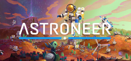
Interact with strange new worlds in a unique and tactile way, molding the environment itself as if it were clay in your hands. Build your base, master resource management, automate your production lines, and more as you unravel the mysteries of the universe, alone or with friends.

$7.49Very Positive(397)
MultiplayerOpen World Survival CraftOpen World
System Era SoftworksFeb 5, 2019

ASTRONEER scores 75/100 — better than 68% of Steam capsules we've analysed (n=22,658).

Very Positive (397 reviews) · $7.49 · Released Feb 5, 2019 · By System Era Softworks

Quick text summary

ASTRONEER scored 75/100 on Steam Analyzer — Good for a Steam capsule. Top priority fix: [composition] Reduce visual clutter in the lower base scene by simplifying or darkening it so the central astronaut reads as a cleaner solo focal point at tiny size.

Capsule scores by dimension

  • Genre Clarity: 8/10 — Space exploration sandbox clear. The astronaut suit, alien planet terrain, small base structures, and colorful low-poly alien world immediately communicate a space exploration or survival sandbox genre. At tiny size the suited astronaut figure floating centrally and the Mars-like terrain below still read as sci-fi exploration. The playful, colorful aesthetic also hints at the non-violent, creative sandbox subgenre rather than a shooter.
  • Title Readability: 8/10 — Bold white logo reads well. The ASTRONEER wordmark is large, bold, white with clean sans-serif letterforms set against the mid-tone alien sky, giving good contrast at full size. At small size the title still reads clearly due to its weight and simplicity. At tiny size (120x45) the letters compress but the short, distinct word ASTRONEER remains recognizable, though the thin blue accent line beneath it becomes invisible.
  • Contrast & Color: 7/10 — Warm palette pops on dark Steam. The warm orange-red terrain, bright teal and purple sky gradient, and white astronaut suit create a vibrant palette that contrasts well against Steam's dark #1b2838 background. The white suit silhouette of the central astronaut has clear separation from the colorful sky. In grayscale the mid-tones of the terrain and sky merge somewhat, but the bright sky and white figure still hold reasonable separation.
  • Uniqueness & Polish: 7/10 — Charming distinct low-poly style. The low-poly stylized art direction is distinctive and immediately recognizable as Astroneer's visual identity, setting it apart from realistic survival games. The busyness of the scene with multiple characters, base elements, and environmental details communicates a lived-in world and co-op sandbox feel. However, the composition feels slightly busy and the overall layout is somewhat conventional for a sandbox capsule, keeping it from standing out among top-tier genre peers like DAVE THE DIVER or COCOON.
  • Brand Consistency: 8/10 — Cohesive signature low-poly identity. The rounded low-poly aesthetic, pastel-meets-vibrant alien color palette, and the iconic round-helmeted astronaut suit are all strong brand identity signals that are consistently used across Astroneer's marketing. The teal accent line under the logo and the white wordmark are recurring brand elements. The art direction feels internally cohesive with no style clashes between foreground characters, terrain, and sky.
  • Composition: 7/10 — Centered hero with busy base layer. The central floating astronaut acts as a clear primary focal point with the logo positioned prominently in the left-center area, creating reasonable hierarchy. The base structures and additional characters in the lower third add context but create visual busyness that competes slightly at small sizes. At tiny size the astronaut and logo remain the dominant read, though the rich lower scene detail collapses into noise and the overall image reads as colorful but complex.

What works

  • Distinctive art style. The low-poly rounded aesthetic is immediately recognizable and sets Astroneer apart from realistic survival competitors at a glance.
  • Strong genre signaling. The suited astronaut, alien terrain, and base structures together clearly communicate space exploration sandbox without ambiguity.
  • Vibrant palette contrast. The warm orange terrain and bright teal-purple sky gradient pop effectively against Steam's dark background.
  • Legible bold title. The white ASTRONEER wordmark is heavy enough to remain readable even at small capsule sizes.

What hurts the capsule

  • Busy lower scene collapses at tiny size. The detailed base structures and multiple characters in the lower third merge into unreadable noise at 120x45, reducing the composition's clarity.
  • Thin accent line disappears small. The thin blue decorative line beneath the ASTRONEER logo becomes completely invisible at small and tiny sizes, losing a brand detail.
  • Mid-tone sky merges in grayscale. The sky gradient and terrain share similar mid-tone values in grayscale, reducing silhouette separation when color is removed.
  • Generic capsule layout for sandbox genre. The hero-above-scene composition is common in survival sandbox capsules and does not create a uniquely memorable or surprising layout.

Priority fixes

  1. [composition] Reduce visual clutter in the lower base scene by simplifying or darkening it so the central astronaut reads as a cleaner solo focal point at tiny size.
  2. [contrast_color] Increase the value contrast between the sky and terrain in grayscale to ensure silhouette separation holds without color.
  3. [title_readability] Replace or thicken the thin accent line beneath the logo with a more substantial brand mark that survives at small sizes.
  4. [uniqueness_polish] Consider a more unconventional composition or focal moment that differentiates the capsule from generic sandbox hero-above-landscape layouts.

Store copy priority fixes

  1. [feature_communication] Add one sentence explaining how production automation works (e.g., 'Connect harvesters, refineries, and storage with conveyor systems to create self-sustaining resource chains') to clarify a core survival-craft mechanic.
  2. [uniqueness] Explicitly contrast the Terrain Tool against grid-based building by adding a phrase like 'unlike traditional block-based builders, reshape terrain freely in any direction' to strengthen differentiation.
  3. [feature_communication] Include a brief sentence on progression or goals (e.g., 'Unlock new technologies and equipment as you decipher the mysteries of each world') to clarify long-term motivation beyond exploration.

Related guides

Steam app ID: 361420