Scoring genre clarity...

Only DWARVES DIG Proper HOLES capsule

Only DWARVES DIG Proper HOLES

As a Dwarf, it is your duty to dig in the search of a legendary pickaxe. Collect gems, sell and upgrade. All in glorious virtual reality. Family-friendly fun.

$1.50Positive(11)
ExplorationVoxelSandbox
Antoine VerbeekOct 29, 2025

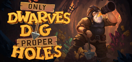
Only DWARVES DIG Proper HOLES scores 73/100 — better than 56% of Steam capsules we've analysed (n=22,658).

Positive (11 reviews) · $1.50 · Released Oct 29, 2025 · By Antoine Verbeek

Quick text summary

Only DWARVES DIG Proper HOLES scored 73/100 on Steam Analyzer — Good for a Steam capsule. Top priority fix: [title_readability] Increase the size and weight of 'ONLY' and 'PROPER' text or integrate them directly into the main title stack so all words survive at tiny 120x45 thumbnail size.

Capsule scores by dimension

  • Genre Clarity: 8/10 — Mining dwarf adventure reads clearly. The stout dwarf character holding a lantern, pickaxe tool visible, and cave rock background immediately communicate a mining/digging theme. The fantasy dwarf archetype is well-established iconography that signals casual adventure or RPG-lite genre. At tiny size the dwarf silhouette and warm lantern glow still communicate the core fantasy, though the subgenre nuance of VR is entirely lost at any size.
  • Title Readability: 7/10 — Bold title reads well at small. The large chunky gold lettering with dark outlines for 'DWARVES DIG' and 'HOLES' reads well at small and even tiny sizes due to high contrast and thick strokes. The smaller words 'ONLY', 'PROPER' are noticeably harder to read at tiny size and nearly disappear at thumbnail scale. The stone-banner treatment on 'ONLY' adds charm but reduces legibility for that word at reduced sizes.
  • Contrast & Color: 8/10 — Warm gold pops on dark cave background. The warm amber and golden tones of the dwarf and title typography contrast strongly against the dark teal-brown cave background and Steam's dark UI. The lantern light creates a natural separation halo around the character silhouette. In grayscale the dwarf reads clearly against the darker background, and the gold title text maintains strong value separation even at tiny size.
  • Uniqueness & Polish: 7/10 — Charming but genre-familiar execution. The illustration quality is solid with expressive character design and good painterly rendering on the dwarf. The playful typography treatment with mixed sizing on 'ONLY', 'PROPER' adds personality and fits the casual-fun tone. However the overall composition of a single character in a cave is a well-worn genre template, and compared to top benchmarks like DAVE THE DIVER or Balatro, it lacks a truly distinctive visual hook or surprising element.
  • Brand Consistency: 7/10 — Cohesive warm fantasy palette identity. The warm amber-gold palette, chunky cartoon dwarf aesthetic, and playful stone-carved typography create a coherent internal identity. The dwarf character is distinctive enough to serve as a brand mascot across store pages. The art direction feels unified between character rendering and environment, though the stone banner title treatment could be more tightly integrated with the overall composition.
  • Composition: 7/10 — Character right, title left balances well. The classic split of title text on the left and character on the right creates a clean two-zone layout that resists Steam cropping. The dwarf fills the right third with good vertical presence and the title stacks naturally in the left portion. At small and tiny sizes the dwarf silhouette and title block both survive the crop, though the smaller title words 'ONLY' and 'PROPER' become dead weight at tiny scale and slightly clutter the left zone.

What works

  • Strong character silhouette. The dwarf's warm lantern-lit form reads as a clean distinct shape against the dark cave background even at tiny thumbnail size.
  • Gold title contrast against dark background. The chunky gold lettering with dark outlines maintains excellent readability against Steam's #1b2838 UI color at small and medium sizes.
  • Immediate genre communication. The dwarf archetype, cave setting, and pickaxe iconography communicate the mining adventure theme within under one second of viewing.
  • Playful typography personality. The mixed-weight title treatment with stone banner accents gives the capsule a lighthearted tone that matches the casual family-friendly positioning.

What hurts the capsule

  • Secondary title words disappear at tiny size. The words 'ONLY' and 'PROPER' in smaller stone-banner frames become illegible at 120x45 thumbnail scale, reducing the full title to just 'DWARVES DIG HOLES'.
  • Generic single-character-in-cave composition. The layout follows a very common template for fantasy mining games and lacks a surprising compositional or storytelling element that would distinguish it from similar capsules.
  • VR feature completely invisible. The game's VR differentiator is not communicated anywhere in the capsule art, missing a potential unique selling point that could separate it from non-VR competitors.
  • Midground lacks depth layering. There is limited foreground or midground detail to create convincing depth, making the background feel somewhat flat behind the character.

Priority fixes

  1. [title_readability] Increase the size and weight of 'ONLY' and 'PROPER' text or integrate them directly into the main title stack so all words survive at tiny 120x45 thumbnail size.
  2. [uniqueness_polish] Add a distinctive visual hook such as a pile of glowing gems, a VR headset gag, or a humorous environmental detail that sets this apart from generic dwarf-mining imagery.
  3. [composition] Introduce a clear foreground element such as scattered gems or a pickaxe to create depth layering and make the composition feel less flat at small sizes.
  4. [brand_consistency] Consider adding a small iconic badge or symbol that could serve as a recurring brand mark across capsule, header, and store screenshots for stronger identity recognition.

Store copy priority fixes

  1. [audience_targeting] Add one sentence to the short description or opening paragraph that explicitly names the ideal player: 'Perfect for VR explorers seeking a relaxing, humorous dig without combat' or similar.
  2. [feature_communication] In the detailed description, reframe the beer mechanic as a core survival loop rather than a joke: 'Manage your energy by drinking beer—your only companion in the dark below' before the humor section.
  3. [uniqueness] Add a concrete differentiator in the detailed description, such as 'The only VR mining game where you manually climb back up every tunnel you dig' or a specific mechanical twist that sets it apart.

Related guides

Steam app ID: 3618790