Scoring genre clarity...
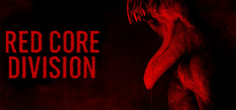
Red Core Division is a co-op survival horror game for 1–4 players. Enter a classified containment facility, where something has gone horribly wrong. Your mission: find evidence of paranormal activity, complete high-risk objectives, and escape alive. But, something is down there—something that hunts.
$4.99Mostly Negative(13)
HorrorSurvival HorrorMultiplayer
YBTJun 30, 2025