Scoring genre clarity...

Tyranny capsule

Tyranny

Experience a story-driven RPG where your choices mean all the difference in the world.

$7.49Very Positive(34)
RPGChoices MatterStory Rich
Obsidian EntertainmentNov 10, 2016

Tyranny scores 75/100 — better than 68% of Steam capsules we've analysed (n=22,658).

Very Positive (34 reviews) · $7.49 · Released Nov 10, 2016 · By Obsidian Entertainment

Quick text summary

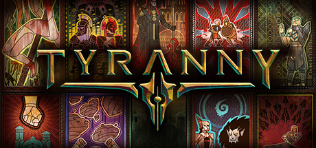
Tyranny scored 75/100 on Steam Analyzer — Good for a Steam capsule. Top priority fix: [composition] Introduce one dominant central or foreground character silhouette that anchors the eye, using the tarot panels as a supporting background rather than equal-weight elements.

Capsule scores by dimension

  • Genre Clarity: 7/10 — Dark Fantasy RPG Implied Clearly. The tarot-card-style panel grid featuring robed figures, armored warriors, mages, and faction emblems strongly communicates dark fantasy RPG territory. The stained-glass aesthetic with characters in dramatic poses hints at choice-driven narrative RPG. At tiny size the individual panels blur together into a mosaic of warm reds and golds, still reading as fantasy but losing the character detail that communicates genre depth.
  • Title Readability: 8/10 — Bold Gold Logo Reads Well. The TYRANNY logotype is large, gold with a subtle embossed treatment, and centered prominently over the panel grid at a size that dominates the composition. At full size it reads immediately and clearly. At tiny size the letterforms still hold their shape due to the heavy serif weight and strong value contrast against the darker mid-zone panels behind it, though the fine inner detailing of the logo is lost.
  • Contrast & Color: 7/10 — Warm Reds Pop Against Steam Dark. The dominant warm red, burnt orange, and gold palette creates good separation against Steam's #1b2838 dark background, particularly at the outer edges of the image. The center panels with purple and green hues add variety but can muddy mid-tone readability at small sizes. In grayscale the gold title retains strong separation, but several character panels merge into similarly mid-toned grey values making individual figures indistinct at tiny size.
  • Uniqueness & Polish: 8/10 — Distinctive Tarot Grid Art Style. The stylized tarot-card mosaic layout is a genuinely distinctive choice that immediately differentiates Tyranny from standard character-hero capsules common in the RPG genre. The stained-glass illustration style with bold outlines and flat color zones feels intentional and premium. The execution is cohesive and the concept communicates multi-faction choice-driven narrative better than a single hero pose would, which is a meaningful visual storytelling win.
  • Brand Consistency: 8/10 — Cohesive Palette and Motif Language. The tarot-panel motif, gold filigree border treatment, and warm dark palette form a recognizable visual identity that extends clearly across the capsule. The faction symbols and varied character archetypes visible across the panels suggest a consistent in-game world aesthetic. The gold dagger emblem embedded in the title treatment acts as an additional brand mark that reinforces identity.
  • Composition: 7/10 — Grid Layout With Clear Central Title. The 3x4 panel grid fills the space efficiently with the TYRANNY title anchored centrally across the mid-zone, creating a natural focal hierarchy. The top row and bottom row panels frame the title well. At small size the composition reads as a decorative mosaic with a clear title center, which is functional. However, the equal visual weight of all twelve panels means no single character or focal element draws the eye first, which can feel slightly scattered at tiny size.

What works

  • Highly Distinctive Tarot Mosaic Layout. The multi-panel tarot grid is unusual in the RPG genre and immediately signals a multi-faction, choice-driven game without relying on a single hero pose.
  • Strong Title Legibility at Small Size. The heavy gold serif TYRANNY logo maintains readable letterforms even at 120x45 due to its large weight and strong contrast against the cooler panel backgrounds behind it.
  • Warm Palette Pops Against Steam Background. The dominant red and gold tones create clear edge separation against Steam's dark navy background, ensuring the capsule is visible during quick scroll.
  • Visual Storytelling of Core Mechanic. The mosaic of different factions and characters communicates the game's choice-and-consequence RPG identity more effectively than a generic single-character illustration would.

What hurts the capsule

  • Individual Panels Collapse at Tiny Size. At 120x45 all twelve character panels blur into an indistinct warm mosaic, losing the character detail and faction identity that make the design meaningful.
  • No Single Focal Character or Hero. The equal emphasis across all panels means there is no primary silhouette to anchor the eye, which weakens immediate visual impact in a quick scroll environment.
  • Mid-Tone Mudding in Grayscale. Several inner panels share similar mid-grey values in grayscale, causing individual figures to blend into their panel backgrounds and reducing silhouette clarity.
  • Panel Variety Can Read as Cluttered. The twelve competing scenes with varying color palettes, including purples, greens, reds, and oranges, create a busy visual field that slightly undermines the premium feel at full size.

Priority fixes

  1. [composition] Introduce one dominant central or foreground character silhouette that anchors the eye, using the tarot panels as a supporting background rather than equal-weight elements.
  2. [contrast_color] Increase value contrast on the inner panel characters by darkening their backgrounds so individual figures read as distinct silhouettes at small and tiny sizes.
  3. [genre_clarity] Add a subtle environmental or UI cue in the central zone, such as a battlefield or stylized map element, to reinforce the tactical RPG subgenre at tiny size when panels become unreadable.
  4. [uniqueness_polish] Reduce the color variety across the twelve panels by tightening the palette to two or three dominant hues to create a more cohesive and premium impression at full size.

Store copy priority fixes

  1. [hook_strength] Rewrite the short description to lead with the villain-protagonist premise: 'You are the enforcer of a tyrant's rule. Now decide: will you strengthen tyranny or dismantle it from within?'
  2. [feature_communication] Add 2-3 examples of specific companions or named NPCs with a brief descriptor (e.g., 'Loyal generals, scheming rebels, or ambitious allies—each with conflicting agendas') to support the 'memorable companions' claim.
  3. [feature_communication] Expand the combat description with one concrete detail: 'Control your party in real-time tactical encounters; pause mid-battle to issue commands, manage cooldowns, and position allies strategically.'
  4. [tone_match] Replace or contextualise vague terms like 'immersive' and 'reactive' with concrete story examples (e.g., 'Your decision to pardon rebels or execute them cascades through the Tiers, changing which factions trust or oppose you in future encounters')

Related guides

Steam app ID: 362960