Scoring genre clarity...

Crop capsule

Crop

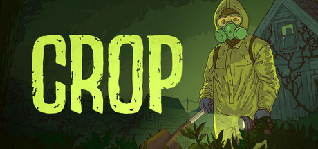
A gritty farming thriller where your safety depends on the yield. Bound to a dying farm, you must dig, plant, irrigate, and cut your way through the decay. Uncover buried secrets, both in the soil and quietly brewing within the village. The only way out is through the harvest.

SimulationFarmingHorror
Carbonara GamesTo be announced

Crop scores 75/100 — better than 68% of Steam capsules we've analysed (n=22,658).

Released To be announced · By Carbonara Games

Quick text summary

Crop scored 75/100 on Steam Analyzer — Good for a Steam capsule. Top priority fix: [brand_consistency] Develop one iconic visual motif (e.g., a harvest symbol, soil artifact, or character mark) that appears consistently across all store assets and marketing to create recognizable identity beyond the hazmat concept.

Capsule scores by dimension

  • Genre Clarity: 7/10 — Survival thriller with farming overtones. The hazmat-suited figure with gas mask and shovel clearly signals danger and agricultural labor, positioning this as a dark farming experience. At tiny size, the yellow suit and tool remain readable enough to suggest manual labor in a hostile environment, though the exact thriller tone is less apparent at that scale. The green atmospheric backdrop reinforces decay and unease.
  • Title Readability: 9/10 — Bold neon yellow typography. The title 'CROP' is rendered in large, high-contrast neon yellow against the dark green background with strong outline definition. At small and tiny sizes, the letterforms remain completely legible and impactful due to extreme value separation and blocky sans-serif construction. No decorative elements or taglines compete for attention.
  • Contrast & Color: 8/10 — Strong value separation, dark moody palette. Neon yellow title creates exceptional contrast against deep forest green and near-black tones, ensuring immediate pop on Steam's dark background. The character silhouette reads clearly in the mid tones with warm yellow-green highlights that separate from the background. In grayscale mental test, the composition maintains strong silhouette integrity and focal point clarity.
  • Uniqueness & Polish: 7/10 — Thematic, gritty but somewhat familiar. The hazmat worker aesthetic effectively communicates the game's dangerous farming premise and creates a memorable visual hook distinct from standard pastoral sims. The illustration quality is solid with atmospheric lighting and detailed character work, though the hazmat-in-decay archetype has been used in other indie titles. The execution feels intentional and cohesive rather than generic, supporting the thriller tone.
  • Brand Consistency: 6/10 — Coherent visual direction, limited iconic depth. The capsule establishes a consistent gritty, naturalistic illustration style with muted earthy tones punctuated by the neon title, which could carry across marketing materials. However, without access to other store assets, there are no immediately recognizable brand motifs or signature visual elements that stand out as uniquely tied to Crop's identity. The hazmat-farmer concept is the primary identity signal and reads cohesively.
  • Composition: 8/10 — Clear hierarchy, balanced focal point. The character is positioned right of center as primary focal point with the title anchored on the left, creating strong visual balance without dead space. The background elements (distant figure, building silhouette) recede appropriately, maintaining depth layering that reads at all sizes. At tiny size, the composition collapses cleanly to the character and title without losing impact or confusion about primary elements.

What works

  • Exceptional title contrast and legibility. Neon yellow 'CROP' maintains perfect readability from full size down to thumbnail thanks to high value separation and clean sans-serif forms.
  • Strong atmospheric genre positioning. Hazmat suit and shovel immediately signal danger farming, differentiating from cozy sims and clearly communicating the thriller premise.
  • Effective depth and composition balance. Character, title, and background elements layer clearly without competing for attention, maintaining hierarchy at all viewing scales.

What hurts the capsule

  • Limited visual brand identity signals. Beyond the hazmat-farmer concept, there are no distinctive motifs, icons, or signature design elements that create lasting brand recognition.
  • Familiar archetype without standout originality. Hazmat-in-decay aesthetic, while thematic, draws from visual tropes already present in other indie thriller and survival games.
  • Character silhouette could be more dynamic. The figure's pose is fairly static and neutral, lacking an action-oriented or emotionally evocative stance that would amplify memorable impact.

Priority fixes

  1. [brand_consistency] Develop one iconic visual motif (e.g., a harvest symbol, soil artifact, or character mark) that appears consistently across all store assets and marketing to create recognizable identity beyond the hazmat concept.
  2. [uniqueness_polish] Consider adding a subtle environmental storytelling detail (e.g., wilted crops, bones in soil, or ominous village atmosphere intensifier) that visually hints at the 'buried secrets' and survival stakes unique to this game's narrative.
  3. [composition] Explore a more dynamic character pose or expression (concerned face, struggle with tool, reaching gesture) to increase emotional engagement and memorability at thumbnail size.

Store copy priority fixes

  1. [feature_communication] Add one sentence describing how investigation works mechanically—e.g., 'Search abandoned buildings, interview villagers, or piece together clues from farmstead evidence' to match the specificity of farming mechanics.
  2. [feature_communication] Clarify consequence systems by adding: 'Fail to meet harvest quotas and watch the townspeople lose faith. Uncover certain secrets and face unexpected consequences' to strengthen stakes clarity.
  3. [audience_targeting] Add a single sentence signaling tone intensity for filtering: 'Not a cozy farming sim—expect psychological tension, environmental decay, and moral ambiguity' to pre-filter players seeking lighter gameplay.

Related guides

Steam app ID: 3645050