Scoring genre clarity...

White Room Protocol capsule

White Room Protocol

A psychological first-person horror game where you enter a memory-erasing protocol and relive a trauma. Uncover dark secrets, and experience fear through immersive atmosphere.

$3.99Mostly Positive(54)
HorrorPsychological HorrorSingleplayer
Lefto StudioAug 15, 2025

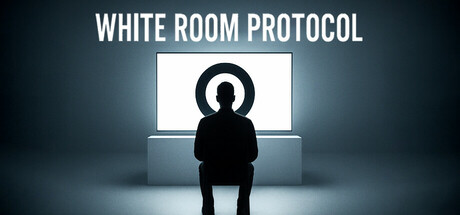
White Room Protocol scores 73/100 — better than 68% of Horror capsules (n=3,118).

Mostly Positive (54 reviews) · $3.99 · Released Aug 15, 2025 · By Lefto Studio

Quick text summary

White Room Protocol scored 73/100 on Steam Analyzer — Good for a Horror capsule. Top priority fix: [brand_consistency] Add a distinctive visual motif or logo system (e.g., a recognizable memory symbol, recurring UI element, or color accent) that will appear consistently across all marketing materials and in-game UI to establish unique brand recall.

Capsule scores by dimension

  • Genre Clarity: 7/10 — Psychological horror intent clear. The silhouette of a figure seated before a glowing screen with a mysterious symbol creates immediate psychological thriller atmosphere. At tiny size, the iconic chair-and-screen composition reads as introspective/unsettling rather than action-driven, supporting the horror/simulation genre expectation. The stark monochromatic figure against the lit screen effectively conveys isolation and dread, though without explicit gameplay mechanics visible.
  • Title Readability: 8/10 — Bold sans-serif reads well across sizes. WHITE ROOM PROTOCOL uses a clean, heavy sans-serif typeface positioned at the top with strong contrast against the dark background gradient. The title remains legible at small and tiny sizes due to its weight and spacing. Letterforms are clear and the all-caps treatment aids recognition, though at extreme tiny size some letter distinction begins to soften.
  • Contrast & Color: 8/10 — Strong value separation, atmospheric lighting. The design exploits a high-contrast value hierarchy: pure white title and screen glow versus deep blue-gray ambient space and pitch-black silhouette. The figure creates a clean dark silhouette against the lit screen, and the cool blue-to-gray gradient background provides excellent separation from the dark Steam panel background (#1b2838). The screen glow reads as a focal point of light in grayscale and maintains impact even at tiny thumbnail size.
  • Uniqueness & Polish: 7/10 — Minimalist, cinematic, somewhat familiar. The composition is deliberately minimalist and cinematic—a figure before an interrogation-like screen setup suggesting psychological experimentation or memory extraction. The execution is polished with clean lighting and atmospheric depth, but the silhouette-in-isolation aesthetic is increasingly common in indie horror marketing (e.g., DREDGE, Slay the Princess precedents). The mysterious symbol on the screen adds intrigue but is not detailed enough to stand as a strong unique brand signature.
  • Brand Consistency: 6/10 — Cohesive but generic minimalism. The visual language—monochromatic figure, glowing screens, clinical setting—is internally consistent and likely aligns with in-game UI and aesthetic from the referenced screenshots. However, the design lacks a distinctive icon, character silhouette, or color motif that would be immediately recognizable as White Room Protocol specifically. The aesthetic leans on proven psychological-horror tropes rather than establishing a memorable brand signature.
  • Composition: 8/10 — Clear hierarchy, strong focal point. Title anchors the top third with adequate margin; the figure-and-screen composition centers the visual interest in the middle frame with balanced symmetry. The staged lighting guides the eye naturally to the screen glow as the primary focal point. At small and tiny sizes, the composition reads immediately without clutter; the centered chair and glowing screen remain the dominant read, and safe margins protect the critical elements from Steam's typical edge cropping.

What works

  • Excellent contrast against Steam background. The cool blue-gray atmosphere and white screen glow create strong separation from the #1b2838 panel, ensuring immediate visual pop in browse lists.
  • Title legible at all viewing sizes. Heavy sans-serif weight and generous spacing ensure WHITE ROOM PROTOCOL remains clear from full header down to tiny thumbnail without collapse.
  • Coherent psychological horror mood. The isolated figure, glowing interrogation screen, and clinical lighting establish a unified atmosphere that matches the game's trauma-recovery premise.

What hurts the capsule

  • Generic silhouette-and-screen aesthetic. The design relies on familiar indie-horror visual language (similar to competitor capsules) without a unique character, symbol, or palette cue to differentiate it.
  • Mysterious symbol lacks definition. The circular icon on the screen is too small and abstract to register as a memorable brand signature, even at full size.
  • Limited color palette may fade in feed. While contrast is strong, the monochromatic blue-white-black palette does not stand out distinctly when scrolling past colorful adjacent games.

Priority fixes

  1. [brand_consistency] Add a distinctive visual motif or logo system (e.g., a recognizable memory symbol, recurring UI element, or color accent) that will appear consistently across all marketing materials and in-game UI to establish unique brand recall.
  2. [uniqueness_polish] Introduce a subtle accent color (e.g., a warm orange or sickly green glow) in the screen or figure to differentiate the palette from standard psychological-horror templates and increase visual distinctiveness in a crowded genre.
  3. [composition] Consider framing or cropping refinement to ensure the screen symbol is larger and more legible at small sizes, or replace it with a more iconic imagery element that reinforces the core mechanic.

Store copy priority fixes

  1. [uniqueness] Add a sentence that explicitly contrasts White Room Protocol with existing walking simulator horror games—e.g., 'Unlike X, White Room Protocol emphasizes [specific mechanic or narrative twist].'
  2. [feature_communication] Rewrite the HIDDEN PUZZLES section to include a concrete example of how a puzzle is discovered and solved, not just what comprises it.
  3. [hook_strength] Strengthen the short description's final clause by replacing 'experience fear through immersive atmosphere' with a consequence or stakes statement: e.g., 'But will Jesse survive the simulation—or become trapped in it?'

Related guides

Steam app ID: 3648450 · Tags: Horror, Psychological Horror, Singleplayer, Walking Simulator, Atmospheric