Scoring genre clarity...
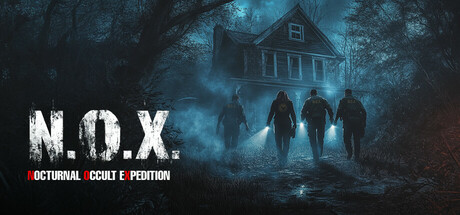
N.O.X. is a co-op horror game where up to four players take on the roles of paranormal investigators. Players must find clues, identify the type of spirit, and banish it using their tools, either alone or together with their crew.
$16.99Mixed(30)
HorrorOnline Co-OpMultiplayer
LuminDriveNov 6, 2025