Scoring genre clarity...

Multi-Merge Mayhem capsule

Multi-Merge Mayhem

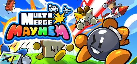
Multi-Merge Mayhem is a chaotic party game for up to 8 players where multiple microgames play at the same time. Run, jump, and punch your way through overlapping challenges as you fight to outscore your friends in pure, unpredictable mayhem!

Party Game2D PlatformerMinigames
PARTYBOMB STUDIOTo be announced

Multi-Merge Mayhem scores 70/100 — better than 30% of Steam capsules we've analysed (n=22,658).

Released To be announced · By PARTYBOMB STUDIO

Quick text summary

Multi-Merge Mayhem scored 70/100 on Steam Analyzer — Good for a Steam capsule. Top priority fix: [uniqueness_polish] Introduce a visual cue for the merge mechanic, such as two items combining with a spark effect, to immediately differentiate the game's core loop from generic party brawlers.

Capsule scores by dimension

  • Genre Clarity: 8/10 — Chaotic party brawler energy clear. The large bomb character with an expressive face, rocket-riding character, and flying debris immediately communicate a chaotic party/action game. The word 'Mayhem' in the title reinforces multiplayer party brawler vibes. At tiny size the cartoony characters and frantic energy still suggest a casual party game, though the merge mechanic is not visually communicated.
  • Title Readability: 7/10 — Bold logo reads at small size. The 'Multi Merge Mayhem' logo uses chunky white letters with dark outlines and a bright yellow accent on 'Mayhem', which holds up well at small capsule size. At tiny size the word 'Multi Merge' begins to collapse slightly due to the stacked layout and smaller secondary word sizing, but 'MAYHEM' remains legible due to its larger scale and high contrast. No problematic taglines or extra text clutter the image.
  • Contrast & Color: 7/10 — Bright palette pops against Steam dark. The bright blue sky background, vivid orange bomb character, and white logo with dark outlines create strong separation against Steam's #1b2838 dark background. The colorful cartoon palette reads quickly in scroll. In grayscale the bomb silhouette and title block maintain decent separation, though the mid-ground chest and coin elements blend somewhat into the grassy floor at tiny size.
  • Uniqueness & Polish: 6/10 — Competent but genre-familiar cartoon style. The art style is clean and professionally executed with consistent cartoon rendering and fun character designs. However, the overall composition and visual language feels familiar within the casual party game space and doesn't immediately communicate a unique selling point like the merge mechanic. Compared to standout capsules like Balatro or DAVE THE DIVER, there is no single distinctive hook that makes this immediately memorable beyond generic party game energy.
  • Brand Consistency: 7/10 — Cohesive cartoon identity with strong palette. The bright primary color palette, thick black outlines, and expressive cartoon characters form a consistent internal visual identity. The large bomb character serves as a potential mascot figure that could become recognizable across store assets. The logo style with the star burst accent integrates naturally with the character art style, reinforcing a unified brand direction.
  • Composition: 7/10 — Clear focal point with dynamic energy. The oversized bomb character dominates the right foreground as a clear primary subject, with the rocket character providing secondary interest in the upper right and the logo anchored to the upper left. This creates a reasonable left-to-right hierarchy. At small size the bomb face remains the dominant focal point. Minor issue is that the chest and coin elements in the lower left corner compete slightly with the logo area and add clutter near the edges that can get cropped.

What works

  • Strong bomb mascot focal point. The large expressive bomb character holds the composition and remains readable even at tiny thumbnail size.
  • High contrast logo with outlines. The chunky white lettering with dark outlines on 'Multi Merge Mayhem' stays legible against the busy background at small sizes.
  • Vibrant color palette pops on Steam. The bright blues, oranges, and whites create immediate visibility against Steam's dark #1b2838 interface.
  • Cohesive cartoon art direction. All characters, props, and UI elements share the same thick-outline cartoon rendering style, creating internal brand consistency.

What hurts the capsule

  • Merge mechanic not communicated. The core game mechanic of merging is not visually represented anywhere in the capsule, missing an opportunity to differentiate from generic party brawlers.
  • Lower left corner clutter. The wooden chest, coins, and controller icon in the lower left compete with the logo and risk being cropped at non-standard aspect ratios.
  • Generic party game impression. Despite clean craft, the capsule blends into casual party game conventions without a distinctive visual hook that separates it from the crowd.
  • Stacked logo loses hierarchy at tiny size. The smaller 'Multi Merge' text above the larger 'Mayhem' creates an uneven hierarchy that weakens at tiny thumbnail scale.

Priority fixes

  1. [uniqueness_polish] Introduce a visual cue for the merge mechanic, such as two items combining with a spark effect, to immediately differentiate the game's core loop from generic party brawlers.
  2. [title_readability] Increase the relative size of 'MULTI MERGE' text and ensure consistent weight parity with 'MAYHEM' so the full title reads as a unified block at tiny size.
  3. [composition] Remove or reduce the lower left chest and coin clutter to clean up safe zone margins and give the logo more visual breathing room.
  4. [genre_clarity] Add a subtle UI hint or multiplayer visual cue such as multiple character silhouettes to reinforce the up-to-8-player party angle at a glance.

Store copy priority fixes

  1. [hook_strength] Rewrite the detailed description opening to eliminate the duplicate and instead lead with the unique simultaneous-gameplay mechanic: 'Picture 8 friends playing 20 different challenges at once, overlapping and chaotic. That's Multi-Merge Mayhem—where every microgame runs simultaneously, meaning you must dodge bricks while your friend solves math and another jumps saws.'
  2. [uniqueness] Add a one-sentence explicit differentiator explaining why simultaneous gameplay matters: 'Unlike turn-based party games, all microgames run in real-time, forcing split-second decisions and unpredictable interactions between challenges.'
  3. [feature_communication] Include a brief section on long-term engagement hooks, such as ranked cosmetics, achievement tiers, or seasonal challenges to signal replayability beyond novelty social sessions.

Related guides

Steam app ID: 3655540