Scoring genre clarity...

ShatterRush capsule

ShatterRush

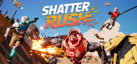
ShatterRush is a multiplayer parkour FPS where fluid movement meets massive mechs in fully destructible levels. Wallrun, grapple, and smash through cover to outplay your foes in kinetic, high-speed combat as the map changes with every fight. Join the rush in our free Open Pre-Alpha & wishlist now!

Early AccessFPSPvP
Tetra StudiosQ3 2027

ShatterRush scores 68/100 — better than 19% of Steam capsules we've analysed (n=22,658).

Released Q3 2027 · By Tetra Studios

Quick text summary

ShatterRush scored 68/100 on Steam Analyzer — Solid for a Steam capsule. Top priority fix: [uniqueness_polish] Introduce a visible environmental destruction moment such as a wall crumbling or a grapple hook mid-swing to visually communicate the parkour-destruction mechanic that differentiates ShatterRush from generic shooters.

Capsule scores by dimension

  • Genre Clarity: 8/10 — Clear action shooter with mechs. The capsule strongly communicates a fast-paced action shooter: characters with guns in dynamic poses, a large mech enemy in the center, and explosive gunfire effects. The parkour FPS angle is implied by the airborne soldiers flanking the composition. At tiny size the mech and gunfire still read as action combat, though the multiplayer nuance is lost.
  • Title Readability: 7/10 — Bold logo reads well at small. The SHATTER RUSH logotype uses thick, bold chunky letters with a yellow-orange color and a subtle outline that provides decent separation from the mid-blue sky background. At full size it reads clearly. At tiny size the two-line stacked layout holds together reasonably well, though fine details in the letterforms compress and the slight diagonal treatment adds mild noise. No tagline clutter hurts readability.
  • Contrast & Color: 7/10 — Warm foreground pops on cool sky. The warm orange-red mech in the center contrasts well against the cool blue-grey sky background, creating solid value separation. The yellow-orange gun muzzle flash adds a bright focal anchor. At tiny size the central mech silhouette still reads clearly. However the flanking soldier figures on left and right blend somewhat into the mid-tone environment at very small sizes, and the overall palette is moderately saturated rather than high-contrast.
  • Uniqueness & Polish: 6/10 — Competent but genre-generic execution. The composition and art style feel competent and readable but follow a familiar template of center boss enemy flanked by soldiers in an explosive arena. The destruction and parkour USPs are not visually distinct from a standard arena shooter capsule. Compared to benchmark titles like Helldivers 2 or Armored Core VI the craft is functional but lacks a distinctive visual hook or storytelling moment that communicates the unique destructible-map parkour mechanic.
  • Brand Consistency: 6/10 — Cohesive palette, limited identity anchor. The warm orange-red armor on the central mech, the sandy desert environment, and the energetic action pose create internal visual cohesion. The bold chunky logotype style feels consistent with the tone. However there is no single iconic character, symbol, or motif that would make this immediately recognizable as ShatterRush specifically versus any other multiplayer shooter, limiting long-term brand recall.
  • Composition: 7/10 — Strong center focal point, busy edges. The large central mech provides a clear primary focal point with the title logo positioned cleanly above it against the lighter sky. The flanking soldiers create dynamic diagonal energy that frames the center. At small size the center mech and logo hierarchy survives well. However the left and right edge figures hug the borders closely and risk cropping issues, and the busy debris and particle effects in the lower third add clutter that competes at tiny size.

What works

  • Strong center mech anchor. The large red mech in the center creates an immediate focal point that survives well even at tiny thumbnail sizes.
  • Warm vs cool color contrast. The orange-red foreground elements against the cool blue sky create natural value separation that pops against Steam's dark #1b2838 background.
  • Bold readable logo placement. The two-line SHATTER RUSH logo is positioned against the cleaner upper sky region, avoiding noisy texture and maintaining readability at small sizes.
  • Dynamic action poses communicate energy. The airborne flanking soldiers and gunfire effects immediately signal fast-paced multiplayer action combat.

What hurts the capsule

  • Flanking figures blend at tiny size. The soldier characters on the left and right edges lose definition and merge into the background at 120x45 size, reducing perceived character count and scene clarity.
  • Parkour and destruction USPs invisible. The game's core differentiators of wallrunning, grappling, and destructible levels are not visually communicated, making it indistinguishable from generic arena shooters at a glance.
  • Edge-hugging figures risk crop loss. The soldiers on both far edges sit very close to the frame border and may be partially cropped in certain Steam display contexts, weakening the flanking composition.
  • Lower third clutter compresses poorly. The rubble, debris, and particle effects in the lower portion become a muddy indistinct mass at tiny thumbnail size, adding visual noise without adding readable information.

Priority fixes

  1. [uniqueness_polish] Introduce a visible environmental destruction moment such as a wall crumbling or a grapple hook mid-swing to visually communicate the parkour-destruction mechanic that differentiates ShatterRush from generic shooters.
  2. [contrast_color] Increase edge brightness and outline thickness on the flanking soldier figures so they remain legible silhouettes at 120x45 and do not dissolve into the background.
  3. [composition] Pull the flanking soldier figures slightly inward from the frame edges and simplify the lower third debris field to reduce crop risk and improve tiny-size cleanliness.
  4. [title_readability] Add a subtle dark drop shadow or heavier stroke to the SHATTER RUSH logo to improve separation when the sky background lightens around the letters at compressed sizes.

Store copy priority fixes

  1. [feature_communication] Add player count and mode types earlier (e.g., '16-player team-based battles') to clarify match structure in the short description or first paragraph.
  2. [uniqueness] Strengthen the destruction differentiation by explicitly comparing: 'Unlike traditional shooters, nearly every surface can be destroyed, forcing constant tactical adaptation' to make the USP unmistakable.
  3. [hook_strength] Replace the third mention of 'multiplayer parkour FPS' in the detailed description with a single, punchier statement about the core fantasy (e.g., 'Master momentum, call down mechs, and reshape the battlefield').

Related guides

Steam app ID: 3668330