Scoring genre clarity...

Warhammer Survivors capsule

Warhammer Survivors

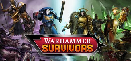
Become the embodiment of bullet hell in Warhammer Survivors, a fast-paced roguelite survivors game. Play as characters from the Warhammer 40,000 and Warhammer: Age of Sigmar universes, collect and evolve iconic weapons and destroy endless swarms of enemies.

ActionBullet HeavenRoguelike
Auroch Digital2026

Warhammer Survivors scores 72/100 — better than 44% of Steam capsules we've analysed (n=22,658).

Released 2026 · By Auroch Digital

Quick text summary

Warhammer Survivors scored 72/100 on Steam Analyzer — Good for a Steam capsule. Top priority fix: [genre_clarity] Add visible enemy swarms or projectile chaos in the background to immediately communicate the survivors/bullet-hell roguelite genre at tiny size.

Capsule scores by dimension

  • Genre Clarity: 6/10 — Heroes suggest action RPG broadly. The three armored warrior figures — a Space Marine in blue, a golden armored Stormcast Eternal, and a third figure — clearly communicate a Warhammer-flavored action game. However, the 'Survivors' subtitle is the primary genre indicator, and the composition reads more like a tactical RPG or action RPG than a bullet-hell roguelite survivors game. At tiny size, genre ambiguity remains high without the subtitle being legible.
  • Title Readability: 8/10 — Bold logo reads well at small. The 'Warhammer Survivors' title uses a strong red banner with white text on a dark-bordered shield shape, providing excellent contrast against the busy character art behind it. At small capsule size (231x87), the logo remains legible. At tiny size (120x45), 'SURVIVORS' may still be parsed due to its large bold letterforms, though 'Warhammer' becomes harder to confirm — the red badge treatment helps flag it as a branded title quickly.
  • Contrast & Color: 7/10 — Warm figures pop on dark background. The golden Stormcast Eternal in the center-right provides strong light-value contrast against the darker greenish background and the darker flanking figure. The deep teal-green toxic fog/background on the right separates well from the warm metallic tones of the characters. In grayscale, the central golden figure maintains clear silhouette separation, though the darker blue Space Marine on the left merges somewhat with the shadowy background at tiny size.
  • Uniqueness & Polish: 7/10 — Polished Warhammer branding, genre-generic pose. The art quality is high with well-rendered Warhammer miniature-inspired characters, giving a premium tabletop-to-digital feel that fans of the IP will recognize immediately. The red title banner treatment is clean and intentional. However, the three-heroes-standing-in-a-row composition is a very common capsule format in the genre, and nothing specific to the 'survivors' bullet-hell mechanic is visually communicated — it could easily be mistaken for a Warhammer tactics or RPG title.
  • Brand Consistency: 8/10 — Strong Warhammer IP identity signals. The Warhammer brand logo at the top left corner combined with the recognizable Space Marine and Stormcast Eternal character designs creates immediate IP recognition for the target audience. The color palette of gold, blue, and sickly green aligns well with Warhammer 40K and Age of Sigmar aesthetics. The overall presentation is internally cohesive — consistent lighting, similar rendering quality across all figures, and a signature banner title treatment that could be recognized across a store page.
  • Composition: 7/10 — Clear hierarchy with centered title badge. The three characters are spread across the full width with the golden figure as the dominant focal point due to value contrast, and the red title badge anchors the lower-center with strong visual weight. The Warhammer logo in the top-left corner is well placed and doesn't compete with the title. At small and tiny sizes, the title badge remains the primary anchor, though the three-character arrangement loses individual distinction and the composition flattens to a silhouette band — functional but not exceptional.

What works

  • Strong title badge contrast. The red shield banner with bold white 'SURVIVORS' text pops against the character art and reads clearly even at small capsule sizes.
  • Recognizable Warhammer IP figures. The Space Marine and Stormcast Eternal are immediately recognizable to the Warhammer fanbase, establishing brand identity within one glance.
  • Warm-versus-cool color palette. The warm gold and blue armor tones against the cool toxic-green background create natural contrast that helps the characters pop on Steam's dark #1b2838 background.
  • Warhammer logo placement. The top-left Warhammer logo is clean and unobtrusive, reinforcing IP credibility without cluttering the primary visual space.

What hurts the capsule

  • No survivors genre visual cues. Nothing in the image — no projectile swarms, no enemy hordes, no ability indicators — communicates the bullet-hell roguelite gameplay, making the genre ambiguous at tiny size.
  • Left figure merges with background. The darker blue Space Marine on the left lacks sufficient value contrast from the shadowy background, causing silhouette collapse at tiny size.
  • Static three-heroes pose is genre-generic. The standing-heroes arrangement is overused across action and RPG capsules, reducing distinctiveness compared to top-performing capsules in the genre.
  • Background detail is unreadable at tiny size. The green fog, rocks, and enemies in the background collapse into undifferentiated noise at 120x45, adding no genre or mood value at that scale.

Priority fixes

  1. [genre_clarity] Add visible enemy swarms or projectile chaos in the background to immediately communicate the survivors/bullet-hell roguelite genre at tiny size.
  2. [uniqueness_polish] Introduce dynamic poses or motion blur on the characters to convey fast-paced action and differentiate from tactical/RPG capsules in the same IP space.
  3. [contrast_color] Increase the left Space Marine's value separation from the background with a rim light or brighter ambient highlight to preserve the three-character read at small size.
  4. [composition] Tighten the character grouping slightly and add a subtle vignette or gradient to ensure the title badge region remains readable against varying background color intensity.

Store copy priority fixes

  1. [hook_strength] Rewrite opening to 'Survive endless waves of Warhammer's mightiest foes in this fast-paced roguelite—unleash iconic weapons, evolve devastating abilities, and unlock new champions from 40K and Age of Sigmar.' This leads with action verb and removes abstraction.
  2. [uniqueness] Add a sentence after the poncle partnership explaining a unique system: 'Evolve weapons into new forms through faction-specific upgrades' or 'Chain together character-specific weapon combos for screen-clearing effects' to differentiate from base Vampire Survivors formula.
  3. [feature_communication] Move the bullet-point feature list higher in the detailed description (after the second paragraph) so it lands before the campaign narrative, improving scannability for busy players.

Related guides

Steam app ID: 3669620