Scoring genre clarity...

Hollow Knight capsule

Hollow Knight

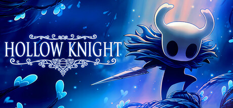
Forge your own path in Hollow Knight! An epic action adventure through a vast ruined kingdom of insects and heroes. Explore twisting caverns, battle tainted creatures and befriend bizarre bugs, all in a classic, hand-drawn 2D style.

$7.49Overwhelmingly Positive(4,503)
MetroidvaniaPlatformerSouls-like
Team CherryFeb 24, 2017

Hollow Knight scores 90/100 — better than 99% of Metroidvania capsules (n=370).

Overwhelmingly Positive (4,503 reviews) · $7.49 · Released Feb 24, 2017 · By Team Cherry

Quick text summary

Hollow Knight scored 90/100 on Steam Analyzer — Excellent for a Metroidvania capsule. Top priority fix: [genre_clarity] Add a subtle environmental platform or cavern ledge element in the lower foreground to hint at platformer exploration for audiences unfamiliar with the IP.

Capsule scores by dimension

  • Genre Clarity: 8/10 — Dark fantasy action adventure clear. The central silhouette of the Knight holding a nail sword immediately signals action-platformer or metroidvania territory, reinforced by the mysterious glowing underground cavern environment with floating blue particles. At tiny size the small dark figure with a weapon against a luminous teal background still communicates a dark fantasy action game, though the insect-kingdom subgenre specifics are lost. The atmospheric depth and creature-like foliage hints at exploration and adventure without mixed genre messaging.
  • Title Readability: 9/10 — High contrast serif title reads clearly. The title HOLLOW KNIGHT is set in clean, wide-spaced serif capitals in white against the darker left portion of the background, creating strong contrast and excellent legibility at full size. At small capsule size the letterforms remain distinct and readable with no crowding or collapse. At tiny size the title is still parseable due to the generous letter spacing, clean weight, and controlled background region behind the text, with only minor loss of the decorative ornament beneath it.
  • Contrast & Color: 9/10 — Strong light-dark separation against Steam dark. The luminous teal and blue gradient background pops sharply against Steam's #1b2838 dark UI, creating immediate visual separation on a browse page. The Knight's stark black silhouette reads cleanly against the bright backlit glow, and in grayscale the value contrast between the dark figure, mid-tone foliage, and bright light source behind remains strong and clear. The floating blue particles add depth without cluttering the silhouette separation, and the composition survives the squint test with the central focal subject still clearly defined.
  • Uniqueness & Polish: 9/10 — Distinctive hand-drawn style with iconic identity. The hand-drawn art style is immediately distinguishable from genre peers, with the expressive flowing cloak, luminous particle field, and soft painterly background forming a cohesive and premium aesthetic that avoids genre clichés. Compared to top-performing capsules in the same genre, Hollow Knight holds its own through a distinctive visual language rather than relying on photorealistic renders or generic fantasy tropes. The ornamental title treatment and the unique insect-bug-knight character design communicate a clear and memorable selling point without explaining anything verbally.
  • Brand Consistency: 10/10 — Iconic character and palette instantly recognizable. The Knight's minimalist black silhouette with horned helmet is one of the most recognizable protagonist designs in the indie space, functioning as a standalone brand mark that requires no supporting text to identify the property. The cool teal and deep blue palette with warm particle accents is consistent with the game's in-engine aesthetic, store screenshots, and promotional materials. The ornate serif logotype with filigree ornament reinforces a coherent gothic-whimsical identity that distinguishes the brand from any competitor in its genre.
  • Composition: 9/10 — Clear hierarchy with strong focal point placement. The Knight is positioned in the right-center third with the nail pointing diagonally inward, creating natural motion and drawing the eye from the title text on the left toward the character, establishing a clean left-to-right reading hierarchy. The bright backlit glow behind the character acts as a natural focal anchor even at tiny size, and the layered depth of background light, mid-ground foliage, and foreground figure creates a convincing sense of depth. Safe margins are respected and no critical elements crowd the edges, making this resilient to Steam's various crop ratios.

What works

  • Iconic silhouette legibility. The Knight's stark black silhouette against the backlit teal glow reads as a single clean shape even at 120x45 pixels, preserving brand recognition at every size.
  • Title placement on controlled background region. HOLLOW KNIGHT text sits over a deliberately darker left area, ensuring white letterforms never compete with busy texture or bright lighting.
  • Distinctive hand-drawn art style. The painterly, hand-crafted aesthetic sets the capsule apart from photorealistic or heavily processed genre peers and communicates the game's core visual identity immediately.
  • Strong value contrast against Steam dark UI. The luminous teal background creates immediate separation from Steam's #1b2838 dark shell, ensuring the capsule catches the eye during a fast scroll.

What hurts the capsule

  • Decorative ornament lost at tiny size. The filigree ornament beneath the title collapses into an unreadable smudge at 120x45, though this is a minor decorative element rather than a functional one.
  • Genre subtype requires prior knowledge. While action-adventure reads clearly, the metroidvania subgenre and insect-kingdom setting are not inferable at tiny size without existing familiarity with the IP.
  • Right-side cloak detail merges with background. The flowing dark cloak on the character's right edge has limited separation from the darker right corner of the image, slightly softening the silhouette in that region at small sizes.
  • No secondary genre cue for new audiences. A player unfamiliar with the game has no UI hint, environment element, or iconography that specifically signals platformer or exploration gameplay beyond general dark fantasy action.

Priority fixes

  1. [genre_clarity] Add a subtle environmental platform or cavern ledge element in the lower foreground to hint at platformer exploration for audiences unfamiliar with the IP.
  2. [contrast_color] Add a very slight darkened vignette or shadow rim to the right edge of the character's cloak to sharpen silhouette separation from the background corner.
  3. [title_readability] Consider increasing the ornament size beneath the title slightly so it retains a recognizable shape at small capsule size rather than dissolving entirely.
  4. [composition] Ensure the nail weapon tip does not risk cropping in any Steam-applied aspect ratio crop by nudging the character composition marginally leftward if needed.

Store copy priority fixes

  1. [uniqueness] Add a sentence or two that explicitly differentiates Hollow Knight from other Metroidvanias—e.g., 'The Dream Nail mechanic and charm customization system offer a depth of character exploration and playstyle flexibility rarely seen in the genre' or call out what makes the hand-drawn art and score particularly acclaimed.
  2. [genre_clarity] Strengthen the Souls-like tag by adding language around challenge and consequence, such as 'Master demanding boss fights and navigate punishing obstacles' or reference stamina/positioning strategy to align the copy with player expectations for difficulty-focused action.
  3. [feature_communication] Expand the description of the Dream Nail to clarify its unique gameplay value—currently it is mentioned without context; specify that it unlocks hidden story content or mechanical advantages so players understand why it matters.

Related guides

Steam app ID: 367520 · Tags: Metroidvania, Platformer, Souls-like, Difficult, Great Soundtrack