Scoring genre clarity...
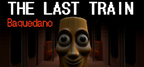
In this short first-person psychological horror game, falling asleep on the subway takes you to the final station, abandoned and eerie. Explore the area and try to survive the entity chasing you in the darkness. Who is it? Its face looks strangely familiar...
$7.99Very Positive(12)
HorrorSingleplayerDark
Matías AvilésMay 14, 2025