Scoring genre clarity...

Evershade The Forgotten Mansion capsule

Evershade The Forgotten Mansion

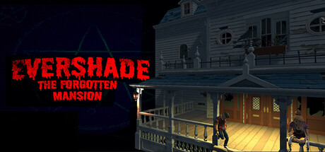
Explore a cursed mansion in this first-person horror adventure. Play as Valeria, a young woman searching for her missing boyfriend while being hunted by a relentless ghost. Solve puzzles, survive supernatural threats, and uncover the dark secrets hidden within

$4.99No user reviews
HorrorSurvival HorrorSurvival
Velthera studiosMay 27, 2025

Evershade The Forgotten Mansion scores 70/100 — better than 36% of Horror capsules (n=3,118).

No user reviews · $4.99 · Released May 27, 2025 · By Velthera studios

Quick text summary

Evershade The Forgotten Mansion scored 70/100 on Steam Analyzer — Good for a Horror capsule. Top priority fix: [uniqueness_polish] Introduce a distinctive visual element—either a recognizable spectral threat in the background, a signature protagonist detail, or a UI/mechanical hint—to differentiate from generic haunted house aesthetics.

Capsule scores by dimension

  • Genre Clarity: 7/10 — Horror mansion exploration clear. The capsule immediately signals first-person horror through the abandoned mansion interior with warm interior lighting contrasting against dark exterior, a lone figure on a lit balcony, and the haunted house architectural silhouette. At TINY size the mansion structure and figure are recognizable, though the specific 'ghost hunting' mechanic is not visually explicit. Genre messaging is strong enough for horror/adventure clarity even at thumbnail scale.
  • Title Readability: 8/10 — Bold red title excellent contrast. EVERSHADE is rendered in large, distressed red lettering with crisp edges against the dark left third of the image, ensuring complete legibility at all sizes down to TINY. Subtitle 'THE FORGOTTEN MANSION' is smaller but still readable at SMALL size; at TINY it begins to blur but the primary title remains crystal clear. Strategic left-side placement on solid dark background maximizes retention across all viewing contexts.
  • Contrast & Color: 8/10 — Strong warm-cool value separation. The bold red title pops decisively against the dark navy-black background, while the warm golden interior lighting in the mansion creates sharp value separation from the cool exterior shadows and night sky. In grayscale mental test, the red title converts to a mid-light gray that stands apart, and the lit mansion interior clearly separates from darkened surroundings. The overall composition maintains strong silhouette clarity even when squinting.
  • Uniqueness & Polish: 6/10 — Competent horror setup, generic execution. The capsule delivers a functional haunted house scene with appropriate lighting and atmosphere, but the scene itself—a lone figure in a mansion interior—is a familiar trope in horror indie games and lacks a distinctive visual hook or memorable detail that separates it from similar titles. The distressed font effect on the title is stylistically consistent with horror branding but not particularly innovative. Execution is clean and professional, placing it at baseline competency without clear differentiation.
  • Brand Consistency: 6/10 — Dark horror palette, limited identity. The capsule uses a cohesive dark palette with warm interior lighting that would likely carry through other marketing materials, establishing basic visual consistency. However, there are no iconic character designs, signature symbols, or memorable motifs visible that would create strong brand recall; the protagonist is a generic silhouette against architectural backdrop. The distressed red title font is the strongest identity cue, but insufficient alone to create distinctive brand personality.
  • Composition: 7/10 — Clear focal hierarchy, solid layout. The composition splits into two zones: the bold title on the left anchors viewer attention immediately, while the mansion interior on the right provides supporting context and visual interest. The lone figure on the lit balcony serves as a secondary focal point that draws the eye into the scene depth. At SMALL and TINY sizes, the title dominates while the mansion reads as cohesive background; no critical elements are dangerously close to crop edges, though the right edge of the mansion is somewhat tight.

What works

  • High-contrast bold title treatment. Red letterforms are large and distressed, providing immediate readability at TINY size with strong separation from the dark background.
  • Clear genre signaling through environment. The abandoned mansion interior with atmospheric lighting and isolated figure immediately communicates first-person horror exploration without ambiguity.
  • Effective value separation in composition. Warm interior lights contrast sharply against cool dark exteriors, maintaining silhouette clarity even in grayscale and at reduced viewing sizes.

What hurts the capsule

  • Generic haunted house visual trope. The lone figure in a mansion is a familiar horror cliché with no distinctive visual hook or mechanical hint that differentiates this title from similar indie horror games.
  • Weak brand identity and recognition. Beyond the title font, there are no iconic visual elements, character designs, or signature motifs that would be recognizable across marketing materials or community discussion.
  • Limited storytelling in composition. The scene does not visually communicate the specific selling point (searching for boyfriend, relentless ghost threat) and reads as a generic atmosphere shot rather than gameplay premise.

Priority fixes

  1. [uniqueness_polish] Introduce a distinctive visual element—either a recognizable spectral threat in the background, a signature protagonist detail, or a UI/mechanical hint—to differentiate from generic haunted house aesthetics.
  2. [brand_consistency] Add a recurring visual motif (icon, symbol, or character design) that could serve as an iconic brand identifier across future marketing and community recognition.
  3. [composition] Consider repositioning or emphasizing the protagonist figure or adding subtle supernatural detail (ethereal effect, ghostly silhouette) to communicate the specific ghost-hunting threat rather than generic exploration.

Store copy priority fixes

  1. [hook_strength] Rewrite the short description opening to lead with Valeria's personal stakes: 'Your boyfriend has vanished into Evershade Mansion. Now something cursed is hunting you. Can you survive long enough to find him?' instead of starting with the setting.
  2. [feature_communication] Expand the detailed description by 150+ words and specifically explain what 'performing a ritual' entails—e.g., 'Gather ritual components, solve environmental puzzles, and perform ceremonies to weaken the entity'—so players can visualize gameplay.
  3. [audience_targeting] Add a single sentence clarifying difficulty and accessibility: 'Designed for horror fans who enjoy puzzle-solving over reflex-based combat' or 'Casual-friendly horror with adjustable difficulty' to resolve the Casual vs. Realistic tag conflict.
  4. [uniqueness] Articulate what differentiates Evershade: e.g., 'The five-ritual structure lets you tackle exorcism challenges in any order' or 'Procedurally-altered mansion layouts ensure no two playthroughs are identical' to set it apart from generic haunted house games.

Related guides

Steam app ID: 3679540 · Tags: Horror, Survival Horror, Survival, Thriller, Supernatural