Scoring genre clarity...

Livber: Smoke and Mirrors capsule

Livber: Smoke and Mirrors

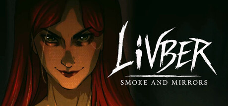
A short psychological horror interactive story. Five years after vanishing without a trace, the woman you once called your lover writes from beyond the silence: "I will give birth to our creation.” In three acts, descend into a fractured mindscape where obsession, memory, and myth intertwine.

$4.99Positive(34)
Visual NovelPsychological HorrorStory Rich
InEv GamesOct 28, 2025

Livber: Smoke and Mirrors scores 75/100 — better than 68% of Steam capsules we've analysed (n=22,658).

Positive (34 reviews) · $4.99 · Released Oct 28, 2025 · By InEv Games

Quick text summary

Livber: Smoke and Mirrors scored 75/100 on Steam Analyzer — Good for a Steam capsule. Top priority fix: [title_readability] Increase the size and contrast of the 'SMOKE AND MIRRORS' subtitle so it remains legible at 231x87, or integrate it into the logotype treatment more boldly.

Capsule scores by dimension

  • Genre Clarity: 7/10 — Dark psychological horror implied. The close-up of a red-haired woman with a sinister smirk and heavy shadow immediately signals psychological horror or dark narrative fiction. The subtitle 'Smoke and Mirrors' and the unsettling facial expression reinforce mystery and psychological themes. At tiny size the face still reads as menacing and horror-adjacent, though 'adventure' specifically is harder to infer without genre familiarity.
  • Title Readability: 7/10 — Title readable, subtitle strains small. The 'LIVBER' logotype uses a scratchy, hand-rendered style with good size hierarchy against the dark background, and reads clearly at full and small sizes. The subtitle 'SMOKE AND MIRRORS' is smaller and lighter, becoming difficult to parse at tiny size. At approximately 120x45, only 'LIVBER' survives legibly.
  • Contrast & Color: 8/10 — Strong dark contrast, face pops. The composition leans heavily into dark tones with the deep shadow background separating cleanly from the subject's pale skin and vivid red hair, both of which create strong contrast against the Steam dark UI (#1b2838). In grayscale the face reads well due to value separation between highlights and shadows. The red hair acts as a saturated accent that draws the eye immediately even in quick scroll.
  • Uniqueness & Polish: 8/10 — Distinctive illustrated style, strong craft. The stylized 2D illustrated portrait with thick ink-like outlines and a graphic novel aesthetic sets it apart from photorealistic or pixel art competitors in the horror adventure space. The smirking face with curtain-like red hair framing feels intentional and memorable, evoking visual storytelling rather than generic genre signaling. Compared to benchmarks like Slay the Princess, it holds its own with a distinctive identity.
  • Brand Consistency: 8/10 — Cohesive dark illustrated identity. The hand-drawn ink aesthetic, limited desaturated palette punctuated by deep red, and dramatic shadow work feel internally cohesive. The scratchy logotype matches the illustration style tonally. The central character creates a recognizable iconic anchor that could serve as a consistent brand identity across store assets.
  • Composition: 7/10 — Clear focal point, title placement works. The face occupies the left-center with the title sitting comfortably in the upper-right quadrant, creating a balanced two-element hierarchy. The red hair frames the top of the composition naturally, drawing the eye downward to the face. At small size the composition simplifies effectively to face plus title, though the subtitle sits close to the bottom edge and risks being cropped or ignored.

What works

  • Striking character anchor. The sinister smirking face with vivid red hair creates an immediately memorable focal point that reads clearly even at tiny thumbnail size.
  • High contrast dark palette. The deep shadow tones combined with pale skin highlights and saturated red hair pop strongly against Steam's dark #1b2838 interface background.
  • Distinctive illustration style. The ink-outlined graphic novel aesthetic differentiates the capsule from generic horror capsules and signals a premium, authored visual identity.
  • Legible main title at small size. The 'LIVBER' logotype retains enough weight and contrast to be readable at 231x87 without requiring zoom.

What hurts the capsule

  • Subtitle disappears at tiny size. 'SMOKE AND MIRRORS' is too small and low-contrast to survive at 120x45, losing an important tonal and branding signal.
  • Genre ambiguity at micro size. At tiny size the image reads as horror but does not clearly communicate interactive story or adventure, which may cause misaligned expectations.
  • Composition slightly face-heavy left. The face placement leaves a noticeable empty dark void in the lower-left corner which adds little compositional value.
  • Scratchy font legibility risk. The decorative scratchy logotype style, while on-brand, has thin irregular strokes that could collapse in heavily compressed or blurry thumbnails.

Priority fixes

  1. [title_readability] Increase the size and contrast of the 'SMOKE AND MIRRORS' subtitle so it remains legible at 231x87, or integrate it into the logotype treatment more boldly.
  2. [genre_clarity] Add a subtle environmental or symbolic element — such as a fractured mirror shard, ghostly silhouette, or environmental texture — to better communicate the psychological interactive story context at small sizes.
  3. [composition] Fill or use the lower-left dark void with a subtle background texture, fog layer, or faint symbolic motif to eliminate the dead space and add depth.
  4. [title_readability] Add a thin light outline or stronger drop shadow to the 'LIVBER' letterforms to ensure they survive aggressive JPEG compression at tiny sizes.

Store copy priority fixes

  1. [feature_communication] Replace vague feature language with concrete mechanics: instead of "dynamic narrative that twists," specify how many distinct endings exist, whether choices lock permanently, or if players can branch back. Replace the whimsical cat feature with a genuine system detail.
  2. [uniqueness] Add a paragraph after the ABOUT section explaining what makes this game's branching or choice system distinct—e.g., 'Unlike traditional branching narratives, every silence is as consequential as every question,' or specify how many unique story paths exist and why the choice system matters to this specific story of obsession.
  3. [feature_communication] Remove or relocate the Roadmap heading if empty, or populate it with genuine planned updates to avoid the appearance of incomplete copy.
  4. [audience_targeting] Add a single sentence early in the detailed description explicitly naming the audience: 'If you loved [comparative title] and crave a deeper dive into psychological horror without cheap scares, this is for you,' to anchor expectations.

Related guides

Steam app ID: 3700580