Scoring genre clarity...

IT Witch Case capsule

IT Witch Case

Are you ready to climb the corporate ladder, or will you fall into the abyss of madness?

Free to Play5 user reviews
RPGInteractive FictionRetro
Thorsten KoernerApr 13, 2026

IT Witch Case scores 72/100 — better than 49% of RPG capsules (n=3,544).

5 user reviews · Free to Play · Released Apr 13, 2026 · By Thorsten Koerner

Quick text summary

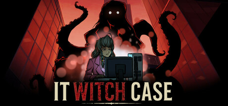
IT Witch Case scored 72/100 on Steam Analyzer — Good for a RPG capsule. Top priority fix: [genre_clarity] Introduce visual elements that hint at corporate/management gameplay such as office architecture, desk details, or UI elements integrated with the horror aesthetic to align visuals with core gameplay.

Capsule scores by dimension

  • Genre Clarity: 7/10 — Dark fantasy with eldritch horror elements. The silhouetted tentacled creature, purple-clad character, and ominous red atmosphere clearly communicate dark fantasy or horror-adjacent gameplay. At TINY size, the tentacle motif and red glow still register as menacing and supernatural, though the specific RPG/management gameplay is not visually implied. The visual language strongly suggests supernatural dread rather than corporate gameplay, creating slight genre mismatch with the description.
  • Title Readability: 8/10 — Clear title with strong contrast. The title 'IT WITCH CASE' uses white and red lettering on a dark background, with 'WITCH' in bold red providing a visual anchor and color break. At SMALL size (231x87), the title remains fully legible with good letter spacing. At TINY size (120x45), the text compresses but the strong value contrast and bold red accent keep it readable without collapsing.
  • Contrast & Color: 8/10 — Strong red glow with clear silhouettes. The dominant red gradient against the Steam dark background (#1b2838) creates excellent value separation, with glowing atmospheric effects enhancing visibility. The black tentacle silhouette reads cleanly at all sizes, and the purple-clothed character in the center maintains clear definition. In grayscale, the bright red areas convert to strong mid-to-light values that separate well from the dark background.
  • Uniqueness & Polish: 7/10 — Polished horror aesthetic with cohesive mood. The execution is clean with professional lighting, particle effects, and atmospheric compositing that feels intentional rather than generic. The tentacled creature is a distinctive visual hook, and the color grading creates a memorable unsettling mood. However, the design relies on familiar dark fantasy tropes without communicating what makes this specific game's narrative or mechanics unique—the corporate ladder gameplay angle is entirely absent from the visual messaging.
  • Brand Consistency: 6/10 — Atmospheric but identity signals unclear. The red-tinted horror aesthetic is internally consistent throughout the capsule with coherent lighting and color treatment. However, there are no readable memorable brand motifs, character identifying features, or signature style elements that would allow recognition across marketing materials without the title. The visual identity is atmospheric but generic within the dark fantasy horror space.
  • Composition: 7/10 — Clear focal point with balanced layering. The composition uses strong depth layering: red geometric background, mid-ground tentacles and glow, and foreground character silhouette creating clear hierarchy. The title placement at bottom-center is protected from edge cropping and remains readable at all sizes. At TINY size, the tentacle mass and red glow still create a cohesive focal area, though compositional subtlety is lost to compression.

What works

  • Title legibility across sizes. White and red title text maintains clarity from FULL down to TINY size with strategic contrast and bold lettering on controlled background.
  • Strong atmospheric polish. Professional lighting, particle effects, and color grading create a cohesive unsettling mood that feels premium and intentional rather than templated.
  • Effective silhouette design. The tentacled creature and character silhouettes read cleanly against the red glow at all sizes due to strong value separation.

What hurts the capsule

  • Genre-gameplay mismatch. Visual messaging of supernatural horror does not communicate the corporate ladder/RPG mechanics described, creating potential audience misalignment.
  • Limited brand identity signals. No distinctive character features, motifs, or visual signatures that would create memorable brand recognition across multiple touchpoints.
  • Generic dark fantasy visual language. While well-executed, the tentacle horror and red atmosphere rely on familiar tropes without a unique visual hook that differentiates this game from similar titles.

Priority fixes

  1. [genre_clarity] Introduce visual elements that hint at corporate/management gameplay such as office architecture, desk details, or UI elements integrated with the horror aesthetic to align visuals with core gameplay.
  2. [uniqueness_polish] Add a distinctive character design element, iconic symbol, or signature visual motif that signals this game's unique identity and differentiates it from generic dark fantasy titles.
  3. [brand_consistency] Develop and apply a recognizable character or mascot design that appears consistently across marketing materials to build brand recall beyond the title text.

Store copy priority fixes

  1. [hook_strength] Rewrite the short description to lead with the supernatural twist: 'Survive 20 days at an IT company possessed by Lovecraftian horrors. Dark comedy meets cosmic dread in this retro RPG.' This immediately signals the unique blend.
  2. [audience_targeting] Add a sentence after the core premise identifying the audience explicitly: 'For fans of Disco Elysium's narrative depth, The X-Files conspiracy, and 90s isometric RPGs—with dark humor throughout.'
  3. [feature_communication] Include one sentence briefly explaining the sanity or progression mechanic: 'Your choices and daily decisions affect your character's stability and alignment, unlocking different paths to uncover the truth.'

Related guides

Steam app ID: 3700600 · Tags: RPG, Interactive Fiction, Retro, Dark Humor, CRPG