Scoring genre clarity...

Tezzel: The Tilemaker's Tale capsule

Tezzel: The Tilemaker's Tale

Tezzel is a cozy, colorful, and crafty puzzle game where every level completed becomes a colorful tile that gets added to the mosaic Wall. Discover mind-bending mechanics across 100 handcrafted levels.

$8.99Positive(11)
SokobanDifficultCozy
Old Mayor StudiosApr 10, 2026

Tezzel: The Tilemaker's Tale scores 77/100 — better than 80% of Sokoban capsules (n=194).

Positive (11 reviews) · $8.99 · Released Apr 10, 2026 · By Old Mayor Studios

Quick text summary

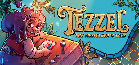
Tezzel: The Tilemaker's Tale scored 77/100 on Steam Analyzer — Good for a Sokoban capsule. Top priority fix: [title_readability] Increase subtitle size or simplify tagline to maintain dual-text readability at TINY thumbnail scale without sacrificing the core 'TEZZEL' prominence.

Capsule scores by dimension

  • Genre Clarity: 7/10 — Casual puzzle with colorful charm. The vibrant illustration of a character crafting at a workspace with puzzle-like elements and bright, playful art style immediately signals a cozy indie puzzle game. At TINY size, the warm color palette and craft-focused imagery remain legible, though the specific puzzle mechanic is not immediately obvious from visuals alone. The aesthetic aligns well with casual strategy games like Balatro and Moonstone Island.
  • Title Readability: 8/10 — Bold golden serif dominates clearly. The title 'TEZZEL' uses large, ornate golden serif letterforms with strong contrast against the teal background, maintaining readability at SMALL and TINY sizes. The subtitle 'THE TILEMAKER'S TALE' is smaller but still legible at normal size, though at TINY it becomes challenging. The decorative swirl framing the title adds charm without compromising the core word recognition.
  • Contrast & Color: 8/10 — Warm-cool separation with strong silhouettes. The warm orange-red character and workbench against cool teal background create excellent value separation that pops against Steam's dark background. The golden title text has high luminosity contrast. In grayscale test, the character silhouette and text remain clearly distinguishable, and the composition holds cohesion at SMALL and TINY scales without muddy mid-tones.
  • Uniqueness & Polish: 8/10 — Distinctive art style with craft narrative. The hand-drawn illustration style with careful character expression, detailed workbench elements, and intentional color harmony convey a premium indie sensibility rather than generic asset assembly. The visual storytelling—a character actively crafting—communicates the core mechanic (tilemaking) effectively. Compared to the reference list, this matches the polish level of Snufkin and Little Kitty, Big City with its distinctive illustrative charm.
  • Brand Consistency: 7/10 — Warm illustration palette well-established. The warm coral-orange character color, teal environment, golden ornate typography, and illustrative craft-focused aesthetic create a cohesive internal identity that suggests recognizable branding across store assets. The character's cheerful expression and workspace setting are memorable identity cues. Without access to other store screenshots, internal consistency appears strong, though the ornate serif treatment may vary in application across different marketing materials.
  • Composition: 8/10 — Character-left, title-right, balanced depth. The composition places the character firmly on the left with clear workbench detail, allowing the title and decorative flourish to anchor the right side without competing for attention. Foreground character, mid-ground workspace, and background foliage create layered depth. The layout remains robust at SMALL and TINY sizes with safe margins; the character and title are both legible without edge-hugging concerns or wasted space.

What works

  • Golden title contrast and legibility. Large ornate serif 'TEZZEL' maintains strong readability across all sizes with excellent contrast against the teal background.
  • Warm-cool color harmony. Orange-red character and golden text pop against cool teal and dark Steam background, creating memorable visual appeal.
  • Clear visual narrative of crafting. The character at a workbench communicates the tilemaking mechanic immediately, aligning perfectly with game premise.
  • Premium illustrative polish. Hand-drawn character expression, detailed accessories, and intentional rendering demonstrate indie quality comparable to top-tier casual games.

What hurts the capsule

  • Subtitle readability at TINY size. 'THE TILEMAKER'S TALE' becomes difficult to parse at thumbnail scale, reducing full narrative clarity.
  • Limited genre iconography specificity. While the craft theme is clear, puzzle-game-specific visual cues (tiles, grid, mosaic hints) are subtle and may not immediately signal the puzzle mechanic at glance.

Priority fixes

  1. [title_readability] Increase subtitle size or simplify tagline to maintain dual-text readability at TINY thumbnail scale without sacrificing the core 'TEZZEL' prominence.
  2. [genre_clarity] Consider adding subtle tile, grid, or mosaic visual element in the corner to reinforce the puzzle-specific mechanic at small sizes.

Store copy priority fixes

  1. [audience_targeting] Add a sentence clarifying the intended difficulty curve and who should start: e.g., 'Perfect for puzzle enthusiasts seeking elegant brain-teasers, or casual players who prefer to solve at their own pace with no timer pressure.'
  2. [feature_communication] Expand the tool unlock mechanic with a concrete example: e.g., 'Unlock tools like the Mirror and Blocker as you progress, each introducing new puzzle rules that layer into increasingly complex challenges.'
  3. [uniqueness] Emphasize how the nonlinear wall structure creates emergent choice: e.g., 'Choose which tiles to complete first—tackle the wall left-to-right or jump between sections as you unlock new tools.'

Related guides

Steam app ID: 3703730 · Tags: Sokoban, Difficult, Cozy, Relaxing, Colorful