Scoring genre clarity...

Mind the Clown capsule

Mind the Clown

Move carefully and hide from the demonic clown stalking you. Burn circus posters to break the curse and save your life.

$3.99Positive(20)
HorrorSingleplayerFirst-Person
Juan Pablo CardosoSep 19, 2025

Mind the Clown scores 72/100 — better than 51% of Horror capsules (n=3,119).

Positive (20 reviews) · $3.99 · Released Sep 19, 2025 · By Juan Pablo Cardoso

Quick text summary

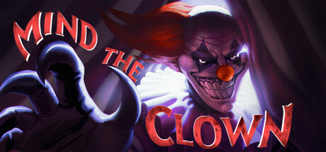
Mind the Clown scored 72/100 on Steam Analyzer — Good for a Horror capsule. Top priority fix: [composition] Consolidate the title into a single unified line or grouped arrangement below or above the clown rather than split across both sides to improve reading hierarchy.

Capsule scores by dimension

  • Genre Clarity: 8/10 — Horror antagonist clearly reads. The demonic clown with glowing red eyes, menacing expression, and sinister hand gesture immediately signals horror/survival gameplay. At tiny size, the silhouette of the clown face and glowing features remain recognizable, though the specific genre nuance (stealth-survival rather than action combat) is less obvious without context.
  • Title Readability: 7/10 — Bold text legible at small sizes. The title 'MIND THE CLOWN' uses thick, high-contrast red/orange lettering with white outlines that stands out against the dark background. At tiny size the text remains readable though individual letterforms lose sharpness; the phrase is short enough to parse quickly even at 120x45 resolution.
  • Contrast & Color: 8/10 — Strong neon glow separation. The capsule uses vibrant red-orange and electric blue neon effects that create sharp value separation against the dark purple-black background. The glowing elements around the clown's hands and eyes maintain silhouette clarity even in grayscale due to bright highlights, though the clown's dark purple face could blend slightly more at tiny sizes.
  • Uniqueness & Polish: 7/10 — Polished horror aesthetic effective. The neon-lit demonic clown design with glowing effects feels intentional and cohesive rather than generic; the art direction clearly targets the horror subgenre with professional lighting and glow work. However, the concept of a menacing clown character is a familiar trope in horror media, limiting the sense of originality despite solid execution.
  • Brand Consistency: 6/10 — Recognizable clown but limited motifs. The distinctive demonic clown character with red/orange coloring and neon glow could serve as a recognizable brand element across marketing materials. However, without reviewing additional store assets, the internal color palette (dark purples, neon reds, electric blues) is coherent but doesn't reveal a signature symbolic motif beyond the clown itself.
  • Composition: 7/10 — Clear focal point with good balance. The clown's face and menacing hands occupy the center-right area as the primary focal point, with the title 'MIND THE CLOWN' split across the left and right sides to frame the character. At small and tiny sizes the composition remains readable with no critical elements cut off; however, the title text split across both sides could benefit from tighter centering to reduce visual fragmentation.

What works

  • Immediate horror recognition. The demonic clown with glowing red eyes and sinister expression communicates genre intent instantly even at tiny thumbnail size.
  • High contrast neon effects. Electric blue and red-orange glow creates strong silhouette separation against the dark background that survives squinting and grayscale tests.
  • Legible title treatment. The thick red outlined lettering with white stroke remains readable at all sizes without collapsing into illegibility.

What hurts the capsule

  • Title layout fragmentation. Splitting 'MIND THE' and 'CLOWN' across left and right sides of the clown's head creates visual fragmentation that doesn't optimize left-to-right reading flow.
  • Limited originality in concept. The menacing clown archetype is a well-worn horror trope without a distinctive hook that sets this game apart visually from other horror titles.
  • Clown face color blending. The dark purple face silhouette has reduced value separation from the deep purple background, particularly noticeable at tiny sizes where the face edges soften.

Priority fixes

  1. [composition] Consolidate the title into a single unified line or grouped arrangement below or above the clown rather than split across both sides to improve reading hierarchy.
  2. [contrast_color] Increase the clown's face highlight or add a rim light to push the silhouette away from the purple background, especially for tiny thumbnail legibility.
  3. [uniqueness_polish] Consider adding a subtle visual signature element like a distinctive circus prop, symbol, or environmental detail that hints at the 'burning posters' mechanic to differentiate from generic clown horror.

Store copy priority fixes

  1. [uniqueness] Add a concrete example of how the circus setting or story twist differentiates this from other clown-killer or haunted-space horror games—e.g., 'Your dying memories warp the circus rules,' or similar mechanic-story fusion.
  2. [feature_communication] Rewrite 'Ever-present killer clown that can hear you' to explain one or two concrete AI behaviors or threat dynamics that create tension—e.g., 'A clown that hunts by sound; crouch-walk in silence or hide in lockers to survive.'
  3. [audience_targeting] Explicitly mention accessibility in the main copy—e.g., 'Adjustable difficulty and no-timed-input option make this stealth horror accessible to players of all skill levels,' to signal inclusivity.
  4. [hook_strength] Strengthen the short description by replacing 'demonic clown' with a specific threat behavior or atmosphere—e.g., 'Survive a circus where a clown hunts by sound alone' to create tension rather than relying on genre tropes.

Related guides

Steam app ID: 3709810 · Tags: Horror, Singleplayer, First-Person, Survival Horror, Dark