Scoring genre clarity...
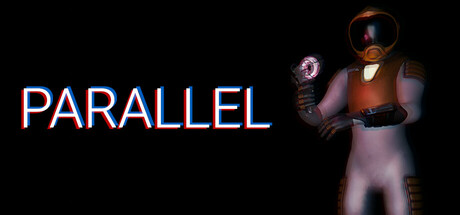
Parallel capsule

Parallel

Parallel is a stealth-based survival horror sci-fi game where you must unravel the mysteries of what happened on a local space station. Can discover the experiments that took place here and live to tell the tale?

Free to PlayMostly Positive(16)
HorrorStealthAdventure
Doppler StudiosJun 1, 2025

Parallel scores 68/100 — better than 23% of Horror capsules (n=3,118).

Mostly Positive (16 reviews) · Free to Play · Released Jun 1, 2025 · By Doppler Studios

Quick text summary

Parallel scored 68/100 on Steam Analyzer — Solid for a Horror capsule. Top priority fix: [uniqueness_polish] Add a distinctive visual hook such as a unique prop, environmental clue, or character-defining detail that signals Parallel's survival-horror identity rather than generic space suit imagery.

Capsule scores by dimension

  • Genre Clarity: 7/10 — Sci-fi horror setup reads clearly. The armored figure with a glowing orb and dark space station aesthetic immediately communicate sci-fi survival horror. At SMALL size the silhouette and lighting effects remain legible, though the specific stealth mechanic isn't visually obvious. At TINY size the figure shape and orange/purple lighting still suggest sci-fi threat, though detail fades into abstraction.
  • Title Readability: 8/10 — Bold title with strong contrast. PARALLEL is rendered in large, bright blue outline text with white/cyan fill positioned firmly on the dark left side, ensuring clean separation from the character. The letterforms maintain clarity at SMALL size with the outline supporting legibility. At TINY size the title remains readable as a distinct white-blue block against black, though individual letters merge slightly.
  • Contrast & Color: 8/10 — Strong value separation, warm lighting. The bright orange-brown armor and purple-pink character glow create distinct warm tones that pop against the pure black background, with clear silhouette separation. The blue title outline amplifies contrast further. At TINY size the warm figure and cool blue text remain visually separated, though the background character detail softens into silhouette.
  • Uniqueness & Polish: 6/10 — Competent sci-fi aesthetic, generic execution. The armored astronaut with glowing orb is a recognizable sci-fi survival trope but lacks a distinctive visual hook or memorable character identity that separates it from other space horror entries. The lighting and render quality are solid, but the composition feels like a standard power pose without narrative or mechanical differentiation. No unique selling point jumps out at SMALL or TINY sizes beyond generic space suit aesthetics.
  • Brand Consistency: 5/10 — Limited identity, generic space sci-fi. The capsule presents no clear character, motif, or signature palette specific to Parallel's identity. While the orange-purple lighting is cohesive internally, this color pairing is common in sci-fi marketing and does not create a memorable or recognizable brand signature. Without reference to the 5 store screenshots, this could represent any number of space horror games, offering no iconic recall advantage.
  • Composition: 7/10 — Clear focal point, balanced layout. The title anchors the left side while the character figure dominates the right, creating diagonal balance and a clear focal point hierarchy. The character position leaves breathing room and avoids edge-hugging crop issues. At SMALL size the layout reads well with title and figure separated; at TINY size the composition remains legible though the character detail collapses into a glowing mass.

What works

  • Clear title placement and contrast. Blue outlined PARALLEL text on black background provides excellent readability across all sizes without competing with the figure.
  • Strong silhouette and lighting design. Warm orange-purple illumination creates immediate visual pop and reads as sci-fi threat even at tiny thumbnail scale.
  • Balanced compositional layout. Left-anchored title and right-positioned character create effective diagonal hierarchy without wasting prime real estate.

What hurts the capsule

  • Generic character and pose. The armored astronaut in standard power stance lacks distinctive personality or visual storytelling that differentiates from other space horror titles.
  • No memorable brand identity. The capsule conveys sci-fi survival but offers no recognizable motif, character trait, or signature visual element tied to Parallel's unique narrative.
  • Stealth mechanic not visually communicated. Despite stealth being core gameplay, the image shows no visual cues—shadows, concealment, or lurking threat—that hint at the stealth-survival core.

Priority fixes

  1. [uniqueness_polish] Add a distinctive visual hook such as a unique prop, environmental clue, or character-defining detail that signals Parallel's survival-horror identity rather than generic space suit imagery.
  2. [brand_consistency] Introduce a signature color accent or motif (e.g., a glowing element, visual effect, or design detail) tied to the space station experiments theme that could become iconic across marketing materials.
  3. [genre_clarity] Layer in stealth-specific visual language such as shadow play, a lurking creature silhouette, or environmental threat to communicate the stealth survival core beyond sci-fi surface.

Store copy priority fixes

  1. [hook_strength] Rewrite the short description to lead with the reality-phasing mechanic and immediate threat: 'Phase through walls, evade twisted experiments, uncover corporate secrets aboard an abandoned space station—and survive.' This is more active and compels immediate interest.
  2. [audience_targeting] Add one sentence clarifying the intended player: 'For fans of slow-burn stealth horror and puzzle-solving over action' or 'For narrative-driven horror explorers seeking atmospheric dread' to signal clearly who this is designed for.
  3. [feature_communication] Restructure the GAMEPLAY section with a bulleted list of core verbs: Explore → Phase through obstacles → Evade monsters → Craft distractions. This improves scanability and mental model formation.
  4. [uniqueness] In the opening of the GAMEPLAY section, emphasize what makes the phasing mechanic special: 'Unlike traditional stealth games, you can literally phase through solid matter—redefining how you approach each encounter' rather than treating it as one of many tools.

Related guides

Steam app ID: 3714700 · Tags: Horror, Stealth, Adventure, Space, Survival Horror