Scoring genre clarity...

Test of Fear | 肝試しの夜に capsule

Test of Fear | 肝試しの夜に

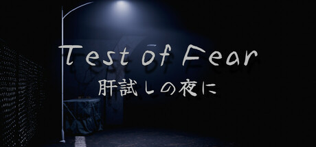
The game is a test of courage for players who have come to a secluded shrine in the mountains to explore and try to escape from this unusual place. There are numerous horror gimmick elements to torment the player.

$1.99Mixed(27)
Psychological HorrorHorrorWalking Simulator
Knows Way StudioJun 20, 2025

Test of Fear | 肝試しの夜に scores 75/100 — better than 79% of Psychological Horror capsules (n=2,166).

Mixed (27 reviews) · $1.99 · Released Jun 20, 2025 · By Knows Way Studio

Quick text summary

Test of Fear | 肝試しの夜に scored 75/100 on Steam Analyzer — Good for a Psychological Horror capsule. Top priority fix: [genre_clarity] Add a subtle visual indicator of the escape or survival mechanic—consider a faint exit doorway or character silhouette in the mid-ground to signal the exploration-based loop.

Capsule scores by dimension

  • Genre Clarity: 8/10 — Strong horror atmosphere, clear intent. The nighttime shrine setting, eerie blue-tinted lighting, and ominous lamp silhouette immediately signal Japanese horror and supernatural dread. The composition evokes exploration-based horror with environmental storytelling. At tiny size, the dark moody aesthetic and architectural framing still communicate 'horror game' effectively, though the specific 'test of courage' mechanic is not visually explicit.
  • Title Readability: 7/10 — Readable title with minor size concerns. The English title 'Test of Fear' is clearly legible at full and small sizes with a clean sans-serif font and strong contrast against the dark background. The Japanese subtitle '肝試しの夜に' is readable but small enough that it blurs slightly at tiny size. At tiny size the English title holds but the full visual hierarchy becomes compressed.
  • Contrast & Color: 8/10 — Excellent dark value separation. The cool blue moonlit palette with pale white text creates strong luminosity contrast against the #1b2838 Steam background. The lamp glow and shrine architecture have clear silhouette definition even at small sizes. Grayscale simulation shows strong tonal separation between foreground elements and shadow, supporting quick visual parsing.
  • Uniqueness & Polish: 7/10 — Atmospheric but somewhat familiar approach. The moody shrine-at-night visual is well-executed and cohesive, but it leans heavily on established Japanese horror aesthetics without a standout mechanical or narrative hook visible in the capsule alone. The lighting and composition are polished, yet the design feels like a solid execution of a familiar mood rather than a distinctive visual identity that sets it apart from other horror games.
  • Brand Consistency: 7/10 — Consistent atmospheric identity. The cool blue nocturnal palette and shrine architecture establish a recognizable visual tone that should carry through promotional materials. Without access to all 7 screenshots, the capsule suggests a cohesive Japanese rural horror aesthetic. The style appears intentional and unified, though no singular iconic character or symbol is present to anchor long-term brand recall.
  • Composition: 8/10 — Balanced focal point with clear hierarchy. The lamp hanging from the top creates a strong vertical anchor and natural focal point, while the shrine structure and dark foreground define distinct depth layers. Title placement on the right side avoids the central subject and allows safe breathing room. At small and tiny sizes, the composition remains readable with the lamp and text hierarchy intact, and critical elements sit safely within margins.

What works

  • Authentic atmospheric mood. The cool blue lighting, shrine architecture, and nocturnal framing create genuine Japanese horror immersion that immediately contextualizes the game.
  • Strong contrast readability. White text and pale lamp glow separate cleanly from the dark background, maintaining legibility even at thumbnail size.
  • Effective depth layering. The foreground silhouettes, architectural midground, and moonlit background create visual depth that draws the eye without clutter.
  • Safe title positioning. Right-aligned text placement avoids the central lamp and shrine detail, preserving margin safety across all size reductions.

What hurts the capsule

  • Generic horror template feel. While well-executed, the nighttime shrine scene uses familiar horror game visual language without a distinctive visual hook or unique selling point.
  • Japanese subtitle size risk. The Japanese subtitle becomes illegible at tiny thumbnail size, potentially causing confusion or missed context for viewers unfamiliar with the title.
  • Limited iconic brand element. No character, creature, symbol, or signature visual motif is present to serve as a memorable brand anchor for future recognition.
  • Mechanic clarity absence. The capsule communicates atmosphere and genre but does not visually suggest the core 'test of courage' or escape mechanic that differentiates it mechanically.

Priority fixes

  1. [genre_clarity] Add a subtle visual indicator of the escape or survival mechanic—consider a faint exit doorway or character silhouette in the mid-ground to signal the exploration-based loop.
  2. [title_readability] Reduce or remove the Japanese subtitle at small sizes using a responsive design, or increase its font size to remain readable at 120×45 thumbnail dimensions.
  3. [uniqueness_polish] Introduce a signature visual element—such as a distinctive shrine torii gate detail, glowing ofuda paper, or unique creature silhouette—to create a memorable brand identity beyond generic horror mood.
  4. [brand_consistency] Ensure the cool blue palette and shrine architecture motif appear consistently across all promotional screenshots to build a cohesive visual identity.

Store copy priority fixes

  1. [hook_strength] Rewrite the short description to lead with a sensory or emotional hook: 'You volunteered for a test of courage at an abandoned mountain shrine. Now something is watching you from the darkness.' This creates immediate dread rather than exposition.
  2. [uniqueness] Add 1–2 sentences explaining how the 'test of courage' tradition shapes gameplay and atmosphere, positioning this as a culturally grounded horror experience rather than a generic walking simulator.
  3. [tone_match] Replace technical jargon ('optimized for short play sessions,' 'depth of field effect adds to the immersion') with evocative language that matches the atmospheric horror mood ('designed for one haunting experience,' 'the world subtly narrows your focus to control what you see').

Related guides

Steam app ID: 3718080 · Tags: Psychological Horror, Horror, Walking Simulator, Atmospheric, Realistic