Scoring genre clarity...

Deadly Delivery capsule

Deadly Delivery

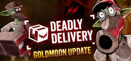
An online VR co-op horror game about delivering parcels into haunted mines. Avoid monsters, drop off packages, and pray you reach the quota! Team up with up to 5 other delivery goblins, survive your shift and pay back your student loans. (VR crossplay supported)

$6.99Very Positive(142)
VRHorrorComedy
Flat Head StudioDec 4, 2025

Deadly Delivery scores 63/100 — better than 6% of Steam capsules we've analysed (n=22,658).

Very Positive (142 reviews) · $6.99 · Released Dec 4, 2025 · By Flat Head Studio

Quick text summary

Deadly Delivery scored 63/100 on Steam Analyzer — Solid for a Steam capsule. Top priority fix: [contrast_color] Increase the value contrast of the left monster by brightening its rim lighting or adding a cooler glow behind it to separate it from the dark background at small sizes

Capsule scores by dimension

  • Genre Clarity: 7/10 — Horror co-op tone reads well. The toothy monster jaw on the left and the quirky goblin-like character on the right immediately suggest horror with a comedic twist, which aligns with the co-op horror genre. The cardboard box logo with a skull face reinforces the delivery theme clearly. At tiny size the horror element still reads through the dark jagged teeth shape, though the comedic goblin character becomes a small unrecognizable figure.
  • Title Readability: 7/10 — Title readable, tagline collapses small. DEADLY DELIVERY in bold white uppercase with a dark drop shadow reads clearly at full and small sizes, benefiting from strong contrast and wide letterforms. The subtitle MYSTERY ROOM UPDATE is significantly smaller and becomes unreadable at tiny size, which is acceptable for a limited-time update label but adds visual noise. At tiny size the main title remains legible as a two-word block.
  • Contrast & Color: 6/10 — Decent contrast, mid-tone muddle. The white title text pops against the mid-dark center background, and the bright teal and yellow goblin character on the right provides some color separation against the darker background. However the large monster on the left is rendered in dark red-brown tones that blend into the similarly dark background, reducing silhouette clarity especially in grayscale. At tiny size the left monster area becomes an indistinct dark mass with little separation from the Steam dark UI.
  • Uniqueness & Polish: 6/10 — Quirky concept, execution feels rough. The pairing of a horror monster with a comedic goblin delivery worker is a distinctive visual idea that communicates the game's tone well. However the overall composition feels like a promotional banner rather than a polished capsule, with the two characters roughly flanking centered text in a format that feels functional rather than crafted. Compared to benchmark capsules like DREDGE or Pacific Drive which have strong singular visual identity, this reads as competent but unrefined.
  • Brand Consistency: 7/10 — Coherent horror-comedy identity. The skull-faced cardboard box logo is a strong recurring brand mark that anchors the delivery theme visually. The color palette of muted darks with pops of teal and warm red is internally consistent and the cartoonish yet creepy rendering style of both characters shares a coherent aesthetic. The logo mark could function as a recognizable icon across store assets, giving the capsule a decent brand anchor.
  • Composition: 5/10 — Split layout strains small sizes. The composition uses a split-character flanking arrangement with the title centered, which is a common but effective layout at full size. However at small and tiny sizes the two characters on opposite edges fight for attention with no single clear focal point, and the center text block sits in a relatively dark, texture-free zone that feels disconnected from both figures. The goblin character on the right is partially cropped at the edge, which hurts at small sizes where Steam may crop further.

What works

  • Distinctive brand logo. The skull-faced cardboard box icon is memorable and directly communicates the game's delivery-horror premise at a glance.
  • Clear tonal contrast between characters. Pairing a creepy monster with a cartoonish goblin immediately signals horror-comedy co-op without needing a tagline.
  • Main title legibility. DEADLY DELIVERY in bold white uppercase remains readable down to small capsule sizes due to strong contrast and clean letterforms.
  • Coherent art style. Both characters share a stylized 3D render aesthetic that keeps the image feeling like a unified piece rather than clashing assets.

What hurts the capsule

  • Left monster blends into background. The dark red-brown monster on the left lacks sufficient value contrast against the dark background, collapsing into an unreadable mass at tiny size.
  • Split focal point hurts small sizes. Two characters on opposite edges create competing focal points with no dominant subject to anchor the eye during a quick scroll.
  • Right character edge-cropped. The goblin figure on the right is trimmed at the capsule edge, risking further crop loss on Steam and weakening the character read at small sizes.
  • Subtitle adds noise without benefit. MYSTERY ROOM UPDATE is unreadable at small and tiny sizes and competes with the main title without contributing to genre or game identity.

Priority fixes

  1. [contrast_color] Increase the value contrast of the left monster by brightening its rim lighting or adding a cooler glow behind it to separate it from the dark background at small sizes
  2. [composition] Shift the compositional focus to a single dominant element, such as the goblin character centered and enlarged, with the monster as a secondary threat emerging from the background rather than equal in size
  3. [title_readability] Remove or significantly reduce the MYSTERY ROOM UPDATE subtitle so it does not compete with the main logo, or move it to a badge element that does not interrupt the title hierarchy
  4. [uniqueness_polish] Add a more deliberate depth layer between the characters and the background, such as a glowing mine shaft or package-scattered environment, to elevate the image above a promotional banner format

Store copy priority fixes

  1. [hook_strength] Emphasize the comedic tone in the short description to match the 'Funny' and 'Comedy' tags—consider rewording to 'deliver packages to haunted mines as a hapless goblin delivery crew' or similar to signal humor alongside horror.
  2. [feature_communication] Clarify what 'Monsters With Personality' means mechanically—do they have unique abilities, patterns, or interactions? Briefly explain one example to raise mechanical specificity.
  3. [uniqueness] Add a 1-line comparison or context statement such as 'uniquely blends delivery logistics with survival horror' or 'the only co-op horror game where your job is the mission, not just staying alive.'

Related guides

Steam app ID: 3743090