Scoring genre clarity...

Dark Cross capsule

Dark Cross

A third-person survival horror game where players navigate a dark, nonlinear facility, using light, sound, and limited tools to avoid deadly threats and uncover hidden experimental data.

$3.99
HorrorSurvival HorrorAction
kataitaiJun 17, 2025

Dark Cross scores 70/100 — better than 36% of Horror capsules (n=3,118).

$3.99 · Released Jun 17, 2025 · By kataitai

Quick text summary

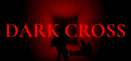
Dark Cross scored 70/100 on Steam Analyzer — Good for a Horror capsule. Top priority fix: [uniqueness_polish] Introduce a unique visual hook such as a distinct character pose, experimental lab detail, or signature light-source element that differentiates Dark Cross from generic horror and hints at the light-and-sound mechanic.

Capsule scores by dimension

  • Genre Clarity: 7/10 — Horror atmosphere clear, mechanic ambiguous. The red glowing cross silhouette and dark, ominous atmosphere immediately signal survival horror or dark action-adventure. At TINY size, the iconic cross shape and crimson lighting remain recognizable as horror-specific cues. However, the silhouettes lack clear indication of the 'light and sound avoidance' core mechanic—viewers see threat but not the survival gameplay loop.
  • Title Readability: 8/10 — Strong serif title, excellent contrast hierarchy. DARK CROSS in large red serif capitals sits cleanly at top-left with high contrast against black background. At SMALL (231×87) and TINY (120×45) sizes, the title remains fully legible due to bold weight and red-on-black separation. Spacing between words is clear and the letterforms do not collapse under scaling.
  • Contrast & Color: 8/10 — High-value red against black, silhouettes read. The bright red title and cross form provide strong silhouette separation against the dark background, matching Steam's #1b2838 context well. Grayscale test confirms the red translates to high-enough value to maintain edge clarity at TINY size. The gradient red glow creates depth without muddying the focal point.
  • Uniqueness & Polish: 6/10 — Iconic cross concept, generic execution. The cross symbol is memorable and genre-appropriate, but the execution relies on familiar horror tropes—red lighting, silhouettes, fog—without a distinctive visual hook or art style that signals 'nonlinear facility exploration' or the unique light-and-sound mechanics. The capsule reads as competent dark horror but not noticeably premium or distinctive compared to top-tier action-horror peers like Lies of P or RE4.
  • Brand Consistency: 6/10 — Minimal identity cues, generic horror palette. The red-and-black color scheme and cross motif are consistent with survival horror branding, but there are no character, symbol, or signature visual elements that would make this capsule uniquely recognizable as Dark Cross on a second viewing. Without reference to in-game screenshots, the design could belong to several horror titles.
  • Composition: 7/10 — Clear hierarchy, minor focal point tension. Title anchors top-left with strong weight; the cross and silhouettes occupy the center-right and lower regions, creating a descending visual flow. At SMALL and TINY sizes, the hierarchy holds and focal point reads as 'dark threat.' However, the lower silhouettes compete slightly for attention with the cross, and the overall composition feels balanced rather than dynamically composed compared to standout genre leaders.

What works

  • Title legibility at scale. Bold red serif capitals maintain full readability at TINY size (120×45) with no letterform collapse or merging.
  • Strong contrast and silhouette. Red-on-black value separation creates clean edges that survive the grayscale and squint tests, ensuring the cross and threat shapes remain distinct in quick-scroll conditions.
  • Genre signaling. The cross icon and ominous red lighting immediately communicate survival horror to the target audience without ambiguity.

What hurts the capsule

  • Generic horror execution. The red glow, silhouettes, and dark fog are familiar horror clichés that do not visually communicate the unique 'light and sound avoidance' core mechanic or nonlinear facility setting.
  • Weak brand identity. No memorable character, logo variant, or signature visual motif exists to make this capsule distinctly recognizable as Dark Cross rather than a generic horror title.
  • Composition lacks dynamism. The layout is competently balanced but static; focal point hierarchy between title, cross, and silhouettes feels equal rather than progressive, reducing visual impact at SMALL size.

Priority fixes

  1. [uniqueness_polish] Introduce a unique visual hook such as a distinct character pose, experimental lab detail, or signature light-source element that differentiates Dark Cross from generic horror and hints at the light-and-sound mechanic.
  2. [brand_consistency] Add a recognizable symbol, character silhouette variant, or color accent that becomes a memorable identity cue for future capsule variations and marketing materials.
  3. [composition] Strengthen focal point hierarchy by enlarging or repositioning the cross symbol as the primary focal point with title as secondary anchor, reducing visual competition from lower silhouettes.

Store copy priority fixes

  1. [hook_strength] Rewrite the short description opening to lead with a visceral threat or discovery—e.g., 'Descend into Echo Deep, where your breath and footsteps draw things that hunt in the dark' instead of leading with navigation.
  2. [uniqueness] Add a sentence or comparison that frames Dark Cross's differentiation—e.g., 'where light and sound are your only tools' or 'the only survival horror where every sense matters' to explain why this game stands out.
  3. [audience_targeting] Explicitly state the intended player type and difficulty expectations in the opening paragraph—e.g., 'For players who thrive in high-tension, resource-scarce horror' or 'hardcore survival enthusiasts.'

Related guides

Steam app ID: 3750690 · Tags: Horror, Survival Horror, Action, Tactical RPG, Top-Down