Scoring genre clarity...

Get In Timelessness capsule

Get In Timelessness

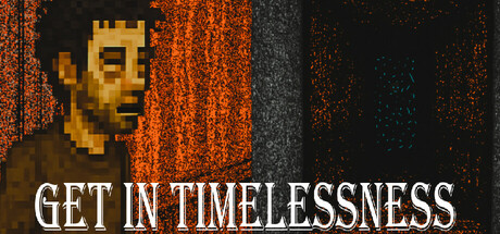
A psychological horror about a man who, by the will of fate — or a joke of chance — had to face the unthinkable. Sometimes a person looks into the abyss. Sometimes the abyss looks at you. And sometimes... She turns out to be Hungry.

$4.998 user reviews
HorrorDark2D
FANTOM INKJul 31, 2025

Get In Timelessness scores 62/100 — better than 3% of Horror capsules (n=3,118).

8 user reviews · $4.99 · Released Jul 31, 2025 · By FANTOM INK

Quick text summary

Get In Timelessness scored 62/100 on Steam Analyzer — Solid for a Horror capsule. Top priority fix: [title_readability] Increase font size or weight of 'GET IN TIMELESSNESS' to maintain legibility at 120x45 thumbnail size without distortion.

Capsule scores by dimension

  • Genre Clarity: 7/10 — Horror intent clear, execution mixed. The pixelated human face with distorted features and the orange/rust color palette suggest psychological horror or survival dread. At tiny size, the pixelated face reads as unsettling but the specific horror subgenre remains slightly ambiguous—could be cosmic, survival, or supernatural. The tagline 'GET IN TIMELESSNESS' reinforces the existential horror angle but is difficult to parse at glance.
  • Title Readability: 6/10 — Title readable at full, compromised tiny. The white all-caps sans serif 'GET IN TIMELESSNESS' has decent contrast against the dark background at full size and reads clearly at small size. At tiny size (120x45), the text becomes compressed and harder to distinguish individual words, though the overall white block is still visible. The title placement in the lower half is strategic but leaves valuable upper space underutilized.
  • Contrast & Color: 7/10 — Strong warm/cool separation works. The orange rusted texture and gray concrete column create clear value separation against the dark background, and the white title pops distinctly. The pixelated character face has moderate luminosity but blends somewhat into the warm orange field at tiny size due to similar saturation levels. Grayscale squint test shows the orange-gray-character reads as distinct zones but the face loses definition in the noise.
  • Uniqueness & Polish: 5/10 — Competent indie aesthetic, lacks signature. The pixelated art style and industrial decay aesthetic are well-executed but align closely with common indie horror visual language seen in games like DREDGE and Lethal Company. The distorted face and rusty textures suggest craft, but the overall composition feels like a strong template execution rather than a memorable visual hook that distinguishes this specific game. No clear unique mechanic or character identity emerges at a glance.
  • Brand Consistency: 6/10 — Palette consistent, identity not distinctive. The warm orange-rust and cool gray palette appears cohesive and likely matches store screenshot color grading consistently. The pixelated character style aligns with the indie horror category expectation, but without seeing the full game context, no iconic character motif or signature symbol emerges that would make this capsule instantly recognizable as GET IN TIMELESSNESS specifically. The industrial decay motif is generic within the genre.
  • Composition: 6/10 — Functional layout, uneven focal balance. The pixelated face occupies the left-center area and serves as the primary focal point, with the vertical concrete column providing depth and the rust field as atmospheric background. At tiny size, the face remains the clear subject but the title in the lower half competes for attention rather than support the character hierarchy. The composition is safe and balanced but lacks dynamic depth layering—midground and foreground blur into the same rusted noise field.

What works

  • Title contrast and placement. White sans serif text pops clearly against dark background and remains readable even at small capsule size.
  • Color palette coherence. Orange rust, gray concrete, and dark background create a unified industrial-horror mood consistent with the game's psychological tone.
  • Pixelated character focus. The distorted pixel-art face serves as a clear primary subject that signals character-driven narrative horror to viewers.

What hurts the capsule

  • Generic indie horror visual language. The pixelated art, rust textures, and decay aesthetic closely mirror dozens of other indie horror capsules without distinctive visual signature.
  • Title readability at tiny size. Text compression at 120x45 makes individual words blur together, reducing clarity in the critical thumbnail view during quick Steam browsing.
  • Weak depth and composition hierarchy. The face, rust field, and concrete column occupy roughly equal visual weight, creating competing focal points rather than guided eye flow from subject to context.
  • Tagline clarity. The phrase 'GET IN TIMELESSNESS' is cryptic and difficult to parse at a glance, offering no clear thematic cue about gameplay or narrative hook.

Priority fixes

  1. [title_readability] Increase font size or weight of 'GET IN TIMELESSNESS' to maintain legibility at 120x45 thumbnail size without distortion.
  2. [composition] Reposit the face higher and larger to dominate the focal point, pushing title lower or integrate it as background text to strengthen hierarchy.
  3. [uniqueness_polish] Add a distinctive visual element—iconic symbol, signature color accent, or unique character pose—that differentiates this from genre peers like DREDGE.
  4. [genre_clarity] Enhance the psychological horror signal through more dramatic facial distortion, unsettling pose, or supernatural visual effect that clarifies the specific horror subgenre.

Store copy priority fixes

  1. [feature_communication] Add a sentence after the Features section that explicitly describes the core interaction model: 'Make choices through dialogue, examine objects and environments, and uncover story branches that lead to different endings based on how you interact with the bar and its inhabitants.'
  2. [feature_communication] Include estimated playtime and number of endings (e.g., '3–4 hours per playthrough with 5 unique endings') to set player expectations for replayability.
  3. [genre_clarity] Clarify the gameplay verb in the opening or features section—explicitly state 'point-and-click adventure' or 'narrative exploration game' to immediately signal interaction style to experienced players.
  4. [uniqueness] Add one sentence that explains what conceptually separates this game from other grief-horror titles, such as: 'Unlike traditional horror, Calib's journey explores how supernatural horror emerges from psychological fragmentation rather than external threat.'

Related guides

Steam app ID: 3760710 · Tags: Horror, Dark, 2D, Story Rich, Alternate History