Scoring genre clarity...

Rodent Company capsule

Rodent Company

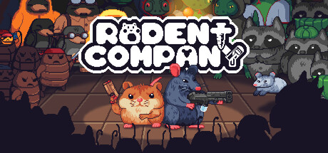
Rodent Company is an action roguelike for 1-4 players where you play as a number of rodents fighting to ensure the survival of their kind. Wield randomized weapons and use special abilities to exterminate your enemies and save rodent-kind!

Early AccessAction RoguelikeBullet Hell
Pixel Rodents2026

Rodent Company scores 75/100 — better than 68% of Steam capsules we've analysed (n=22,658).

Released 2026 · By Pixel Rodents

Quick text summary

Rodent Company scored 75/100 on Steam Analyzer — Good for a Steam capsule. Top priority fix: [contrast_color] Darken the background crowd figures by 20-30% in value to increase separation from the lit foreground hero duo at small and tiny sizes.

Capsule scores by dimension

  • Genre Clarity: 8/10 — Pixel roguelike shooter reads well. The two foreground rodents wielding guns and the dense crowd of enemy creatures behind them clearly communicate a co-op action shooter or roguelike. The pixel art style, weapon designs, and arena-style layout reinforce familiar roguelike-shooter visual language. At tiny size the armed hamster and rat silhouettes with guns still read as an action game, though the subgenre nuance collapses slightly.
  • Title Readability: 8/10 — Bold logo reads at most sizes. The chunky white chunky lettering with black outline for 'RODENT COMPANY' is well-sized and centrally placed against the lighter background glow, giving strong contrast. At small size the title remains readable with the bold stroke weight holding up. At tiny size (120x45) the words become strained but the large block letters and outline keep it marginally legible compared to more decorative fonts.
  • Contrast & Color: 7/10 — Warm glow separates heroes well. The warm orange-yellow spotlight behind the two hero rodents creates a strong light-dark separation against the darker crowd and Steam's #1b2838 background. In grayscale the foreground heroes read clearly against the midtone crowd. However the busy crowd of characters in the background creates a cluttered mid-value zone that competes with the hero silhouettes at small and tiny sizes.
  • Uniqueness & Polish: 7/10 — Charming pixel craft, familiar concept. The pixel art is clean and consistently rendered, with appealing character designs that have personality — the armed hamster and rat duo have a charming contrast to the threatening crowd behind them. The concept echoes Lethal Company's aesthetic in indie tone and co-op framing but the rodent theme and weapon variety give it distinct identity. It feels polished for an indie release but doesn't deliver a single knockout visual hook that elevates it above the genre crowd.
  • Brand Consistency: 8/10 — Cohesive pixel style, memorable cast. The pixel art style is consistent across all visible elements — characters, background, logo treatment, and lighting all share the same rendering language. The hamster-and-rat duo as central heroes creates a recognizable brand identity that could be recalled on second viewing. The logo's chunky inline style complements the pixel aesthetic without clashing.
  • Composition: 7/10 — Clear hero focus, crowded background. The two foreground hero characters are well-positioned in the lower center, with the title logo sitting prominently above them in a natural reading flow from top to bottom. The spotlight glow creates a natural focal hierarchy. However the dense crowd filling the entire background competes for attention and makes the midground feel cluttered, which at small and tiny sizes causes the image to feel busy rather than focused.

What works

  • Armed hero rodents are instantly readable. The hamster and rat holding weapons in the foreground create a clear and charming focal point that communicates co-op action at a glance.
  • Strong logo contrast and weight. The chunky white lettering with thick black outline on a glowing background keeps the title readable down to small capsule sizes.
  • Consistent pixel art craft. Every element from characters to background crowd shares the same pixel rendering style, giving the capsule a unified and professional indie feel.
  • Warm spotlight creates natural depth. The orange-yellow glow behind the heroes separates them from the darker crowd and background, giving the composition clear foreground-midground layering.

What hurts the capsule

  • Busy crowd collapses at tiny size. The dense background filled with varied enemy characters turns into visual noise at 120x45, making the image feel muddy and hard to parse quickly.
  • No single iconic silhouette at tiny size. At tiny dimensions the two hero characters merge into a single indistinct blob rather than reading as distinct recognizable figures.
  • Mid-value crowd competes with heroes. In grayscale the background characters share too similar a value range to the foreground heroes, weakening silhouette separation.
  • Title placement on textured background. Portions of the logo overlap with the busy crowd texture on the sides, slightly weakening the controlled contrast needed for clean legibility at small sizes.

Priority fixes

  1. [contrast_color] Darken the background crowd figures by 20-30% in value to increase separation from the lit foreground hero duo at small and tiny sizes.
  2. [composition] Add a subtle dark vignette or shadow zone immediately behind the two hero characters to isolate them more cleanly from the crowd at tiny size.
  3. [title_readability] Ensure the logo sits fully within the warm glow zone so no letterforms overlap busy crowd textures, improving contrast uniformity across the full title.
  4. [uniqueness_polish] Consider emphasizing one iconic hero pose or silhouette more strongly — a single bold character read would sharpen the brand hook and tiny-size recognition.

Store copy priority fixes

  1. [feature_communication] Add 1–2 sentences explaining what 'rodent-based abilities' are and give 1–2 concrete examples (e.g., 'deploy a decoy mine', 'summon a tanking hamster') to clarify playstyle variety.
  2. [hook_strength] Rewrite the opening to lead with the highest-impact unique mechanic or moment rather than a generic 'ensure survival' premise. For example: 'Rodent Company: a chaotic 1-4 player action roguelike where you build impossible weapon combos and watch your squad tear through an army of enemy factions.'
  3. [uniqueness] Add a sentence explicitly contrasting the weapon module system or co-op scaling against other roguelikes, or highlight what makes the rodent squad dynamic mechanically distinct (e.g., 'Each rodent class brings a unique ability playstyle that reshapes team strategy').
  4. [feature_communication] Clarify the run structure and permadeath interaction: specify if it is stage-based, endless, time-limited, and whether permanent upgrades or unlocks persist between runs.

Related guides

Steam app ID: 3764550