Scoring genre clarity...

異ノ故リ-Isolated Hours- capsule

異ノ故リ-Isolated Hours-

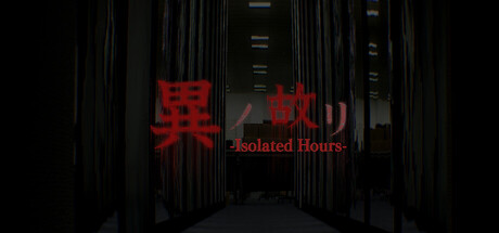
A 3D horror game where your only goal is to finish your work… and survive the night. Unnatural anomalies creep into the office as you complete your tasks. Can you make it to the end of your shift alive.

Free to PlayVery Positive(56)
HorrorWalking SimulatorAtmospheric
Byking RooKIESDec 15, 2025

異ノ故リ-Isolated Hours- scores 72/100 — better than 51% of Horror capsules (n=3,118).

Very Positive (56 reviews) · Free to Play · Released Dec 15, 2025 · By Byking RooKIES

Quick text summary

異ノ故リ-Isolated Hours- scored 72/100 on Steam Analyzer — Good for a Horror capsule. Top priority fix: [title_readability] Increase subtitle font weight or size to maintain clarity at 120x45 thumbnail scale without losing elegance

Capsule scores by dimension

  • Genre Clarity: 8/10 — Horror office setting clear. The dark corridor with institutional architecture, red warning text, and ominous atmosphere immediately signal a horror game with workplace setting. At tiny size, the red kanji and English subtitle remain readable enough to convey dread, though the specific office-survival mechanic is not obvious from visuals alone. The eerie environmental design supports genre expectations well.
  • Title Readability: 7/10 — Title visible but tagline fades small. The red kanji title (異ノ故リ) stands out clearly against the dark background at full size with strong value contrast. The English subtitle 'Isolated Hours' reads at small size but becomes soft and loses clarity at tiny thumbnail size due to thin letterforms and low relative scale. The dual-language approach is intentional but the subtitle weight doesn't support the tiniest viewing condition well.
  • Contrast & Color: 8/10 — Strong red-on-black silhouette. Bright red text and signage create excellent value separation against the near-black corridor background, ensuring strong legibility in quick scroll. The institutional grays and blacks in the environment provide depth context without competing. Even in grayscale simulation, the red elements maintain clear edge definition and silhouette against surrounding darkness.
  • Uniqueness & Polish: 7/10 — Atmospheric but uses familiar horror tropes. The capsule executes a cohesive creepy-office aesthetic with professional lighting and architectural perspective that feels intentional and crafted. However, the dark corridor with red warning signs is a recognizable horror visual pattern, and the composition doesn't reveal a distinctive mechanic or unique art hook beyond 'workplace horror.' The polish is evident but the concept reads as competent rather than remarkable.
  • Brand Consistency: 6/10 — Cohesive but limited identity signals. The dark industrial palette and red accent color system appear consistent with typical horror branding, but no iconic character, symbol, or signature visual motif is present to create lasting brand recognition. The kanji title is memorable as a language choice, but visual identity cues that would distinguish this from other indie horror titles are minimal. Internal consistency is solid but memorable identity markers are absent.
  • Composition: 7/10 — Centered depth hierarchy works well. The receding corridor creates strong compositional depth with a clear focal point in the centered title, supporting natural eye movement from foreground to background. Title placement is safe from crop edges and maintains readability across sizes. At tiny size, the silhouette of the corridor structure and red text still read as primary focus, though environmental detail becomes secondary noise.

What works

  • Red-on-black contrast excellence. The bright red kanji and text create exceptional value separation that reads cleanly even at tiny thumbnail size and maintains impact in quick scroll conditions.
  • Atmospheric environmental storytelling. The institutional corridor with perspective lines and industrial architecture immediately communicates the office-survival premise without text, supporting genre expectations.
  • Safe title placement and crop resilience. The centered title positioning keeps text away from edge hazards and maintains legibility across viewing sizes without aggressive cropping risk.

What hurts the capsule

  • Subtitle readability at tiny size. The English tagline 'Isolated Hours' uses thin letterforms that fade and lose clarity at thumbnail scale, reducing secondary messaging impact.
  • Generic horror visual vocabulary. Dark corridor with red warning signs is a familiar trope that doesn't communicate a distinctive mechanic or unique selling point specific to this title.
  • Weak brand identity differentiation. No iconic character, recurring symbol, or signature visual element is present to create lasting brand recognition or distinguish from competitor horror titles.

Priority fixes

  1. [title_readability] Increase subtitle font weight or size to maintain clarity at 120x45 thumbnail scale without losing elegance
  2. [uniqueness_polish] Add a subtle visual element that hints at the unique work-survival mechanic (e.g., desk object, deadline UI, anomalous detail) to differentiate from generic horror
  3. [brand_consistency] Introduce a recurring symbol or visual motif that could become iconic across store screenshots and promotional materials for stronger brand recall

Store copy priority fixes

  1. [feature_communication] After describing anomalies, add one sentence clarifying the core interaction: e.g., 'Interact with each anomaly to calm or dismiss it, or hide and wait for it to pass—choose wisely, as time is limited.'
  2. [hook_strength] Move the developer disclaimer to the end of the detailed description or a separate 'Notes' section to preserve the horror atmosphere in the opening pitch.
  3. [uniqueness] Add a sentence differentiating the game from other office-horror or entity-stalking games, such as 'Unlike traditional horror, you cannot fight back—only observe, avoid, and survive.'

Related guides

Steam app ID: 3767300 · Tags: Horror, Walking Simulator, Atmospheric, Hidden Object, Psychological Horror