Scoring genre clarity...

Torebia: Island Odyssey capsule

Torebia: Island Odyssey

Torebia: Island Odyssey is an old-school sandbox MMORPG. No classes, no pay-to-win. Craft, fight, trade, and rise through the Adventurer's Guild ranks your way. One shared world. Pure adventure.

MMORPGOpen WorldMassively Multiplayer
Twin StudiosTo be announced

Torebia: Island Odyssey scores 70/100 — better than 32% of MMORPG capsules (n=110).

Released To be announced · By Twin Studios

Quick text summary

Torebia: Island Odyssey scored 70/100 on Steam Analyzer — Good for a MMORPG capsule. Top priority fix: [uniqueness_polish] Incorporate a visual element that hints at the sandbox or MMO nature, such as a crafting bench, trading goods, or guild insignia in the background to differentiate from generic fantasy games.

Capsule scores by dimension

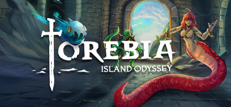
  • Genre Clarity: 7/10 — Fantasy action-adventure setting clear. The capsule communicates a fantasy setting through the stone castle architecture, mermaid figure, and mystical environment. The title 'Torebia: Island Odyssey' and visual elements suggest an adventure game with RPG elements. At TINY size, the castle and mermaid silhouette remain identifiable, though the exact genre (MMORPG sandbox vs. single-player action) is not entirely obvious from visuals alone.
  • Title Readability: 8/10 — Strong white typography with clean separation. The title 'TOREBIA' uses a bold, serif-inflected white font with excellent contrast against the dark background and castle stonework. The subtitle 'ISLAND ODYSSEY' is positioned cleanly below in smaller text. At SMALL and TINY sizes, the main title remains highly legible thanks to generous letter spacing and the bright white color; the subtitle becomes slightly harder to read at TINY but does not collapse significantly.
  • Contrast & Color: 8/10 — Excellent value separation and silhouettes. The bright white title pops dramatically against the dark castle and background. The mermaid figure features warm reds and oranges (costume and tail) that separate well from the cool blue-grey stone architecture and dark water. Light sky visible through the window arch adds further depth and contrast. At TINY size, the key elements—white text, red-orange mermaid, and dark stone—remain clearly distinguishable in grayscale.
  • Uniqueness & Polish: 6/10 — Competent fantasy scene, somewhat generic. The composition feels well-executed with a mermaid character and castle setting that fit the island odyssey theme. However, the visual presentation—female fantasy character in a castle with mystical elements—aligns closely with common fantasy game templates and does not convey a distinctive indie or sandbox identity. The scene is polished but lacks a unique selling point or memorable hook that differentiates it from other fantasy RPGs.
  • Brand Consistency: 6/10 — Coherent fantasy aesthetic, limited identity markers. The capsule presents a cohesive fantasy art style with consistent rendering of stone, water, cloth, and skin tones. The cross symbol integrated into the title is a recognizable motif. However, without reference to other 19 screenshots, the visual identity does not yet feel strongly distinctive or iconic—the mermaid and castle could represent many fantasy properties. The color palette (blues, greys, warm oranges, white) is harmonious but not uniquely branded.
  • Composition: 7/10 — Clear hierarchy, balanced focal points. The title sits prominently in the upper-left to center area with strong visual weight. The mermaid character on the right and castle architecture on the left create a balanced composition with good depth layering (background sky window, midground castle and character, foreground water). At SMALL size, the layout remains clear with the title and character silhouette as dual focal points. At TINY size, elements compress slightly but the composition does not fall apart.

What works

  • Readable white title typography. Bold, well-spaced white letters with a thematic cross symbol integrate smoothly and remain legible even at TINY sizes.
  • Strong color and value contrast. The warm red-orange mermaid, bright white title, and cool blue-grey stone architecture create distinct visual separation against the dark Steam background.
  • Coherent fantasy world-building. Stone castle, mermaid character, mystical window, and water elements combine to convey a cohesive fantasy adventure setting.

What hurts the capsule

  • Generic fantasy trope execution. The mermaid-in-castle scene aligns with common fantasy game visuals and does not clearly communicate what makes this sandbox MMORPG unique or different from other fantasy titles.
  • Weak brand identity differentiation. The capsule lacks distinctive visual markers, iconic symbols, or a signature style that would make Torebia memorable or recognizable in future encounters.
  • Sandbox MMORPG identity unclear. The capsule does not visually hint at the core selling points (crafting, trading, guild progression, no classes, no pay-to-win) that differentiate this from traditional fantasy RPGs.

Priority fixes

  1. [uniqueness_polish] Incorporate a visual element that hints at the sandbox or MMO nature, such as a crafting bench, trading goods, or guild insignia in the background to differentiate from generic fantasy games.
  2. [genre_clarity] Add a subtle UI element or design cue (e.g., a guild banner, crafted weapon, or trading interface hint) that signals this is an MMO sandbox rather than a single-player action RPG.
  3. [brand_consistency] Develop and integrate a more iconic, recognizable visual motif or signature color accent that will anchor Torebia's identity across future marketing materials.

Store copy priority fixes

  1. [hook_strength] Rewrite the opening line to lead with the core appeal: 'Experience a true sandbox MMORPG where your trades reshape the economy, your gear can shatter if you're careless, and your legend is earned through mastery—not your wallet.' This moves from definition to emotional promise.
  2. [feature_communication] Add a "CRAFTING & GEAR PROGRESSION" section explaining what players craft, how it ties to combat, and how it differs from other MMOs, since crafting is tagged but unexplained.
  3. [uniqueness] Add explicit comparisons: 'Unlike modern MMOs with bind-on-equip restrictions and battle pass progression, Torebia's economy is player-driven—every drop you find can be sold, and meaningful upgrades come from mastery, not microtransactions.'
  4. [audience_targeting] Add a sentence near the end identifying the core audience: 'If you loved EverQuest, Runescape's depth, or Ultima Online's freedom, Torebia recaptures that spirit for a new generation.' This crystallizes who the game is for.

Related guides

Steam app ID: 3768880 · Tags: MMORPG, Open World, Massively Multiplayer, Old School, RPG