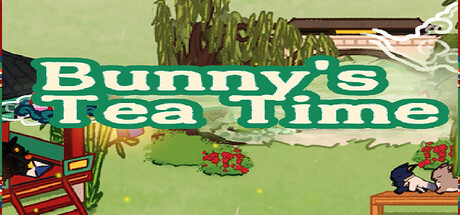
Bunny's Tea Time scores 68/100 — better than 18% of Casual capsules (n=10,153).

Quick text summary

Bunny's Tea Time scored 68/100 on Steam Analyzer — Solid for a Casual capsule. Top priority fix: [composition] Reposition rabbits and foliage away from left and right edges to preserve composition integrity on Steam's small capsule crop.

Capsule scores by dimension

  • Genre Clarity: 7/10 — Cozy casual aesthetic reads clearly. The soft green background, gentle rabbit characters, tea setting, and pastoral garden elements immediately signal a cozy, low-stress casual game rather than action or competition. At tiny size, the scattered rabbits and teacup imagery remain legible enough to suggest relaxation and collection mechanics. The pomodoro timer gameplay is not visually obvious from the capsule alone, but the cozy tone matches the genre expectation.
  • Title Readability: 8/10 — Bold white text stands out well. The title 'Bunny's Tea Time' uses a thick white outline on a contrasting green and darker backgrounds, maintaining strong legibility at small and tiny sizes. The letterforms are clean and geometric enough to survive compression without collapsing. At tiny size, the text remains the primary readable element and clearly communicates the game concept through language.
  • Contrast & Color: 7/10 — Good value separation, warm palette. The bright lime-green background provides strong contrast against the Steam dark background #1b2838, and the white title text pops clearly with a darker outline. The rabbit characters and tea elements use warm browns and reds that read reasonably well against the green, though some mid-tone greens in the foliage blend slightly when squinting. Overall the composition avoids muddy areas and maintains clear silhouettes.
  • Uniqueness & Polish: 6/10 — Competent cozy illustration, somewhat generic. The pixel-art or hand-drawn illustration style is consistent with the cozy indie genre and captures a gentle, welcoming mood. The scattered rabbits and tea theme feel charming but not particularly distinctive or memorable compared to other cozy sims like Minami Lane or Tiny Glade. The composition reads as well-executed but lacks a standout visual hook or signature style that would elevate it above baseline.
  • Brand Consistency: 6/10 — Soft palette consistent, limited icon identity. The warm greens, pastels, and rabbit motif create internal cohesion and match the gentle brand promise. However, there are no clearly iconic brand symbols, signature characters, or distinctive visual markers that would make this capsule instantly recognizable in isolation across other Steam browsing contexts. The style is clean but generic enough that a player might confuse it with other cozy simulation titles.
  • Composition: 7/10 — Clear hierarchy, title placement effective. The title bar sits prominently in the upper third with good visual weight, while the garden scene below provides supporting context without overwhelming the primary message. The focal point remains on the title and overall cozy scene rather than scattered equally across elements. At small size, the composition reads cleanly, though some edge rabbits and foliage approach margins and could risk Steam crop cropping; the core message survives intact.

What works

  • Strong title contrast and readability. White outlined text on green background maintains legibility across all sizes from full to tiny, ensuring the game name is immediately clear.
  • Cohesive warm, gentle aesthetic. The soft green palette, rabbit characters, and tea imagery create a unified cozy mood that aligns perfectly with the game's pomodoro-style relaxation concept.
  • Clear genre signaling through iconography. Rabbits, teacup, garden setting, and pastoral elements immediately communicate casual, cozy, and low-stress gameplay without ambiguity.

What hurts the capsule

  • Generic visual identity without standout hook. The composition and art style are competent but lack a distinctive signature element or iconic character that would make this memorable compared to benchmarked cozy titles.
  • Edge elements risk Steam cropping issues. Rabbits and foliage scattered near left and right margins may be partially cut off on small capsule displays, potentially losing composition balance.
  • Pomodoro timer mechanic not visually evident. The capsule communicates cozy relaxation but does not hint at the unique timer-based gameplay loop that differentiates it from other tea or garden sims.

Priority fixes

  1. [composition] Reposition rabbits and foliage away from left and right edges to preserve composition integrity on Steam's small capsule crop.
  2. [uniqueness_polish] Add a subtle visual signature such as a distinctive teapot design, moon element, or letter motif that appears consistently and becomes an instant brand recognition cue.
  3. [genre_clarity] Introduce a subtle clock, timer icon, or visual cue near the title or center to hint at the pomodoro mechanic and differentiate from generic cozy sims.

Store copy priority fixes

  1. [hook_strength] Change 'Cozy&lo-fi' to 'Cozy & Lo-fi' in the short description for typographic polish.
  2. [feature_communication] Reorganize the opening: lead with 'During breaks in your Pomodoro work routine, record daily emotions and gather with rabbits for tea' as a single punchy sentence, then move the detailed explanations to after the bulleted features list.
  3. [uniqueness] Add a sentence after the detailed description opening that crystallizes the unique hook: 'What makes Bunny's Tea Time different: your emotional reflections are answered by the rabbits themselves through handwritten letters, creating a personal connection no other cozy game offers.'
  4. [audience_targeting] Add a single line clarifying play commitment: 'Perfect for short daily sessions—check in for 5–10 minutes during work breaks or enjoy longer decoration sessions whenever you choose.'

Related guides

Steam app ID: 3772060 · Tags: Casual, Time Management, Simulation, Cozy, 2D