Scoring genre clarity...

Cursed Digilens capsule

Cursed Digilens

It is a psychological horror game and walking simulator. Use a digital camera to take photos of ghosts. Get chased by monsters. Monsters jumping towards at your screen.

$1.995 user reviews
Psychological HorrorAdventureHorror
Markus KordaAug 1, 2025

Cursed Digilens scores 70/100 — better than 35% of Psychological Horror capsules (n=2,166).

5 user reviews · $1.99 · Released Aug 1, 2025 · By Markus Korda

Quick text summary

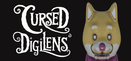
Cursed Digilens scored 70/100 on Steam Analyzer — Good for a Psychological Horror capsule. Top priority fix: [genre_clarity] Add a subtle camera or photography element (lens reflection, viewfinder frame, or film grain) to the creature or background to communicate the unique photo-mechanic core gameplay.

Capsule scores by dimension

  • Genre Clarity: 7/10 — Horror elements clear, genre slightly ambiguous. The grotesque creature head on the right with unsettling proportions and the ornate horror-themed title font immediately signal psychological horror. However, the 'walking simulator with camera mechanic' core is not visually evident—there are no camera, photography, or investigation cues visible. At TINY size, viewers will recognize 'creepy' but may not grasp the unique photo-documentation mechanic that differentiates this from standard horror games.
  • Title Readability: 8/10 — Decorative title reads well overall. The white ornate serif lettering of 'Cursed Digilens' sits cleanly against the dark background with good contrast and deliberate spacing. The flourished typography maintains readability even at SMALL size (231×87), though the intricate swirls begin to blur slightly at TINY (120×45). The title placement in the upper left avoids competition with the creature and benefits from the dark negative space backdrop.
  • Contrast & Color: 8/10 — Strong dark-light separation, creature pops. The white title and tan/beige creature head create crisp value separation against the near-black background (#1b2838), ensuring both elements remain distinct in grayscale and quick-scroll conditions. The warm ochre tones of the creature's face and purple-pink mouth area provide chromatic interest without muddying the silhouette. At TINY size the creature remains a recognizable warm form against cool darkness, supporting instant visual parsing.
  • Uniqueness & Polish: 6/10 — Competent horror presentation, lacks distinctive hook. The creature design is technically well-rendered with attention to anatomical distortion and texture, but the overall composition feels like a straightforward 'spooky face reveal' common in horror game marketing. The ornate title font is polished but a familiar trope in indie horror branding. There is no visible communication of the unique camera/photography mechanic or the 'monsters jumping at screen' pitch that would differentiate this from generic psychological horror walking simulators.
  • Brand Consistency: 6/10 — Internal cohesion present, identity not distinctive. The ornate white typography, dark palette, and creature-focused imagery are internally consistent and suggest a unified horror aesthetic. However, without reference to the 6 store screenshots mentioned, this capsule does not establish an iconic motif, recognizable character, or signature visual hook that would stand out as memorable brand identity. The design reads as 'competent horror' rather than 'this specific game.'
  • Composition: 7/10 — Clear hierarchy, minor balance concerns. The title anchors the left third and the creature face dominates the right side, creating a left-right visual flow that avoids dead-center voids. However, there is uneven visual weight—the creature face occupies significant space but lacks contextual support or depth cues, making the composition feel slightly split rather than unified. At SMALL and TINY sizes the eye jumps between title and creature without a strong transitional element, reducing compositional refinement.

What works

  • Strong contrast against Steam dark background. White title and warm creature tones create crisp silhouettes and remain legible at all sizes including TINY thumbnail view.
  • Readable ornate title typography. The decorative serif lettering maintains clarity through SMALL sizes and avoids collapsing into illegibility despite intricate flourishes.
  • Immediate horror genre recognition. The grotesque creature and ornate font instantly communicate psychological horror tone and atmosphere.

What hurts the capsule

  • Core mechanic (camera/photography) not visually communicated. The capsule shows a generic horror face but gives no visual hint of the unique photo-documentation gameplay that differentiates this title from standard walking simulators.
  • Composition feels split and unbalanced. Title and creature occupy opposite sides without connecting elements or depth layering, creating a disjointed left-right tension rather than unified focal hierarchy.
  • Generic horror aesthetic without distinctive identity. The ornate typography and spooky creature face are competent but common in indie horror branding, offering no memorable or recognizable brand hook.

Priority fixes

  1. [genre_clarity] Add a subtle camera or photography element (lens reflection, viewfinder frame, or film grain) to the creature or background to communicate the unique photo-mechanic core gameplay.
  2. [composition] Integrate the title and creature through a connecting visual element—such as a frame border, layered depth, or atmospheric effect—to unify the left-right split.
  3. [uniqueness_polish] Introduce a distinctive visual storytelling element that conveys either the 'monsters jumping at screen' pitch or the investigation/photography loop, differentiating from generic horror templates.

Store copy priority fixes

  1. [hook_strength] Replace the opening with an evocative, specific hook that creates intrigue, such as 'Trapped in a 1990s research facility, something is hunting you through the darkness. Your only defense: a digital camera that captures what should not exist.' This leads with atmosphere and mechanic rather than genre labels.
  2. [feature_communication] Expand the detailed description to 150+ words explaining the interconnection between photography, ghost encounters, and monster mechanics—specifically, what happens when you photograph a ghost, what triggers chases, and what happens if caught.
  3. [uniqueness] Add a sentence that clarifies what is distinct about this experience, such as 'Unlike typical horror games, you are never armed—only the camera lens stands between you and the unknown' or a specific narrative premise that sets it apart.
  4. [audience_targeting] Include a sentence indicating tone intensity and player type, such as 'For players who prefer atmosphere and tension over jump scares' or 'Recommended for fans of Found Footage horror and '90s nostalgia' to help self-selection.

Related guides

Steam app ID: 3788860 · Tags: Psychological Horror, Adventure, Horror, Walking Simulator, Realistic