Scoring genre clarity...
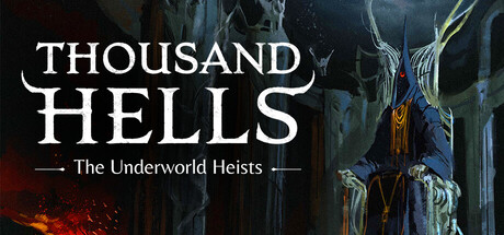
Thousand Hells: The Underworld Heists capsule

Thousand Hells: The Underworld Heists

Recruit your team, choose your path, and descend into hell. Four heroes must overcome the trials of the underworlds in tactical narrative encounters. A new systemic storybook experience blending mythology and surrealism. From the designers of King of Dragon Pass and Six Ages.

RPGStrategyMythology
A SharpComing soon

Thousand Hells: The Underworld Heists scores 75/100 — better than 73% of RPG capsules (n=3,707).

Released Coming soon · By A Sharp

Quick text summary

Thousand Hells: The Underworld Heists scored 75/100 on Steam Analyzer — Good for a RPG capsule. Top priority fix: [genre_clarity] Enhance visibility of tactical gameplay elements (team composition, combat positioning) through subtle UI hints or character silhouette grouping to better communicate RPG strategy mechanics.

Capsule scores by dimension

  • Genre Clarity: 7/10 — Dark fantasy RPG with underworld theme. The ornate hellish architecture, demonic mask imagery, and supernatural color palette clearly signal a dark fantasy RPG setting. At TINY size, the architectural elements and skull-like masks maintain recognizable silhouettes that suggest dungeon-based tactical gameplay, though the exact narrative/heist angle is less apparent without text.
  • Title Readability: 8/10 — Bold serif title, readable at all sizes. THOUSAND HELLS uses clean white serif typography with strong contrast against the dark background, positioned in the upper-left quadrant with stable hierarchy. The subtitle 'The Underworld Heists' is proportionally sized and readable at SMALL size; at TINY size the main title remains legible while the subtitle becomes small but not unreadable due to clean letterforms and adequate spacing.
  • Contrast & Color: 8/10 — Strong value separation, dark tones pop cleanly. The pale architectural masks and cream-colored structural elements create high-contrast silhouettes against the deep brown and black background. The red accent lighting in the right side adds warm separation from cool darks, and the white title text sits cleanly on the dark field; grayscale conversion shows strong separation throughout the composition.
  • Uniqueness & Polish: 7/10 — Distinctive surreal gothic aesthetic, well-crafted. The ornate hellish architecture and layered demonic mask elements evoke the game's narrative premise of underworld trials and mythological setting more effectively than generic dark fantasy. The surrealist visual treatment and careful lighting hierarchy suggest premium production, though the composition leans toward atmospheric rather than immediately communicating core mechanics like team tactics or choice-driven systems.
  • Brand Consistency: 7/10 — Cohesive dark fantasy identity, recognizable style. The color palette (deep browns, blacks, cream, red accents), architectural language, and surrealist mask imagery create a unified visual identity that should remain consistent across marketing materials. The gothic ornamental style and lighting treatment suggest a distinctive brand signature, though without viewing additional screenshots, internal consistency cannot be fully confirmed.
  • Composition: 8/10 — Clear hierarchy, strong focal depth layering. The composition uses strong foreground-to-background layering with the title anchored safely in the upper-left safe margin, the central mask motifs creating a natural focal point, and architectural elements framing the composition. At SMALL and TINY sizes, the central demonic masks remain the dominant focal point while the title stays readable; the balanced use of negative space and layered depths prevents clutter and supports quick visual parsing.

What works

  • High-contrast title placement. White serif typography maintains excellent readability against dark background across all sizes, with safe margins preventing edge cropping.
  • Thematic visual cohesion. Ornate architecture, masks, and supernatural lighting work together to communicate dark fantasy narrative without requiring text decoding.
  • Effective depth layering. Multiple planes of architectural elements create visual richness that reads cleanly at small sizes due to strong silhouette separation.

What hurts the capsule

  • Gameplay mechanics unclear. The visual treatment emphasizes atmosphere and setting but does not clearly communicate the tactical RPG, team recruitment, or choice-driven systems that distinguish the game.
  • Subtitle scale at tiny size. While readable at small, 'The Underworld Heists' tagline becomes quite small at thumbnail size and may not register on quick scroll despite clean typography.
  • Limited warm color accents. Red lighting is present but subdued; more saturated warm tones could increase visual pop and memorability compared to benchmark competitors.

Priority fixes

  1. [genre_clarity] Enhance visibility of tactical gameplay elements (team composition, combat positioning) through subtle UI hints or character silhouette grouping to better communicate RPG strategy mechanics.
  2. [contrast_color] Increase saturation and brightness of red accent lighting or add a secondary warm highlight to boost visual pop and memorability against the dark background.
  3. [uniqueness_polish] Add a distinctive visual motif (recurring symbol, character silhouette, or signature effect) that could serve as recognizable brand identity across future marketing materials.

Store copy priority fixes

  1. [uniqueness] Clarify what 'create a new unique quest' means—does the game procedurally generate missions, or is this editor-driven? Replace vague language with specific mechanics.
  2. [hook_strength] Replace 'surreal journey into the afterlife' with a more action-oriented opening that leads with a core verb or choice, e.g., 'Descend into dynamically generated hells where your party composition and decisions determine survival.'
  3. [feature_communication] Expand the 'Highly Replayable' section to explain the procedural generation or quest creation system in one additional sentence to reduce ambiguity.
  4. [tone_match] Remove or reframe 'gorgeous hand-painted illustrations' and 'untold demons'—replace with specific mythological or surreal descriptors that match the literary tone of the rest of the copy.

Related guides

Steam app ID: 3794210 · Tags: RPG, Strategy, Mythology, Choices Matter, Simulation