Scoring genre clarity...
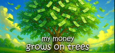
Click. Water. Grow. Harvest. Explore. Upgrade. Profit. An incremental-minimalist clicker farming game about growing your own farm full of money trees! 🌳 Ever wondered what it'd be like if money grew on trees? 💸Online co-op supported!
$9.99Mixed(39)
IncrementalSimulationFarming
Tbjbu2Aug 21, 2025