Scoring genre clarity...
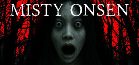
A first-person psychological horror set in a remote Japanese mountain onsen. As the new caretaker, survive by following the memo: wear visible clothes, stay on the path, don’t turn when called, no women here, flee if you smell something. Obey—or never escape!
$5.99Mixed(31)
HorrorPsychological HorrorAdventure
神 SHENOct 21, 2025