Scoring genre clarity...
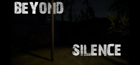
Beyond Silence is a first-person psychological horror where you play as James, a former surgeon who returns to the house of his past. The dark rooms, creaking floors, and forgotten notes hide the horrors he himself had a hand in. But the past won't let him go and it speaks to him through the silence
$5.992 user reviews
Psychological HorrorHorrorThriller
Rage GamesJul 10, 2025