Nocturnomaly scores 73/100 — better than 66% of Psychological Horror capsules (n=2,166).

Quick text summary

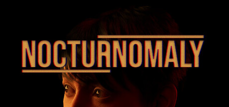
Nocturnomaly scored 73/100 on Steam Analyzer — Good for a Psychological Horror capsule. Top priority fix: [uniqueness_polish] Introduce a subtle environmental or mechanical cue (e.g., repeating street geometry, impossible perspective element) to hint at the endless street loop and differentiate from generic horror faces.

Capsule scores by dimension

  • Genre Clarity: 7/10 — Psychological horror indie adventure. The close-up face with orange warm lighting and dark shadows clearly signals a character-driven narrative experience with unsettling tone. The disembodied head and eerie lighting suggest psychological tension rather than action or pure exploration, aligning with the game's surreal adventure premise. At tiny size, the face silhouette and warm glow still register as something wrong and character-focused, though genre specificity softens slightly.
  • Title Readability: 8/10 — Strong orange title, clear at all sizes. NOCTURNOMALY in bold orange sans-serif with a horizontal underline sits confidently in the upper third against the dark background, maintaining legibility from full header down to tiny thumbnail. The geometric sans-serif letterforms remain crisp and distinct even at 120x45 resolution, and the gold/orange hue provides strong value contrast. Minor issue: tagline or description text is not present, so only the title is tested, but it performs excellently.
  • Contrast & Color: 8/10 — Strong warm-cool separation, clear silhouette. Orange title and warm face lighting create vibrant value separation against the near-black background, with the face's golden-orange tones pushing forward while deep shadows recede. The grayscale test shows crisp edge definition between the lit face and dark surround, with no muddy mid-tone collapse. At small and tiny sizes, the warm glow and title remain visually distinct and readable, though fine facial detail is lost as expected.
  • Uniqueness & Polish: 7/10 — Distinctive unsettling mood, executed cleanly. The close-up haunting face with orange theatrical lighting is a memorable hook that differentiates from generic adventure scenes; it communicates psychological discomfort and intrigue. The lighting quality and subtle facial expression suggest intentional craft rather than stock assets, though the face itself does not reveal unusual visual storytelling beyond mood. Compared to benchmarks like DREDGE and Slay the Princess, it is visually compelling but slightly less conceptually distinctive—solid but not standout.
  • Brand Consistency: 6/10 — Coherent mood, limited iconic identity. The color palette (orange, deep red, black) and unsettling face lighting are internally consistent and reinforce a unified psychological horror mood. However, there are no clear iconographic elements—character design cues, signature symbols, or motifs—that would make the capsule instantly recognizable on a storefront carousel or in memory. The mood is strong but the visual identity is more atmospheric than branded.
  • Composition: 8/10 — Clear focal point, balanced negative space. The face occupies the center-lower region with the title anchored cleanly in the upper third, creating a natural viewing hierarchy without clutter. The large dark background provides breathing room and frames both the face and title without distraction or visual noise. At tiny size, the title-face relationship remains clear and the composition is resilient to edge cropping; no critical elements sit dangerously close to margins.

What works

  • Orange title legibility at small sizes. Bold sans-serif letterforms and high contrast with underline maintain crisp readability even at 120x45 thumbnail resolution.
  • Strong atmospheric mood communication. The close-up face with golden-orange unsettling lighting immediately conveys psychological unease and narrative intrigue without text.
  • Effective value separation and silhouette. Warm face tones and title pop cleanly against deep black background, with no muddy transitions or blended edges in grayscale test.
  • Clean composition hierarchy. Title, face, and negative space are balanced with clear focal points and no edge-hugging or wasted prime real estate.

What hurts the capsule

  • Limited iconographic brand identity. The capsule relies on mood and atmosphere rather than memorable character, symbol, or signature visual motif that would stand out in repeated exposure.
  • Generic indie horror face trope. While executed well, the close-up unsettling face is a familiar visual shorthand in psychological horror games, reducing distinctiveness against peers like DREDGE or Slay the Princess.
  • Minimal visual storytelling. The capsule communicates tone effectively but does not hint at the core mechanic (observe surroundings, escape endless street) or unique selling point beyond generic unease.

Priority fixes

  1. [uniqueness_polish] Introduce a subtle environmental or mechanical cue (e.g., repeating street geometry, impossible perspective element) to hint at the endless street loop and differentiate from generic horror faces.
  2. [brand_consistency] Add a recurring visual motif or signature color accent (beyond orange) that can serve as an iconic identifier across storefront and marketing materials.
  3. [genre_clarity] Consider a faint background element (blurred street, looping geometry) that reinforces the 'escape endless street' mechanic while maintaining atmospheric focus on the face.

Store copy priority fixes

  1. [feature_communication] Add 2–3 specific anomaly examples in the detailed description (e.g., 'a traffic light that flickers in reverse, a street sign that changes language, an NPC who walks backward') to make the detection challenge concrete.
  2. [hook_strength] Rewrite the short description closing to emphasize the anomaly-detection puzzle mechanic rather than generic 'observation': 'You're heading home from school. Something feels off. Spot the anomalies—or restart from the beginning.'
  3. [tone_match] Remove or reframe the developer's casual final note to maintain atmospheric tone, or relocate it to a separate 'About the Developer' section below the main copy.
  4. [audience_targeting] Clarify the intended audience in the short description or opening line by hinting at the retry-loop commitment (e.g., 'A tense anomaly hunt for players who love psychological puzzle walking simulators') to set proper expectations against the 'casual' label.

Related guides

Steam app ID: 3825240 · Tags: Psychological Horror, Walking Simulator, Choices Matter, Horror, Casual