Scoring genre clarity...

YAPYAP capsule

YAPYAP

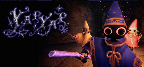
A magic-themed co-op horror game where you and up to 5 friends are minions summoned by a wizard to break into their rival's towers to cause mayhem. Try to fufill your vandalism target with an assortment of spells while avoiding magical beasts and monsters that protect the tower.

$7.49Very Positive(406)
Online Co-OpMultiplayerHorror
Maison BapFeb 3, 2026

YAPYAP scores 63/100 — better than 6% of Steam capsules we've analysed (n=22,658).

Very Positive (406 reviews) · $7.49 · Released Feb 3, 2026 · By Maison Bap

Quick text summary

YAPYAP scored 63/100 on Steam Analyzer — Solid for a Steam capsule. Top priority fix: [title_readability] Redesign the YAPYAP logo with bolder strokes, tighter kerning, and a solid or outlined letterform that maintains legibility at 120px width and remains readable when squinted.

Capsule scores by dimension

  • Genre Clarity: 7/10 — Magic chaos action readable. The capsule clearly signals a magic-themed action game through purple arcane text, glowing spell effects, and wizard-like character silhouettes wearing pointed hats. At TINY size, the magical aura and character poses are still recognizable, though the co-op or horror elements are less explicit—it reads as magical action rather than specifically co-op vandalism gameplay.
  • Title Readability: 5/10 — Stylized logo loses clarity small. The purple distorted "YAPYAP" logo has decorative flourishes that create visual interest at full size but become illegible at TINY (120x45) due to thin strokes and ornate letterforms blending together. At SMALL size (231x87) the text remains difficult to parse confidently, and the logo does not maintain a strong silhouette when squinted or viewed quickly during Steam scroll.
  • Contrast & Color: 7/10 — Purple glow separates well overall. The purple neon glow of the title and character accents (wizard hats, ribbons, spell effects) creates good value separation against the dark background and brown stone tower. However, the center character mass blends somewhat into the murky background, and the overall palette stays within cool-warm mid-tones that reduce punchiness at tiny size compared to top-tier action capsules.
  • Uniqueness & Polish: 6/10 — Competent but generic wizard scene. The composition shows three wizard-like minion characters in a tower setting with magical effects, which communicates the core theme clearly but feels like a straightforward scene capture rather than a unique visual hook or memorable art direction. The character design and spell effects are functional and on-brand but do not stand out as distinctly premium or emotionally engaging compared to benchmarks like Black Myth: Wukong or Lies of P.
  • Brand Consistency: 6/10 — Consistent wizard theme minimal identity. The capsule establishes internal cohesion through a consistent purple magical palette, matching character silhouettes, and a unified tower setting that reinforces the wizard-minion fantasy. However, there are no iconic symbols, signature motifs, or recognizable character traits that would create a memorable brand identity likely to be recalled across future marketing or store screenshots.
  • Composition: 7/10 — Clear focal point good balance. The three characters form a clear primary focal point in the center-right area with the glowing title anchoring the upper left, creating a balanced composition that guides the eye naturally. At SMALL and TINY sizes the character cluster remains the dominant read, though the stone tower background is somewhat passive and the spell effect in the lower left adds minor visual weight without strong narrative purpose.

What works

  • Magic theme immediately clear. Purple glow, wizard hats, and arcane visual effects signal the magical action genre unmistakably at all viewing sizes.
  • Character grouping creates focal point. Three distinct minion characters clustered together draw the eye and communicate co-op/group gameplay potential even at tiny size.
  • Value contrast separates elements. The bright purple accents and character silhouettes maintain clear visual separation from the dark stone tower background.

What hurts the capsule

  • Title logo loses readability at scale. Ornate decorative letterforms in "YAPYAP" become illegible blur at TINY size and remain ambiguous at SMALL due to thin overlapping strokes.
  • Generic scene lacks memorable hook. Characters in tower setting is thematically coherent but visually generic and does not communicate a unique selling point or core mechanic that distinguishes this from similar magic-themed games.
  • Background feels passive and muddy. The stone tower and shadowed midground lack visual interest and create mid-tone blur that reduces overall contrast and premium feel.
  • No iconic brand identity signals. The capsule establishes theme but lacks a signature character trait, symbol, or visual motif that would be recognizable in future marketing.

Priority fixes

  1. [title_readability] Redesign the YAPYAP logo with bolder strokes, tighter kerning, and a solid or outlined letterform that maintains legibility at 120px width and remains readable when squinted.
  2. [uniqueness_polish] Add a distinctive visual hook such as a signature spell effect, a memorable character expression, or environmental destruction element that communicates the core 'vandalism co-op' mechanic.
  3. [contrast_color] Increase background depth by brightening or adding accent lighting to the tower to separate the character silhouettes more dramatically in grayscale.
  4. [composition] Reinforce composition hierarchy by scaling down or repositioning the lower-left spell effect to prevent competing focal points and clarify the three-character center group as the sole primary subject.

Store copy priority fixes

  1. [feature_communication] Fix the typo "fufill" → "fulfill" in both short and detailed descriptions to remove credibility friction.
  2. [uniqueness] Add one sentence explaining how procedural generation affects tower variety or spell randomization to justify the tag and strengthen differentiation.
  3. [audience_targeting] Clarify the Family Sharing category by removing it or adding a note that dark humor and horror elements are present, preventing audience mismatch.

Related guides

Steam app ID: 3834090