Scoring genre clarity...
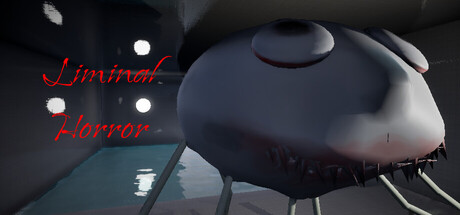
You wake up trapped in a strange swimming pool. A 20-minute psychological horror experience where familiar spaces transform into alien nightmares. There are no monsters. Only you, an endless maze of water, and your slowly dissolving grip on reality.
$3.997 user reviews
HorrorIndieAdventure
dayme200, dayme200Jul 30, 2025