Scoring genre clarity...
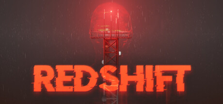
A short solo developed psychological narrative horror game where you close your eyes to reveal a hidden layer of reality, the REDSHIFT. Uncover the secrets of the facility, Tower 7, and survive what hunts you within the REDSHIFT.
Free to PlayMostly Positive(99)
HorrorFree to PlayInvestigation
Gravity InteractiveSep 2, 2025