Terminal Shift scores 68/100 — better than 23% of Horror capsules (n=3,118).

Quick text summary

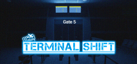
Terminal Shift scored 68/100 on Steam Analyzer — Solid for a Horror capsule. Top priority fix: [uniqueness_polish] Introduce a distinctive visual hook—such as an unsettling recurring element, signature art style detail, or unique lighting effect—that differentiates the capsule from standard abandoned-location horror titles.

Capsule scores by dimension

  • Genre Clarity: 7/10 — Horror-action setting readable. The abandoned airport terminal with ominous Gate 5 signage clearly communicates a confined, unsettling environment that hints at survival-horror or psychological thriller gameplay. At tiny size, the institutional architecture and blue institutional lighting remain recognizable as a dystopian setting, though the specific loop-mechanic and escape objective are not visually apparent. The neon glow and dark corridors effectively suggest tension and confinement without being genre-specific enough to rival top-tier clarity.
  • Title Readability: 8/10 — Neon title reads clearly. The cyan neon 'TERMINAL SHIFT' text is bold, high-contrast, and spaced clearly against the dark background with a strong outline that holds up well at small and tiny sizes. The white sans-serif letterforms maintain legibility even when squinted, and the blue glow provides separation from the background. The small logo in the top left (RPS Games) does not interfere with the primary title placement, allowing the main text to dominate the composition.
  • Contrast & Color: 8/10 — Strong neon-dark value separation. Bright cyan neon against deep dark blue-black background creates excellent value contrast that reads cleanly in grayscale and pops against the Steam #1b2838 background color. The institutional blue lighting on the terminal structure provides a secondary mid-tone that does not muddy the focal point. At tiny size, the bright title and dark environment maintain clear silhouette separation without any blending or obscurity.
  • Uniqueness & Polish: 6/10 — Competent but familiar aesthetic. The neon-drenched abandoned terminal is a solid visual concept that fits the narrative premise, but the execution relies on established cyberpunk and horror tropes (neon glow, institutional decay, isolation) without introducing a distinctive art direction or memorable hook that distinguishes it from similar indie horror titles. The lighting and color grading are technically sound but do not reveal unique gameplay mechanics, visual style, or emotional differentiation from competitors like DREDGE or The Invincible.
  • Brand Consistency: 5/10 — Generic horror aesthetic lacking icon. The capsule does not feature a recognizable character, motif, or signature visual element that could become a brand identifier across store materials and marketing. The neon aesthetic is visually cohesive within this single image but does not establish a memorable or distinctive identity; without reference to the 14 store screenshots, it reads as a competent but generic abandoned-location horror capsule. No iconic symbol, recurring character, or unique color palette is evident that would create internal brand recognition.
  • Composition: 7/10 — Clear focal point, minor balance issue. The 'TERMINAL SHIFT' title is positioned as the dominant focal point in the lower half of the frame, drawing the eye immediately with bright neon contrast and size. The institutional 'Gate 5' structure above provides context and depth layering that reinforces the setting without competing for attention. At tiny size, the composition reads clearly as title-dominant with supporting environment; however, the upper third contains some dead space and the RPS Games logo placement is minor enough not to disrupt hierarchy.

What works

  • High-contrast neon title. The cyan 'TERMINAL SHIFT' text maintains excellent readability and visual pop at all viewing sizes due to strong value separation and clean outline rendering.
  • Thematic environmental context. The abandoned Gate 5 terminal structure with institutional lighting effectively communicates confinement and unease, supporting the game's core narrative premise of a looping nightmare.
  • Clean color discipline. The restricted palette of dark blue-black, institutional blue, and cyan neon creates visual coherence and prevents the composition from feeling cluttered or overwhelming.

What hurts the capsule

  • Generic horror-thriller aesthetic. The neon-abandoned-location concept is visually competent but relies on established indie horror tropes without introducing distinctive or memorable visual differentiation from similar titles.
  • No recognizable brand identity. The capsule lacks an iconic character, motif, symbol, or signature visual element that could serve as a memorable brand differentiator across store materials and marketing touchpoints.
  • Upper-frame dead space. The area above Gate 5 contains minimal visual interest or supporting detail, creating an unbalanced composition that could be optimized with additional environmental storytelling.

Priority fixes

  1. [uniqueness_polish] Introduce a distinctive visual hook—such as an unsettling recurring element, signature art style detail, or unique lighting effect—that differentiates the capsule from standard abandoned-location horror titles.
  2. [brand_consistency] Establish and feature a recognizable motif, character silhouette, or iconic symbol that can carry the Terminal Shift brand across store screenshots and marketing materials for increased recognition.
  3. [composition] Rebalance the upper frame by adding environmental storytelling details, foreground elements, or depth cues that maximize prime real estate and strengthen the focal point hierarchy at tiny sizes.

Store copy priority fixes

  1. [feature_communication] Replace 'hidden as formed objects and even in visual patterns with unusual occurrences' with a concrete example: e.g., 'Numbers are hidden throughout the terminal—etched into walls, formed by arrangement of objects, or revealed through the VHS camera's lens.'
  2. [uniqueness] Add a sentence explaining what makes the procedural code system different: e.g., 'The randomized 10-digit code means every playthrough demands fresh observation, not memorization, creating unpredictable tension across loops.'
  3. [tone_match] Rewrite the FEATURES section in atmospheric, first-person voice rather than bullet points: replace 'Dynamic player movement system' with 'Move through the airport with an immersive, grounded perspective' to maintain horror tone.
  4. [feature_communication] Clarify the entity encounter system by adding a sentence on stakes: e.g., 'If the entity corners you, you lose your progress in the current loop and must start the search again.'

Related guides

Steam app ID: 3856670 · Tags: Horror, Exploration, Dark, Hidden Object, Puzzle