Scoring genre clarity...
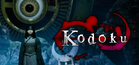
Kodoku is a single-player survival horror experience that challenges you to escape a monster-infested dimension. Urohoshi, a university folklore professor, sets out on a journey through a darkness-filled otherworld in search of his missing friend—gathering souls while evading grotesque monsters.
$7.907 user reviews
HorrorPsychological HorrorFaith
HirasakaMay 7, 2026