Scoring genre clarity...

Colony 37 capsule

Colony 37

Dig deep down the abandoned planet to find its secrets and earn cash by collecting resources. Spend your money on buying various trinkets and instruments that will help you along the way to earn even more profit.

$2.69Very Positive(24)
Dungeon CrawlerSandboxPvE
ValenSep 23, 2025

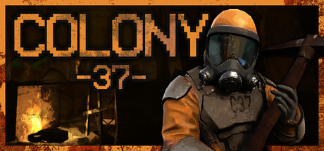
Colony 37 scores 60/100 — better than 0% of Steam capsules we've analysed (n=22,658).

Very Positive (24 reviews) · $2.69 · Released Sep 23, 2025 · By Valen

Quick text summary

Colony 37 scored 60/100 on Steam Analyzer — Solid for a Steam capsule. Top priority fix: [contrast_color] Darken and desaturate the cave background significantly behind the character to create strong value separation and make the orange suit silhouette read cleanly at tiny size.

Capsule scores by dimension

  • Genre Clarity: 6/10 — Survival explorer, unclear at tiny. The gas-masked figure in worn orange hazard gear holding what appears to be a tool, set against a dark cave-like environment, suggests post-apocalyptic survival or resource extraction gameplay. The 'C37' label on the suit reinforces a sci-fi colony setting. At tiny size the genre reads as survival or shooter but the resource-digging mechanic is not communicated visually.
  • Title Readability: 7/10 — Chunky pixel font reads well. The bold, blocky pixel-style 'COLONY' text in orange-tan on the upper left reads clearly at full size and holds up reasonably at small size due to its thick letterforms. The '-37-' subtitle is slightly smaller and lighter but still legible at small size. At tiny size 'COLONY' remains parseable while '-37-' becomes difficult to read, though the main title identity survives.
  • Contrast & Color: 6/10 — Warm tones blend into background. The orange hazard suit and warm-lit background share a similar value and hue range, causing the central character to partially blend into the cave environment in a mental grayscale test. The dark Steam background (#1b2838) does provide some edge separation for the overall capsule, but the interior contrast between subject and background is muddy. At small and tiny sizes the figure loses definition and becomes a warm blob against a warm background.
  • Uniqueness & Polish: 5/10 — Generic survival asset vibe. The rendered 3D character looks competent but feels like a generic post-apocalyptic asset without a distinctive artistic hook or memorable visual storytelling element. Compared to top-performing peers like Pacific Drive or Lethal Company which use strong compositional ideas to communicate their unique selling points, this capsule presents a standard character portrait without communicating the digging or resource-collection loop. The pixel-font title is a nice touch that adds personality but is undercut by the photorealistic background.
  • Brand Consistency: 6/10 — Hazard suit motif is recognizable. The C37-labeled orange hazard suit creates a recognizable identity anchor that ties the capsule to the game's colony theme. The warm earthy palette and cave setting are internally consistent. However the mixed rendering style between the pixel typography and photorealistic 3D character creates a slight tonal inconsistency that weakens a cohesive brand identity.
  • Composition: 6/10 — Right-heavy figure, title left. The layout places the title text in the upper left and the character figure on the right side, creating a basic but functional split composition. The character's head is reasonably centered vertically and avoids edge cropping. At small and tiny sizes the composition holds structurally but the lack of a strong focal separation between the figure and background means the subject does not pop as a clear dominant element, and the overall read becomes flat.

What works

  • Chunky pixel title font. The bold blocky 'COLONY' letterforms in orange hold legibility down to small size and add personality that differentiates the capsule from pure photorealistic peers.
  • Character label reinforces theme. The 'C37' stencil on the hazard suit ties the character directly to the game's title and builds a memorable identity anchor.
  • Clear subject placement. The figure is positioned to avoid edge cropping and the head falls in a readable upper-center zone that survives Steam's common crop ratios.

What hurts the capsule

  • Warm-on-warm contrast problem. The orange suit against the warm cave background collapses in grayscale, making the primary subject hard to distinguish at small and tiny sizes.
  • Genre mechanic not communicated. Nothing in the composition visually communicates the digging or resource-extraction loop that defines the game's core loop, missing a key discoverability opportunity.
  • Mixed rendering style inconsistency. The pixel-font title sits awkwardly against the photorealistic 3D character and environment, creating a tonal mismatch that undermines polish.
  • Background lacks depth separation. The cave interior behind the character has similar brightness and color to the foreground figure, flattening the composition and reducing silhouette clarity at tiny size.

Priority fixes

  1. [contrast_color] Darken and desaturate the cave background significantly behind the character to create strong value separation and make the orange suit silhouette read cleanly at tiny size.
  2. [genre_clarity] Add a secondary visual element such as a pickaxe, resource ore, or underground depth indicator to communicate the digging and resource-collection mechanic at a glance.
  3. [uniqueness_polish] Commit fully to either a pixel art style or photorealistic style across the entire capsule to eliminate the tonal mismatch and improve perceived polish.
  4. [composition] Add a subtle dark vignette or focused rim light around the character to create a clear foreground-background separation that survives the tiny thumbnail crop.

Store copy priority fixes

  1. [hook_strength] Rewrite the short description to open with the story mystery: 'Descend into the depths of an abandoned colony to uncover why it was left behind—and earn riches while you investigate.' This combines discovery with profit incentive.
  2. [uniqueness] Add a 1-2 sentence statement after the opening paragraph that explicitly differentiates the game: e.g., 'Unlike pure survival games, your progress is permanent through character upgrades—even failed runs advance your power.' or highlight the story-driven survival twist that sets it apart.
  3. [tone_match] Replace or supplement the bullet-list format with 1-2 sentences that evoke the mood of deep-mining exploration and peril, not just mechanical facts (e.g., 'Face radiation, suffocation, and crushing darkness the deeper you venture, but each discovery pushes you closer to the colony's dark secret.').

Related guides

Steam app ID: 3869630