Scoring genre clarity...

Hello Anxiety capsule

Hello Anxiety

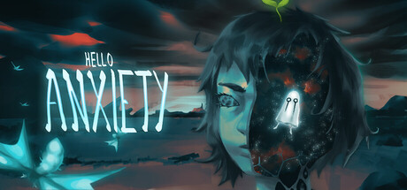
Hello Anxiety is a pixel art narrative puzzle RPG set in a surreal world shaped by mental health struggles. Navigate eerie bookstores, silent streets, and haunting memories as you explore the layers of anxiety and self-doubt in this emotional, story-driven experience.

$2.167 user reviews
RPGInteractive FictionPuzzle
Aleph EchoJan 22, 2026

Hello Anxiety scores 72/100 — better than 44% of Steam capsules we've analysed (n=22,659).

7 user reviews · $2.16 · Released Jan 22, 2026 · By Aleph Echo

Quick text summary

Hello Anxiety scored 72/100 on Steam Analyzer — Good for a Steam capsule. Top priority fix: [composition] Shift the character face slightly left and down to provide safe margins of at least 10% from top and right edges, ensuring the focal point remains fully visible across all Steam cropping contexts.

Capsule scores by dimension

  • Genre Clarity: 7/10 — Psychological narrative game evident. The split-face design with glitching/corrupted right half clearly signals psychological horror or mental health themes rather than action-oriented gameplay. The surreal, distorted character face and eerie atmospheric sky communicate narrative-driven indie rather than puzzle mechanics specifically, but the emotional weight reads at all sizes. At TINY size, the silhouette of the distorted face still registers as emotionally heavy and introspective.
  • Title Readability: 8/10 — Title clear at most sizes. HELLO ANXIETY uses a clean, high-contrast cyan/white typeface positioned in the left-center area against darker sky background. The text maintains legibility from FULL down to SMALL size with minimal degradation. At TINY size the letters compress but remain distinguishable, though 'HELLO' above 'ANXIETY' stacking adds minor complexity that slightly impacts ultra-small readability.
  • Contrast & Color: 8/10 — Strong value separation and saturation. The cyan title text pops distinctly against the dark teal-grey sky background with excellent luminosity separation. The warm orange/red glitch elements on the character face create visual contrast against cool blue tones, and the bright eye highlights read clearly even at reduced sizes. Grayscale test confirms strong value hierarchy between title, character, and background without muddy mid-tones.
  • Uniqueness & Polish: 7/10 — Distinctive visual hook, solid execution. The split-face corruption motif is a memorable and thematically appropriate visual metaphor for anxiety and mental fragmentation that feels intentional rather than decorative. The glitch effects and color grading show craft and coherent art direction. However, the overall composition leans on recognizable indie psychology-game tropes, preventing it from reaching the standout polish of top-tier comparable titles like DREDGE or Chants of Sennaar.
  • Brand Consistency: 6/10 — Thematic coherence, limited iconic identity. The capsule maintains internal consistency with the described pixel art and surreal mental health theme—the corrupted face, eerie atmosphere, and color palette all align with the game's emotional focus. However, without reference to the 8 store screenshots, there are no immediately recognizable recurring motifs, character designs, or signature visual elements that would create strong brand recognition across multiple touchpoints. The palette and effects are cohesive but not distinctly ownable.
  • Composition: 7/10 — Clear focal point, minor edge tension. The split-face character occupies the right half as the primary focal point, with the title anchoring the left side—creating balanced visual weight and clear hierarchy. The eye naturally follows from title to character face. At TINY size, the composition still reads as a unified piece. Minor weakness: the character extends close to the right edge and top, which may be clipped depending on Steam's cropping, and the left side has some dead space above HELLO that could be optimized for tighter balance.

What works

  • Thematically aligned visual metaphor. The split-corrupted face directly communicates the game's mental health and anxiety focus without generic imagery, immediately signaling emotional narrative weight.
  • Excellent color contrast against dark Steam background. Cyan text and orange glitch accents create strong luminosity separation that makes the capsule pop in quick scroll and maintains readability at small sizes.
  • Balanced composition with clear hierarchy. Title and character are positioned to guide the eye naturally across the image without scattered attention or competing focal points.

What hurts the capsule

  • Generic indie psychology-game aesthetic. While executed well, the split-face glitch and eerie atmosphere lean heavily on recognizable tropes seen in other mental health indie titles, limiting distinctiveness.
  • Character positioned dangerously close to edges. The right half of the face and top of the head sit near or at the cropping boundary, risking important visual elements being clipped on different Steam display contexts.
  • No clear recurring brand identity motif. The capsule is thematically coherent but lacks iconic character design, symbol, or palette hook that would be instantly recognizable across marketing materials.

Priority fixes

  1. [composition] Shift the character face slightly left and down to provide safe margins of at least 10% from top and right edges, ensuring the focal point remains fully visible across all Steam cropping contexts.
  2. [brand_consistency] Introduce or emphasize a recurring visual motif—such as a distinctive UI element, color signature, or character design detail—that can anchor brand recognition in future marketing materials.
  3. [uniqueness_polish] Layer additional subtle details into the background (e.g., architectural or symbolic elements from the game's surreal setting) to elevate the composition beyond standard psychological-horror tropes.

Store copy priority fixes

  1. [feature_communication] Replace 'surreal puzzles woven into metaphorical spaces' with a concrete example: 'Solve environment puzzles where a cluttered room represents racing thoughts, or navigate symbolically blocked paths that reflect self-doubt' to make gameplay tangible.
  2. [uniqueness] Add a differentiating sentence after the opening short description: 'Unlike traditional walking simulators, Hello Anxiety uses puzzle-solving as a metaphor for processing anxiety—each solution reveals emotional truths about the protagonist.'
  3. [feature_communication] Clarify the gameplay loop with specificity: add a sentence like 'Expect 2-3 hours of exploration, 15-20 environmental puzzles, and dialogue choices that shape your understanding of anxiety' to set expectations.
  4. [hook_strength] Rewrite the final paragraph from 'This is just the beginning' to 'Hello Anxiety is a complete, self-contained experience offering 2-3 hours of atmospheric storytelling—the first in a planned series exploring different mental health themes' to frame this as a full game rather than incomplete content.

Related guides

Steam app ID: 3876920