Scoring genre clarity...

The Birthday Boys capsule

The Birthday Boys

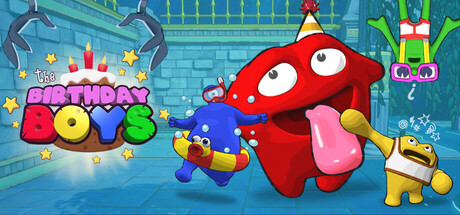
Hunt down a dastardly cake thief and destroy his minions using pebbles, bubbles, brute strength, or… your tongue? Play with up to four friends online in this absurd dungeon crawler where the only thing more dangerous than the enemies is your own party.

Hack and SlashDungeon CrawlerAction RPG
Juice Box GamesComing soon

The Birthday Boys scores 65/100 — better than 11% of Steam capsules we've analysed (n=22,658).

Released Coming soon · By Juice Box Games

Quick text summary

The Birthday Boys scored 65/100 on Steam Analyzer — Solid for a Steam capsule. Top priority fix: [composition] Simplify the right edge by removing or pulling back the hanging claw and secondary character so no key elements risk being cropped, giving the main red character more breathing room

Capsule scores by dimension

  • Genre Clarity: 6/10 — Casual party game implied. The colorful blob characters with party hats, birthday cake logo, and dungeon-like stone background hint at a lighthearted party-style game. At tiny size the birthday theme is visible but the dungeon crawler RPG aspect is lost entirely, leaning more toward casual or kids' game. The tongue-extending red character adds some action flavor but genre remains ambiguous between casual platformer and party brawler.
  • Title Readability: 7/10 — Readable at full, weak at tiny. The hand-drawn birthday cake logo with 'The Birthday Boys' text in a bubbly font is clearly legible at full header size, supported by a warm yellow outline and star accents. At small and tiny sizes the multi-word stacked layout and decorative letterforms cause the individual letters to blur together, making it harder to parse quickly. The birthday cake icon above the text actually helps anchor recognition even when the words collapse.
  • Contrast & Color: 7/10 — Vibrant characters pop well. The saturated primary-color characters — bold red, blue, and yellow — contrast well against the muted teal-grey dungeon stone background, creating decent silhouette separation. In a grayscale mental test the large red center character still reads clearly as the focal point. However the right-side yellow character blends somewhat into the lighter background areas at tiny size, and the overall mid-tone background doesn't create as strong a dark contrast against the Steam #1b2838 interface as a darker vignette would.
  • Uniqueness & Polish: 6/10 — Charming but somewhat generic. The rounded blob character designs are appealing and the birthday party theme applied to a dungeon crawler is a fun concept, but the visual execution feels like a competent indie title rather than a standout capsule. The art style is clean with consistent cartoon rendering, though the composition of characters simply standing in a line with the logo is a fairly common template approach. Compared to top-performing capsules in this genre space the energy and visual storytelling of the core mechanic is not strongly communicated.
  • Brand Consistency: 7/10 — Cohesive cartoon style throughout. The rounded blob character designs, bubbly logo font, star accents, and birthday cake motif create a recognizable internal identity that would likely carry across screenshots and store page assets. The warm yellow-orange logo palette contrasts nicely with the cool stone dungeon environment, reinforcing the absurdist birthday-meets-dungeon theme. The art direction feels unified and the character designs are distinctive enough to be recognizable across marketing materials.
  • Composition: 6/10 — Centered but slightly crowded. The large red character dominates the center-right and serves as a clear focal point, while the logo sits upper-left in a reasonable position with readable negative space. However the right edge has characters and UI elements hugging dangerously close to the crop boundary, and the hanging claw element in the top center adds clutter without clear purpose. At small and tiny sizes the multiple characters of similar visual weight compete for attention rather than creating a clear single-subject read.

What works

  • Bold character silhouettes. The primary red blob character is large enough and saturated enough to read as a clear focal point even at small capsule sizes.
  • Thematically distinctive concept. The birthday party aesthetic applied to a dungeon setting is immediately memorable and communicates the absurdist tone of the game.
  • Logo anchored by icon. The birthday cake icon above the title text helps the logo remain recognizable even when the letterforms become harder to read at tiny sizes.
  • Cohesive color palette. Warm logo colors against cool stone background creates a consistent and visually appealing tonal contrast throughout the image.

What hurts the capsule

  • Edge-hugging right side characters. The yellow character and hanging decorative elements on the right edge risk being cropped and add visual noise without contributing to the focal hierarchy.
  • Genre ambiguity at tiny size. At 120x45 the dungeon crawler RPG aspect disappears entirely and the image reads as a generic casual or kids' party game, potentially missing the core audience.
  • Multi-character lineup lacks drama. Characters standing in a row is a common template composition that misses an opportunity to show the absurd action and party dynamic described in the game.
  • Background lacks depth contrast. The mid-tone stone background does not create a strong dark anchor, reducing the overall pop against the Steam dark UI especially in quick scroll conditions.

Priority fixes

  1. [composition] Simplify the right edge by removing or pulling back the hanging claw and secondary character so no key elements risk being cropped, giving the main red character more breathing room
  2. [genre_clarity] Add a visual action beat — such as the red character using its tongue to grab an enemy or showing dungeon loot — to communicate the dungeon crawler mechanic at a glance rather than a static lineup
  3. [contrast_color] Darken the background with a stronger vignette or deeper stone shadow to increase separation between the characters and the Steam dark UI background in quick scroll
  4. [title_readability] Add a slightly thicker or higher-contrast drop shadow or outline to the title text so it remains legible as a unit at small and tiny sizes

Store copy priority fixes

  1. [feature_communication] Remove the duplicate opening paragraph from the detailed description and replace it with a second paragraph that explains progression systems (leveling, ability unlocks, loot rarity tiers) in more detail.
  2. [hook_strength] Expand the short description to explicitly mention that players can attack with unconventional weapons (tongue, bubbles, pebbles) upfront to reinforce the game's comedic uniqueness, not just the cake theft.
  3. [audience_targeting] Add a sentence after the solo-play mention that explains how solo difficulty or pacing differs, so single-player fans know whether this game works for them.
  4. [uniqueness] Add one sentence comparing the game's absurdist tone and character roster to nearby competitors, or clarify what makes the combat system distinct beyond character roles.

Related guides

Steam app ID: 3892530