Scoring genre clarity...

Sniperbot: The Hype Game capsule

Sniperbot: The Hype Game

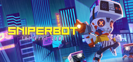
SNIPERBOT: THE HYPE GAME is a retro styled action platformer where the player traverses through the cybertech world of Meta Metro where Hypebeasts run wild, clout is currency and the only way to survive is attacking your enemies and fighting boss battles with a blaster and sword.

ActionPlatformer3D Platformer
RLUX StudiosTo be announced

Sniperbot: The Hype Game scores 68/100 — better than 19% of Steam capsules we've analysed (n=22,659).

Released To be announced · By RLUX Studios

Quick text summary

Sniperbot: The Hype Game scored 68/100 on Steam Analyzer — Solid for a Steam capsule. Top priority fix: [title_readability] Remove or significantly enlarge THE HYPE GAME tagline, or integrate it into the main logo lockup so it does not read as unresolved clutter at small sizes.

Capsule scores by dimension

  • Genre Clarity: 7/10 — Action platformer reads clearly. The dynamic leaping robot character in a neon cyberpunk cityscape strongly implies action and movement, with visible combat-ready posture suggesting a platformer or brawler. The retro-gaming aesthetic of the robot head (NES controller-style design) and neon signage reinforce the cybertech theme well. At tiny size the action genre still reads from the character pose, though platformer versus shooter is harder to distinguish.
  • Title Readability: 7/10 — Title bold but tagline collapses. SNIPERBOT uses a chunky yellow outlined font with strong contrast that holds up at small size, placed on a relatively controlled dark-blue left region. The subtitle THE HYPE GAME is noticeably smaller and in a thinner white font that becomes completely unreadable at tiny size. At full header size the main title is clear, but the tagline adds noise without contributing legibility.
  • Contrast & Color: 7/10 — Neon palette pops on Steam dark. The warm yellow-orange title and the bright character silhouette create reasonable separation against the cool blue-purple cityscape background, which itself sits well against Steam's #1b2838 dark background. The character's white and orange color blocking gives decent silhouette separation in grayscale, though the busy neon background signage introduces some mid-tone clutter that competes at small sizes. The blue rain and cyan neon elements add depth but slightly muddy the overall value hierarchy.
  • Uniqueness & Polish: 6/10 — Fun concept, slightly generic execution. The NES-controller robot head is a genuinely distinctive character design that communicates the retro-cyber hook well and differentiates from standard cyberpunk imagery. However the overall composition and neon-drenched city backdrop feels familiar within the indie action genre, and the craft level of the background painting reads slightly below premium indie benchmarks like Hades II or Sea of Stars. The concept is interesting but the execution doesn't fully elevate it to memorable standout territory.
  • Brand Consistency: 7/10 — Cohesive retro-cyber identity. The palette of neon cyan, warm orange, and deep purple-blue is applied consistently across the character, environment, and title typography, creating a recognizable internal visual language. The NES-controller robot head is a strong signature motif that could become iconic and recognizable across store assets. The retro gaming meets cyberpunk aesthetic is clearly intentional and carried through without major stylistic contradictions.
  • Composition: 7/10 — Dynamic pose, decent hierarchy. The leaping character occupies the right-center focal point with the title anchored to the upper-left, creating a natural left-to-right reading flow that works at full header size. The character's dynamic upward kick pose draws the eye effectively and the background recedes with appropriate depth layering of foreground figure, mid cityscape, and distant neon skyline. At small size the title and character compete more equally and the busy background neon signs start to flatten the image, slightly reducing the clear single focal point the design needs at thumbnail scale.

What works

  • Distinctive character design. The NES-controller robot head is a memorable and original motif that immediately signals the retro-cyber concept and sets it apart from generic cyberpunk entries.
  • Strong title contrast at full size. The chunky yellow outlined SNIPERBOT wordmark sits on a controlled darker region and remains legible down to small capsule size.
  • Palette cohesion. Neon cyan, warm orange, and deep purple-blue are applied consistently across character, environment, and type, creating a visually unified identity.
  • Action genre readable at small size. The character's dynamic leaping kick pose communicates action and energy even when the image is reduced to thumbnail dimensions.

What hurts the capsule

  • Tagline completely unreadable at tiny size. THE HYPE GAME in thin white text is too small and low-contrast to survive reduction to 120x45 and adds visual noise without payoff.
  • Busy background competes with focal point. The dense neon signage and rain effects in the cityscape mid-ground flatten value separation at small sizes and dilute the character silhouette.
  • Background craft below genre benchmarks. The painted city backdrop reads slightly rough compared to top-performing indie capsules, reducing the perceived premium quality of the overall image.
  • Character silhouette merges with background at tiny size. The white and orange robot partially blends into the lighter neon-lit building faces at thumbnail scale, reducing the clean pop needed for quick-scroll visibility.

Priority fixes

  1. [title_readability] Remove or significantly enlarge THE HYPE GAME tagline, or integrate it into the main logo lockup so it does not read as unresolved clutter at small sizes.
  2. [contrast_color] Darken the mid-ground cityscape values and reduce the brightness of background neon signs to create stronger foreground-background separation and a cleaner character silhouette in grayscale.
  3. [composition] Add a subtle dark vignette or drop shadow halo around the character to ensure the robot silhouette pops cleanly against the background at tiny thumbnail size.
  4. [uniqueness_polish] Refine the background painting quality with sharper depth-of-field blurring on the far city elements to push the character forward and elevate the overall perceived production value.

Store copy priority fixes

  1. [hook_strength] Rewrite the short description opening to lead with an action verb and immediate payoff—e.g., 'Dual-wield a blaster and sword to fight your way through a hip-hop-fueled cybertech metropolis overrun by Hypebeasts' to grab attention before introducing the setting.
  2. [audience_targeting] Add a sentence in the detailed description that explicitly addresses player type—e.g., 'Perfect for retro action fans seeking challenge-based gameplay and stylish combat, or newcomers wanting accessible, skill-rewarding action without time pressure.'
  3. [feature_communication] Clarify the replayability hook by specifying whether 'secret paths' and 'build variety' come from multiple loadout combinations with Beast Modes, hidden collectibles, or level design shortcuts that reward exploration.
  4. [uniqueness] Add a direct comparison or ownership statement in the opening that emphasizes the hipbeast-culture angle as a defining first—e.g., 'The only action platformer where sneaker culture and 80s/90s Hip-Hop are not just flavor; they are the core world and reward loop.'

Related guides

Steam app ID: 3897100