Scoring genre clarity...

Letherfall capsule

Letherfall

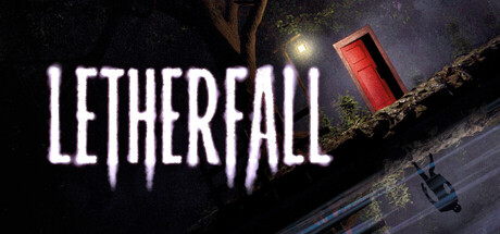
Letherfall is a first-person horror video game with Lovecraftian elements: the player must make their way through monstrous entities and intricate puzzles while exploring the abandoned village of Letherfall. Some nightmares don’t fade. They’re just waiting for you to open the wrong door.

Free to PlayVery Positive(91)
HorrorPsychological HorrorSurvival Horror
Mnemonic Monkey StudioDec 19, 2025

Letherfall scores 70/100 — better than 30% of Steam capsules we've analysed (n=22,658).

Very Positive (91 reviews) · Free to Play · Released Dec 19, 2025 · By Mnemonic Monkey Studio

Quick text summary

Letherfall scored 70/100 on Steam Analyzer — Good for a Steam capsule. Top priority fix: [uniqueness_polish] Introduce a distinctive visual hook—such as a memorable character silhouette, game-specific UI element, or unique artifact design—that signals Letherfall's specific identity rather than generic horror.

Capsule scores by dimension

  • Genre Clarity: 7/10 — Horror atmosphere clearly communicated. The dark nocturnal setting, eerie tree silhouettes, floating red monolith, and dim lighting unmistakably signal horror/mystery genre. The Lovecraftian tone is suggested through the unsettling imagery and abandoned atmosphere, though at tiny size the specific 'first-person puzzle horror' subgenre is less distinct—it reads as generic dark horror rather than action-puzzle hybrid.
  • Title Readability: 8/10 — Strong readable title with atmospheric styling. The title 'LETHERFALL' in bold white sans-serif letterforms reads clearly at all sizes including tiny, with intentional dripping effect that reinforces horror tone without compromising legibility. The placement in upper-left quadrant on a dark sky region maximizes contrast and readability, and the text does not collapse when scaled down to 120x45px.
  • Contrast & Color: 8/10 — Strong value separation and silhouette clarity. The bright white title contrasts sharply against the dark sky background, and the red monolith pops clearly against the murky environment. The overall scene uses strong dark-to-light separation with the luminous sky and focal red object creating immediate visual hierarchy that survives squinting and grayscale conversion; silhouettes remain distinct.
  • Uniqueness & Polish: 6/10 — Competent horror setup with limited distinctiveness. The composition is well-executed and atmospheric, but the core elements—nighttime forest, glowing red object, eerie lighting—are familiar tropes in indie horror marketing. The dripping text effect is a standard horror cliché rather than a distinctive visual hook. While polished, it lacks a memorable unique selling point that differentiates Letherfall from other atmospheric horror titles.
  • Brand Consistency: 6/10 — Coherent but generic horror brand identity. The visual language is internally consistent with a dark, mysterious Lovecraftian aesthetic, and the color palette (blacks, grays, reds, warm glow) is cohesive. However, there are no distinctive identity cues—no iconic character, symbol, or signature visual motif that would make this recognizable as Letherfall specifically versus any other indie horror game with similar theming.
  • Composition: 7/10 — Clear focal point with good depth layering. The red monolith creates a strong primary focal point center-right, with atmospheric background elements (tree, sky, water) providing depth and context. The title occupies upper-left without blocking key imagery, and the composition uses the full frame effectively. At small and tiny sizes, the focal hierarchy reads clearly, though the floating figure at bottom-right introduces slight secondary competition that is not fully necessary.

What works

  • Title legibility at all scales. The bold white 'LETHERFALL' with clear letterforms maintains readability from full header down to 120x45px thumbnail without losing impact.
  • Strong atmospheric mood and tone. The nocturnal forest setting, red floating object, and moody lighting immediately communicate horror/mystery genre and Lovecraftian unease.
  • Effective contrast against Steam dark background. White title and red monolith create distinct value separation that pops against the #1b2838 background in quick-scroll scenarios.

What hurts the capsule

  • Generic horror visual tropes. The dark forest, glowing red artifact, and eerie lighting are familiar indie horror clichés that do not differentiate Letherfall from competitors like DREDGE or Lethal Company.
  • No iconic brand identity signal. The capsule lacks a memorable character, symbol, or distinctive visual motif that would allow recognition of Letherfall specifically in a genre catalog.
  • Secondary focal point distraction. The small floating figure at bottom-right creates visual noise that competes slightly with the strong red monolith focal point without adding narrative clarity.

Priority fixes

  1. [uniqueness_polish] Introduce a distinctive visual hook—such as a memorable character silhouette, game-specific UI element, or unique artifact design—that signals Letherfall's specific identity rather than generic horror.
  2. [brand_consistency] Develop a recognizable motif or symbolic element (e.g., a specific monster type, puzzle geometry, or location landmark) that appears consistently in marketing to build brand recall across store screenshots.
  3. [composition] Consider removing or de-emphasizing the small floating figure at bottom-right to strengthen focus on the red monolith as the singular clear primary subject.

Store copy priority fixes

  1. [feature_communication] Add a concrete gameplay section after the narrative setup: 'Gameplay: Solve environmental puzzles, navigate encounters with supernatural entities, piece together fragmented memories, manage sanity/fear mechanics.' This grounds the narrative in actual player activity.
  2. [feature_communication] Clarify the survival loop with one sentence: 'Do you hide, flee, or confront the entities? Your choices determine whether Dylan escapes, uncovers the truth, or succumbs to madness.' This answers 'what do I actually do?'
  3. [hook_strength] Add a sentence in the short description acknowledging free-to-play status or core value proposition: 'Letherfall is a first-person horror game... completely free to play' to eliminate price-shock confusion.
  4. [uniqueness] Strengthen the closing tagline by anchoring it to a mechanic or consequence: Change 'no one gets out' to something like 'no one gets out unchanged—or gets out at all' to hint at branching outcomes and raise stakes.

Related guides

Steam app ID: 3908270