Scoring genre clarity...

Yuki「清醒梦」 capsule

Yuki「清醒梦」

Explore an abandoned school where memories linger longer than the living. Uncover the mystery of your best friend’s disappearance. Dodge bullets.

Free to PlayVery Positive(23)
Psychological HorrorAdventureBullet Hell
visualmemoryunit_Oct 24, 2025

Yuki「清醒梦」 scores 73/100 — better than 66% of Psychological Horror capsules (n=2,167).

Very Positive (23 reviews) · Free to Play · Released Oct 24, 2025 · By visualmemoryunit_

Quick text summary

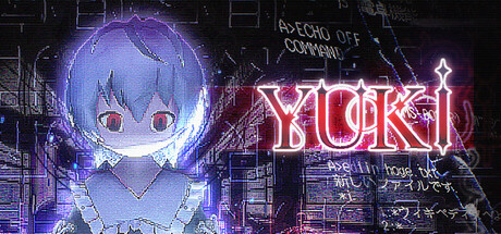
Yuki「清醒梦」 scored 73/100 on Steam Analyzer — Good for a Psychological Horror capsule. Top priority fix: [genre_clarity] Add a subtle visual hint of the bullet-dodging mechanic—such as trajectory lines, a weapon silhouette, or danger-zone geometry—to differentiate from pure visual novel expectations.

Capsule scores by dimension

  • Genre Clarity: 7/10 — Anime adventure with supernatural tension. The large pale anime character face with glowing eyes signals visual novel or supernatural adventure, supported by neon text and cyberpunk-tinged UI elements suggesting a mystery game. At tiny size the character silhouette remains readable but genre messaging becomes ambiguous—could be dating sim, horror, or narrative adventure without the full context. The neon aesthetic hints at puzzle or exploration gameplay but doesn't clearly communicate the bullet-dodging mechanic mentioned in the description.
  • Title Readability: 8/10 — Bold neon title reads well at all sizes. The large YUKI logo in bright neon pink-purple stands out sharply against the dark background with strong contrast and clean letterforms. At small and tiny sizes the main title remains legible, though the smaller Japanese text and subtitle below become unreadable and fade into the composition. Strategic placement in the upper-right portion keeps it away from the dominant character and ensures it survives small-size rendering.
  • Contrast & Color: 8/10 — Strong neon separation with clear silhouettes. The bright blue-white character face and purple-pink neon title elements create excellent value separation against the dark #1b2838 background, with the glowing effect adding luminosity that reads even when squinting. The character's pale skin tone and large eyes form a distinct silhouette that stands out at tiny size. Background details (buildings, UI elements) remain dark and recessive, keeping focus on the primary subject without muddy mid-tones.
  • Uniqueness & Polish: 7/10 — Polished anime aesthetic with style-specific appeal. The capsule demonstrates clean execution of the anime visual novel aesthetic with intentional neon color grading, atmospheric glows, and a cohesive cyberpunk-meets-supernatural tone that feels intentional rather than generic. The character rendering and lighting show craft and premium finish compared to template-based capsules. However, the visual story still relies on recognizable anime tropes (glowing-eyed character, neon text) rather than communicating a unique gameplay hook or core mechanic specific to this title's bullet-dodging school mystery angle.
  • Brand Consistency: 7/10 — Consistent visual identity with signature palette. The capsule establishes a distinctive brand through consistent use of purple-blue-pink neon color grading, glowing soft-focus character rendering, and cyberpunk UI overlays that create a recognizable identity. The anime art style and atmospheric tone appear intentionally crafted and memorable. Without access to the 6 store screenshots, internal cohesion appears strong—the neon aesthetic, character rendering quality, and overall mood feel unified—though whether this translates to a recognizable franchise or series marker cannot be fully assessed.
  • Composition: 7/10 — Clear hierarchy with dominant focal point. The large character face dominates the left-center area as the primary focal point with strong size and luminosity, while the neon title anchors the upper-right in a supporting role creating natural eye flow. Depth is established through background buildings and particle effects that recede behind the character. At tiny size the composition still reads clearly, though some background detail becomes noise; the character and title remain the only legible elements, which serves the design well.

What works

  • Neon title contrast. The bright pink-purple YUKI logo pops sharply against the dark background and remains readable at tiny sizes with clean, bold letterforms.
  • Character silhouette clarity. The pale blue-white anime face with glowing eyes creates a strong, recognizable silhouette that anchors the composition and reads well when reduced to thumbnail size.
  • Atmospheric cohesion. The neon color grading, soft glows, and cyberpunk aesthetic create a unified mood that feels intentional and premium rather than assembled from generic parts.

What hurts the capsule

  • Gameplay mechanic invisibility. The bullet-dodging core mechanic is completely absent from the visual language—nothing suggests action, evasion, or danger, making the capsule feel like a visual novel despite the action gameplay.
  • Unreadable Japanese subtitle. The smaller Japanese text below the main title becomes illegible at small and tiny sizes, wasting valuable real estate and creating visual clutter without payoff.
  • Limited visual storytelling. The composition relies on anime character appeal and aesthetic mood rather than communicating why this specific mystery or school setting is unique compared to other narrative adventures.

Priority fixes

  1. [genre_clarity] Add a subtle visual hint of the bullet-dodging mechanic—such as trajectory lines, a weapon silhouette, or danger-zone geometry—to differentiate from pure visual novel expectations.
  2. [title_readability] Remove or significantly enlarge the Japanese subtitle text, or relocate it to a position where it won't compete with the main title at small sizes.
  3. [uniqueness_polish] Incorporate a distinctive visual element (character pose, environment detail, or UI motif) that communicates the school mystery and abandoned-world theme more directly than generic neon aesthetics alone.

Store copy priority fixes

  1. [feature_communication] Replace one of the redundant 'demons are memories' passages with a concrete explanation of how the chatroom mechanic works and what players do with the information gathered—does it unlock dialogue branches, reveal spirit weaknesses, or unlock new areas?
  2. [uniqueness] Add a sentence explicitly differentiating the combat from standard bullet hells, e.g., 'Unlike pure bullet hells, your success depends on understanding each spirit's tragic backstory, forcing you to choose mercy or confrontation.'
  3. [feature_communication] Consolidate the technical features (3D exploration, puzzle-solving, NPC interaction) into a single clear bullet point rather than burying them in the final paragraph to improve scanability.

Related guides

Steam app ID: 3909220 · Tags: Psychological Horror, Adventure, Bullet Hell, Mystery, Visual Novel