Scoring genre clarity...

Brick Layer capsule

Brick Layer

BrickLayer is an atmospheric brick building game designed to allow players to be fully immersed while creating their wildest dreams.

$7.003 user reviews
Casual3DBuilding
ZombieguyJan 29, 2026

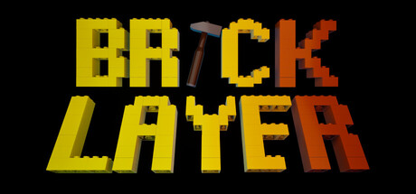
Brick Layer scores 73/100 — better than 54% of Casual capsules (n=10,153).

3 user reviews · $7.00 · Released Jan 29, 2026 · By Zombieguy

Quick text summary

Brick Layer scored 73/100 on Steam Analyzer — Good for a Casual capsule. Top priority fix: [uniqueness_polish] Integrate a distinctive visual element or unique game mechanic cue (e.g., a signature creation tool, iconic build result, or character mascot) that conveys what makes this builder special beyond generic pixel aesthetics.

Capsule scores by dimension

  • Genre Clarity: 7/10 — Building game signaled by hammer icon. The pixelated hammer embedded in the title text immediately communicates a crafting or building mechanic. The blocky yellow and orange aesthetic reinforces a construction theme with voxel-style visuals typical of building games. At tiny size, the hammer remains visible as a key identifier, though the specific subgenre (creative builder vs. puzzle) is slightly ambiguous without additional context.
  • Title Readability: 8/10 — Bold pixel typography, excellent contrast. The title uses a strong blocky pixel font in bright yellow and orange against solid black background, ensuring excellent legibility at all sizes. The hammer icon integrates cleanly into the word BRICK without disrupting letterforms. Even at tiny size, the chunky letterforms and value separation hold up well, though the two-line split may compress slightly on very small thumbnails.
  • Contrast & Color: 9/10 — Exceptional value separation, high pop. Bright yellow-to-orange gradient text creates strong luminous contrast against the black background, standing out immediately in quick scroll. The saturated warm tones provide both color and value separation that works excellently in grayscale. Silhouette definition is sharp and clean, with no blending or muddy midtones; the entire composition reads crisply at all viewing scales including tiny thumbnail.
  • Uniqueness & Polish: 6/10 — Competent but thematically straightforward. The pixel-art aesthetic and hammer-in-text integration show intentional craft, but the overall visual presentation follows familiar indie game conventions without a distinctive memorable hook. The color palette and design approach are functional and appropriate for a building game, yet lack a unique visual storytelling element or signature visual motif that would distinguish it from other builder titles.
  • Brand Consistency: 6/10 — Cohesive pixel style, limited identity depth. The blocky yellow-orange pixel aesthetic is internally consistent and aligns with a building game identity, but without reference to game screenshots, there is no distinctive character, icon, or visual signature that would make this recognizable as BRICK LAYER specifically rather than a generic pixel builder. The hammer motif is the strongest identity cue, but it is relatively common in the genre.
  • Composition: 8/10 — Well-balanced, clear focal point. The title dominates the center with excellent hierarchy and no competing elements. The two-line text layout is balanced vertically, and the hammer icon provides a focal point within the word BRICK without cluttering. Safe margins are maintained, and the composition is resilient to cropping across small and tiny sizes; the centered stacked layout ensures no critical elements are lost at edges.

What works

  • Excellent color-value contrast. The bright yellow-orange gradient pops powerfully against black, with sharp silhouettes that remain crisp even at tiny thumbnail sizes.
  • Strong readable typography. The blocky pixel font is legible and intentional, with the integrated hammer icon enhancing rather than compromising letterform clarity.
  • Clear genre signaling. The hammer icon and blocky construction aesthetic immediately communicate a building game mechanic to potential players.

What hurts the capsule

  • Generic visual identity. The pixel art style and color palette, while competent, lack a distinctive memorable signature or unique visual hook that differentiates it from other indie builders.
  • Limited brand storytelling. The capsule communicates 'building game' but does not convey what makes BRICK LAYER's creative experience unique or why it stands out from competitors.
  • No character or motif anchor. Unlike top performers like DAVE THE DIVER or Hades II, there is no iconic character, creature, or visual symbol that would create lasting brand recognition.

Priority fixes

  1. [uniqueness_polish] Integrate a distinctive visual element or unique game mechanic cue (e.g., a signature creation tool, iconic build result, or character mascot) that conveys what makes this builder special beyond generic pixel aesthetics.
  2. [brand_consistency] Reference game screenshots to identify and amplify a signature visual motif or unique color accent that creates instant brand recognition and differentiates from competitors.
  3. [composition] Consider adding a subtle background element or atmospheric detail that hints at creative possibilities (e.g., a shadow of a constructed creation or voxel landscape) without cluttering the bold title focus.

Store copy priority fixes

  1. [hook_strength] Rewrite the short description to lead with a concrete action verb and specific emotional outcome: e.g., 'Build tranquil worlds brick by brick with no pressure—just you, dynamic weather, and infinite terrain to shape.' This is more specific and evocative than 'create wildest dreams.'
  2. [uniqueness] Add a differentiation sentence after the opening paragraph: e.g., 'Unlike traditional sandbox games, BrickLayer prioritizes atmosphere over progression, with emissive bricks, real-time weather, and day/night cycles that make your creations feel alive.' This clarifies what sets it apart.
  3. [feature_communication] After the feature list, add 1-2 sentences that bridge features to experience: e.g., 'Watch your creations transform under dynamic auroras and storms. Explore at your own pace across infinite worlds, pausing time whenever you need to perfect each detail.' This shows *why* features matter.
  4. [audience_targeting] Add a sentence signaling intended audience: e.g., 'Perfect for creative builders, artists, and anyone seeking a meditative, no-pressure building experience.' This helps the right players self-identify immediately.

Related guides

Steam app ID: 3909510 · Tags: Casual, 3D, Building, Controller, Singleplayer