Scoring genre clarity...

Monolith: Rogue TD capsule

Monolith: Rogue TD

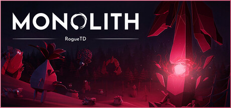
You are the Monolith - an unbreakable force crashing from the sky, spreading corruption across countless worlds in this roguelike tower defense game with deckbuilding mechanics. Defend your core against those who resist and meet each world’s unique challenges.

Tower DefenseRoguelikeDeckbuilding
Progress_CheckComing soon

Monolith: Rogue TD scores 73/100 — better than 56% of Steam capsules we've analysed (n=22,658).

Released Coming soon · By Progress_Check

Quick text summary

Monolith: Rogue TD scored 73/100 on Steam Analyzer — Good for a Steam capsule. Top priority fix: [genre_clarity] Replace or supplement the 'JOIN THE PLAYTEST' CTA with a visual gameplay element such as tower silhouettes, enemy waves, or card motifs to communicate the TD and deckbuilding genre at a glance

Capsule scores by dimension

  • Genre Clarity: 6/10 — Atmospheric but genre ambiguous. The glowing monolith structure against a dark alien landscape communicates a sci-fi or dark fantasy setting clearly, but tower defense or roguelike mechanics are not visually implied at any size. The 'RogueTD' subtitle provides a text cue but it is unreadable at tiny size, leaving genre inference dependent on the title alone. At tiny size this reads as a sci-fi atmospheric game, possibly survival or exploration, not clearly strategy or TD.
  • Title Readability: 8/10 — Bold title reads well at small. MONOLITH uses a clean, wide bold sans-serif with strong contrast against the dark background on the left side, making it highly legible at small size. The subtitle 'RogueTD' in smaller tracking below is readable at full size but collapses to near-illegible at tiny size. The 'JOIN THE PLAYTEST' CTA banner is large and legible at small size but takes up real estate that could serve genre communication.
  • Contrast & Color: 8/10 — Strong dark-red palette pops well. The deep dark blue-black background creates strong separation for the white title text and the glowing red-magenta monolith structure, which acts as the primary light source and focal anchor. The warm crimson glow against the cold dark environment creates solid value contrast that holds in grayscale and against Steam's #1b2838 background. At tiny size the red glow remains a visible beacon, though fine environmental detail is lost.
  • Uniqueness & Polish: 7/10 — Polished atmosphere, generic TD hook. The art direction is clean and deliberately moody, with high production value visible in the lighting and environmental design around the cracked monolith. However the visual concept of a glowing structure on an alien surface is a common sci-fi trope and does not communicate a unique selling point like the deckbuilding or roguelike corruption mechanics. The 'JOIN THE PLAYTEST' banner slightly cheapens the premium feel and distracts from the atmospheric core identity.
  • Brand Consistency: 8/10 — Coherent dark sci-fi identity. The deep crimson and dark navy palette, the iconic monolith silhouette, and the atmospheric lighting create a recognizable and self-consistent visual identity that would be reproducible across promotional materials. The word 'MONOLITH' paired with the glowing obelisk motif forms a memorable pairing that functions as a brand anchor. The composition style and color palette feel internally cohesive and distinct enough within the roguelike TD subgenre to aid later recognition.
  • Composition: 7/10 — Clear focal point, CTA crowds layout. The monolith is well-positioned in the right-center area with the title anchored to the upper-left, creating a natural left-to-right read order across the header. However the 'JOIN THE PLAYTEST' button introduces a third competing element that breaks the two-point hierarchy and pulls eye movement downward in an unfocused way at small sizes. At tiny size the composition reduces to a dark background with a glowing red shape, which is serviceable but the text hierarchy is largely lost.

What works

  • Strong title legibility. The bold white MONOLITH logotype against the dark background reads clearly even at small capsule sizes due to high contrast and clean letterforms.
  • Memorable monolith motif. The glowing red obelisk silhouette acts as a recognizable brand anchor that creates a distinctive visual signature across sizes.
  • Effective color contrast. The warm crimson glow against the cool dark environment creates strong value separation that holds in grayscale and against Steam's dark interface.
  • Cohesive atmospheric art direction. The lighting, palette, and environment feel intentional and polished, elevating perceived production quality above typical indie TD capsules.

What hurts the capsule

  • Playtest CTA disrupts hierarchy. The 'JOIN THE PLAYTEST' button banner competes with the title and monolith as a third focal element, making the layout feel like a promotional banner rather than a product identity capsule.
  • Genre mechanics invisible at tiny size. Nothing in the visual communicates tower defense, deckbuilding, or roguelike gameplay even at full size, relying entirely on the unreadable 'RogueTD' subtitle.
  • RogueTD subtitle collapses at small size. The secondary 'RogueTD' text beneath the title becomes unreadable at small and tiny sizes, removing the only genre text cue available.
  • Sparse mid and foreground storytelling. The environment has minimal detail suggesting gameplay or scale, missing an opportunity to hint at the corruption spreading mechanic or defensive structures that would differentiate it from a generic sci-fi scene.

Priority fixes

  1. [genre_clarity] Replace or supplement the 'JOIN THE PLAYTEST' CTA with a visual gameplay element such as tower silhouettes, enemy waves, or card motifs to communicate the TD and deckbuilding genre at a glance
  2. [title_readability] Increase the size and weight of the 'RogueTD' subtitle so it remains readable at 231x87, or integrate the genre cue directly into the logo lockup with a stronger visual treatment
  3. [uniqueness_polish] Remove the playtest banner from the primary capsule art or reduce it to a small badge to preserve the premium atmospheric identity and keep composition focused
  4. [composition] Introduce a foreground element such as a small defensive structure or corrupted terrain detail to create depth layering and communicate the game's core mechanic within the visual hierarchy

Store copy priority fixes

  1. [feature_communication] After 'build your own deck of upgrades,' add a concrete example: 'e.g., enhance tower attack speed, increase core health, unlock new tower types' to clarify deck impact on strategy.
  2. [uniqueness] Rewrite the deckbuilding paragraph to explicitly state what makes this deckbuilding system distinct: 'Unlike standard tower defense, your deck choices permanently shape which towers and upgrades you can deploy each world, forcing strategic specialization.'
  3. [feature_communication] Replace 'Face off against defiant bosses that will be deployed to slow your corruption' with a specific boss mechanic: 'Each world's boss has unique abilities—some summon reinforcements, others block tower placement—forcing adaptive strategies.'
  4. [hook_strength] Expand the short description to hint at roguelike progression: 'You are the Monolith... spread corruption across procedurally generated worlds, and build a unique deck of upgrades with each run to become unstoppable.'

Related guides

Steam app ID: 3913970