Scoring genre clarity...

Even20: The Interference of Parallels capsule

Even20: The Interference of Parallels

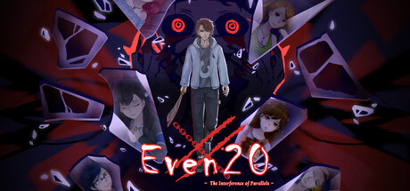
Two souls are drawn into a mysterious otherworld—and torn apart. In a realm filled with danger and restless spirits, each searches for the other while uncovering hidden truths. A suspenseful multi-ending adventure where every choice shapes their fate.

$6.99Positive(32)
RPGAdventureHorror
SilverEyesNov 24, 2025

Even20: The Interference of Parallels scores 75/100 — better than 74% of RPG capsules (n=3,544).

Positive (32 reviews) · $6.99 · Released Nov 24, 2025 · By SilverEyes

Quick text summary

Even20: The Interference of Parallels scored 75/100 on Steam Analyzer — Good for a RPG capsule. Top priority fix: [title_readability] Remove or significantly simplify the subtitle tagline to ensure the core title 'Even20' remains the sole readable element at small and tiny sizes, improving clarity during quick scroll.

Capsule scores by dimension

  • Genre Clarity: 7/10 — Mystery adventure with supernatural undertones clear. The central character in formal attire surrounded by fragmented figures and glowing red geometric shapes suggests psychological mystery and otherworldly danger. At tiny size, the red accents and ghostly silhouettes communicate a supernatural narrative adventure, though the exact genre remains slightly ambiguous between mystery, psychological horror, and traditional RPG. The composition reads as story-driven indie adventure rather than action-focused.
  • Title Readability: 8/10 — Strong title placement with good contrast. The 'Even20' title is positioned prominently in white against the dark background with clean letterforms and excellent spacing. The subtitle 'The Interference of Parallels' is readable at full size and maintains legibility at small size due to its centered placement on a controlled dark region. At tiny size the main title remains recognizable, though the subtitle becomes compressed and harder to parse.
  • Contrast & Color: 8/10 — Vibrant red accents against dark background effective. The neon red geometric elements and glowing shapes create strong value separation against the #1b2838 dark background, with the central character in light tones providing clear silhouette definition. The warm red-to-purple color palette maintains saturation without becoming muddy, and the high contrast reads clearly even at small capsule size. In grayscale, the lighting hierarchy remains distinct with good separation between foreground character and background elements.
  • Uniqueness & Polish: 7/10 — Polished aesthetic with moderate distinctive identity. The fragmented mirror/parallel composition and red geometric motif suggest a thematic visual hook around the 'interference of parallels' concept, elevating it beyond generic mystery adventure. The 3D rendered style and careful lighting treatment show craft and intentionality, though the overall aesthetic shares DNA with other contemporary indie adventure titles. The design communicates the core premise effectively but doesn't establish a wholly unique visual signature when compared to top-tier benchmark titles.
  • Brand Consistency: 7/10 — Coherent art direction with recognizable motifs. The consistent rendering style, cool-to-warm color palette (dark purples and reds), and fragmented/mirrored visual motif appear to align with the game's thematic identity around parallel worlds and separation. The central character pose and surrounding spirit figures suggest an established visual language that could be recognized across marketing materials. However, without direct comparison to the 16 store screenshots, full internal cohesion cannot be verified, but visible elements show strong intentional direction.
  • Composition: 8/10 — Clear focal hierarchy with effective depth layering. The center-positioned character in light tones serves as the primary focal point, with fragmented figures and geometric shapes creating a clear background-midground-foreground layering that guides the eye. The title placement at the base uses negative space effectively without crowding or competing with the character. At small and tiny sizes, the composition remains readable with the character remaining the clear subject, and edge elements do not critically suffer from Steam's typical cropping margins.

What works

  • Strong red-dark contrast. Neon red geometric accents and glowing shapes pop decisively against the dark background, ensuring visual impact even at tiny thumbnail size.
  • Clear compositional hierarchy. The centered character and layered background-midground-foreground structure create an intuitive focal point that reads well across all viewing sizes.
  • Readable, well-positioned title. White 'Even20' text sits on controlled dark space with clean letterforms and maintains legibility at small capsule sizes.
  • Thematic visual storytelling. The fragmented figures and mirrored composition visually communicate the core premise of parallel worlds and separation without explicit text.

What hurts the capsule

  • Subtitle legibility at tiny size. The 'The Interference of Parallels' tagline compresses significantly at small and tiny sizes, potentially becoming unreadable during quick scrolling.
  • Generic modern indie aesthetic. While polished, the overall visual style shares similarities with other contemporary indie titles, limiting distinctive brand recognition compared to top benchmarks.
  • Moderate genre ambiguity. At tiny size, it reads as mystery-adventure but lacks clear gameplay signals that would definitively communicate RPG mechanics or specific narrative structure.

Priority fixes

  1. [title_readability] Remove or significantly simplify the subtitle tagline to ensure the core title 'Even20' remains the sole readable element at small and tiny sizes, improving clarity during quick scroll.
  2. [uniqueness_polish] Develop a more distinctive visual signature—consider a signature character design element, unique color motif variation, or symbolic imagery that differentiates this from contemporary indie adventure titles and aids brand recall.
  3. [composition] Test capsule crop resilience at Steam's typical edge margins to ensure no critical character detail or emotional expression is lost if the image is cropped slightly during platform display.

Store copy priority fixes

  1. [hook_strength] Rewrite the short description to lead with a gameplay verb and hook (e.g., 'Explore a haunted realm torn between two separated souls—uncover dark truths and fight to reunite, but every choice rewrites your ending') to make the player experience clearer immediately.
  2. [uniqueness] Add a paragraph explaining what makes this game's horror, setting, or choice system distinct—why should players choose this over other narrative-driven ARPGs, and what is the thematic or mechanical hook specific to Even20?
  3. [feature_communication] Expand the Skill System and Real-Time Combat descriptions with one or two specific tactical examples or game-feel details that make combat feel engaging and strategic, not just mechanically standard.
  4. [tone_match] Rewrite the feature section opening to match the eerie, literary tone of the narrative setup rather than shifting to a formal tutorial voice; maintain narrative immersion throughout the entire copy.

Related guides

Steam app ID: 3914200 · Tags: RPG, Adventure, Horror, Thriller, Mystery