Word Worm scores 70/100 — better than 32% of Puzzle capsules (n=4,408).

Quick text summary

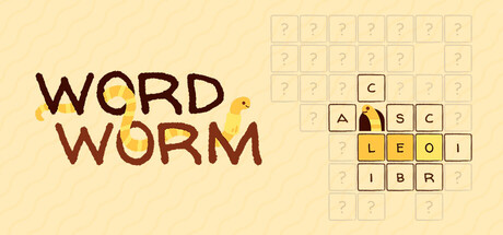
Word Worm scored 70/100 on Steam Analyzer — Good for a Puzzle capsule. Top priority fix: [uniqueness_polish] Integrate the worm actively into the grid composition—show it interacting with or emerging from letter tiles to create a stronger gameplay hook and memorable visual identity.

Capsule scores by dimension

  • Genre Clarity: 7/10 — Word puzzle game with character. The word grid on the right immediately signals a word puzzle mechanic, and the worm character adds a casual indie charm that fits the genre. At tiny size, the grid remains identifiable and the worm silhouette is clear, though the connection between worm and puzzle becomes slightly abstract at minimal scales.
  • Title Readability: 8/10 — Bold title, clean placement. WORD WORM uses a bold sans-serif treatment with strong brown and gold color separation on the pale background. The title remains legible at small and tiny sizes due to large letterforms and high contrast, though the stacked layout is efficient and maintains readability even at minimal scales.
  • Contrast & Color: 8/10 — Strong warm palette, good separation. The cream background (#F5E6D3 approximate) creates excellent contrast with the dark brown title text and the golden grid elements. At tiny size, the warm palette pops against the dark Steam background, and the worm's tan body reads clearly; grayscale test shows strong value separation between title, worm, and grid.
  • Uniqueness & Polish: 6/10 — Competent but generic puzzle styling. The design is clean and well-executed, but the word grid and worm character combination feels like a straightforward mashup without a distinctive visual hook or unexpected craft element. The illustration quality is solid, but the overall presentation does not stand out as particularly innovative or memorable compared to premium indie puzzle titles.
  • Brand Consistency: 6/10 — Consistent but not memorable identity. The warm cream and brown palette is cohesive internally, and the worm character is consistent within this capsule. However, without access to how the worm is used across screenshots and UI, the identity signals remain somewhat generic; the worm motif could be iconic but feels underutilized in this single composition.
  • Composition: 7/10 — Balanced layout with clear focal points. The title anchors the left side with the worm nestled below it, while the word grid occupies the right in a natural reading flow. The composition is well-balanced and safe from Steam cropping, with the worm and grid serving as complementary focal points that do not compete; at tiny size, both elements remain distinguishable and the layout stays coherent.

What works

  • Legible title at all scales. Bold brown and gold letterforms maintain clarity from full header down to tiny thumbnail without collapse or blur issues.
  • Strong warm color contrast. Cream background with dark brown and golden accents pops distinctly against the dark Steam background in both full and scrolling contexts.
  • Clear genre communication. Word grid immediately signals puzzle game mechanics while the worm character adds personality and casual indie appeal.

What hurts the capsule

  • Generic visual presentation. The worm-meets-word-grid concept reads as a straightforward mashup without distinctive craft or a memorable visual hook that separates it from similar indie puzzle titles.
  • Worm character underutilized. The worm is present but passive; it does not interact with the grid or communicate gameplay action, reducing narrative impact and brand identity strength.
  • Limited visual storytelling. The composition shows what the game is (word puzzle + worm) but does not convey why the player should care or what makes this experience unique.

Priority fixes

  1. [uniqueness_polish] Integrate the worm actively into the grid composition—show it interacting with or emerging from letter tiles to create a stronger gameplay hook and memorable visual identity.
  2. [brand_consistency] Establish a signature worm pose or expression across multiple design contexts that becomes instantly recognizable as the brand mascot.
  3. [composition] Consider adding subtle environmental context or UI framing that hints at the trivia element alongside the word search, strengthening the dual-mechanic narrative at small sizes.

Store copy priority fixes

  1. [feature_communication] Expand the detailed description to explain how the word search and trivia mechanics interact—does trivia help you guess hidden words? Is trivia a separate challenge? Clarify the unique hybrid experience.
  2. [uniqueness] Define the worm character's role: is it purely cosmetic flavor, does it react to gameplay, or is it a core mechanic? Explain what makes this word game distinct from Crosswordle, Waffle, or other modern word puzzles.
  3. [hook_strength] Rewrite the opening to lead with the emotional or curiosity hook rather than a dry genre descriptor—e.g., 'Uncover hidden words in mysterious grids while your quirky worm companion cheers you on' instead of 'A cross between word search and trivia.'
  4. [feature_communication] Add a short line about progression or variety—do themes change? Is difficulty ramped? What keeps gameplay fresh across 60+ levels?

Related guides

Steam app ID: 3923280 · Tags: Puzzle, Spelling, Word Game, Casual, Trivia