Scoring genre clarity...
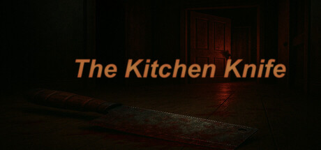
The Kitchen Knife is a psychological horror game that throws you into the fragmented mind of a man haunted by memory, guilt, and something much darker. As the world shifts around you, you must uncover the truth about that morning... This house isn't haunted. It’s waiting for you to come home.
$4.993 user reviews
HorrorAtmosphericPsychological Horror
One Hand StudioOct 23, 2025