Scoring genre clarity...
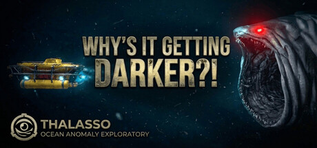
Why's It Getting DARKER?! capsule

Why's It Getting DARKER?!

The light is your only lifeline. Descend into a crushing, thalassophobic abyss where every photograph could be your last. Investigate unpredictable deep-sea horrors and explore the vast, dark unknown - all while being 'assisted' by a darkly sarcastic AI.

Psychological HorrorHorrorSurvival Horror
Kenan'sGamesQ4 2026

Why's It Getting DARKER?! scores 72/100 — better than 47% of Psychological Horror capsules (n=2,245).

Released Q4 2026 · By Kenan'sGames

Quick text summary

Why's It Getting DARKER?! scored 72/100 on Steam Analyzer — Good for a Psychological Horror capsule. Top priority fix: [genre_clarity] Integrate a camera or lens element into the composition to visually communicate the photography investigation mechanic and differentiate from generic deep-sea horror.

Capsule scores by dimension

  • Genre Clarity: 7/10 — Deep-sea horror exploration clear. The capsule successfully communicates a thalassophobic horror theme through the glowing deep-sea creature with red eyes on the right and the bioluminescent submersible on the left. At tiny size, the creature silhouette and vessel are still recognizable enough to suggest an underwater exploration game, though the specific 'photography investigation' mechanic is not visually apparent from gameplay cues alone.
  • Title Readability: 8/10 — Gold text strong at all sizes. The title 'WHY'S IT GETTING DARKER?!' uses large, bold gold letterforms with excellent contrast against the dark space background. The text remains legible down to small size due to generous letter spacing and minimal decoration, though at tiny size the question marks become less distinct and the full text compresses slightly.
  • Contrast & Color: 8/10 — Bright accents pierce dark void. The gold title, cyan-blue submersible glow, and red creature eyes create strong value separation against the dark navy-black background. The design reads cleanly in grayscale with clear silhouettes; the bioluminescent elements maintain edge clarity even at small sizes, and the warm-cool color interplay enhances visual depth.
  • Uniqueness & Polish: 7/10 — Cohesive deep-sea atmosphere well-executed. The capsule delivers a distinctive thalassophobic mood with deliberate visual storytelling—the submersible represents your lifeline, the creature embodies the unknown threat, and the darkening void reinforces the core mechanic of descending into crushing depth. The composition feels intentional and thematic rather than generic, though it relies on established deep-sea horror tropes rather than introducing a truly novel visual hook.
  • Brand Consistency: 6/10 — Thematic but limited identity markers. The capsule establishes a consistent dark-ocean aesthetic with bioluminescent elements that align with the game's core theme and description. However, there are no clearly iconic character, logo, or signature visual motifs that would make this capsule immediately recognizable as THALASSO on repeat viewing—it communicates the genre and mood but lacks a distinctive brand anchor.
  • Composition: 7/10 — Balanced asymmetry with clear hierarchy. The title dominates the upper-center area with strong visual weight, while the submersible (left) and creature (right) frame the lower portion, creating dynamic asymmetrical balance. The focal point is clear at all sizes, though the small THALASSO logo at bottom-left sits in a safe zone and does not compete with primary elements; at tiny size, the composition compresses well without losing its core message.

What works

  • Readable title at multiple scales. Gold letterforms with generous spacing and high contrast against dark background maintain legibility from full header down to tiny thumbnail size.
  • Strong atmospheric mood. The dark void, bioluminescent accents, and creature design immediately evoke thalassophobic dread and deep-sea exploration, directly supporting the game's core theme.
  • Effective color contrast. The warm gold title, cool cyan submersible, and red creature eyes create visual interest and clear silhouettes that pop against the dark background in both color and grayscale tests.
  • Clear focal hierarchy. The composition guides the eye from the dramatic title to the environmental elements without scattered attention or competing focal points.

What hurts the capsule

  • Weak brand identity anchors. The capsule is thematically cohesive but lacks a memorable iconic character, logo variation, or signature visual motif that would distinguish THALASSO from other deep-sea horror games.
  • No mechanical clarity. The photography investigation mechanic—a unique selling point—is not visually communicated; a camera UI element or visual cue could strengthen the identity and differentiate from generic exploration horror.
  • Creature detail loss at tiny size. The deep-sea creature's textural details and distinctive features blur significantly at tiny thumbnail size, reducing its impact as a memorable visual anchor.

Priority fixes

  1. [genre_clarity] Integrate a camera or lens element into the composition to visually communicate the photography investigation mechanic and differentiate from generic deep-sea horror.
  2. [brand_consistency] Add a subtle but distinctive logo or icon (e.g., THALASSO text logo refresh or a signature UI badge) larger and more prominent to create a recognizable brand anchor.
  3. [uniqueness_polish] Enhance the creature's silhouette or add a unique visual detail (glowing pattern, distinctive shape) that remains readable at tiny size and becomes a memorable icon.

Store copy priority fixes

  1. [feature_communication] Add 1–2 sentences after 'NO HANDHOLDING' section clarifying what 'investigating' entails (e.g., 'Piece together creature behavior from logs, photographs, and AI warnings') to deepen mental model of core loop.
  2. [uniqueness] Rewrite the final atmosphere paragraph to explicitly contrast this game against other underwater horror titles (e.g., 'Unlike passive deep-sea exploration games, every moment is a tactical decision between safety and discovery').
  3. [audience_targeting] Add a single line in the short description explicitly welcoming experienced survival-horror players or acknowledging difficulty curve to ensure the right audience self-selects (e.g., 'For those who thrive on resource scarcity and consequence').

Related guides

Steam app ID: 3932730 · Tags: Psychological Horror, Horror, Survival Horror, Underwater, Atmospheric