Scoring genre clarity...

The King's Bargain capsule

The King's Bargain

A king's foolish bargain. A queen's final curse. A kingdom's rotten soul and a world in ruins. In this gothic ARPG, manage your team, sanity, and resources to fight the blight that consumes your kingdom.

Early AccessAction RPGHack and Slash
Pleja Games2026

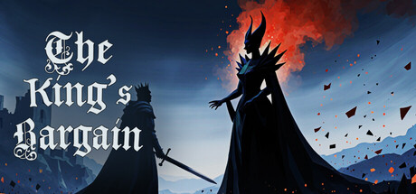
The King's Bargain scores 72/100 — better than 44% of Steam capsules we've analysed (n=22,658).

Released 2026 · By Pleja Games

Quick text summary

The King's Bargain scored 72/100 on Steam Analyzer — Good for a Steam capsule. Top priority fix: [genre_clarity] Add a subtle UI or mechanical cue (e.g., a corrupted crown detail, sanity meter, or resource icon) to hint at the survival/strategy layer beyond the gothic narrative.

Capsule scores by dimension

  • Genre Clarity: 8/10 — Dark fantasy RPG with gothic tone. The silhouetted figures with crowns, glowing red fire/corruption, and mountainous gothic architecture clearly signal dark fantasy adventure. The ominous atmosphere and supernatural elements (floating particles, intense orange glow) convey RPG and survival mechanics. At tiny size, the dark silhouettes and red fire remain readable enough to suggest the genre, though specific mechanics are less obvious.
  • Title Readability: 7/10 — Clear serif title with solid contrast. The ornate serif font 'The King's Bargain' uses white letterforms with subtle drop shadow against the dark upper sky, providing good contrast at full size. At small size, the title remains legible but the decorative serifs lose some sharpness. At tiny size, the text compresses and serifs blur slightly, reducing elegance but maintaining basic readability due to white-on-dark placement.
  • Contrast & Color: 8/10 — Strong value separation with warm glow. The composition uses high contrast between dark blue-purple sky background and bright orange-red fire/corruption effects, plus white title text and black silhouettes. The warm orange glow creates clear separation from the cool background tones. In grayscale, the value range remains strong, and at tiny size the silhouettes and central flame still read distinctly against the background.
  • Uniqueness & Polish: 7/10 — Polished gothic atmosphere, generic composition. The art direction is clean with intentional lighting, particle effects, and a cohesive dark fantasy aesthetic that feels premium. However, the two-figures-facing-off composition is familiar in the genre (similar energy to Slay the Princess and other dark fantasy titles), and the scene lacks a distinctive mechanical or narrative hook that sets it apart visually. The craft is solid but the visual concept doesn't convey what makes this game unique.
  • Brand Consistency: 6/10 — Coherent gothic palette, limited identity. The capsule maintains consistent rendering style with unified color palette (dark blue, orange-red, white, black) and a recognizable dark fantasy tone. However, without access to the store screenshots mentioned, the silhouettes and scene feel somewhat generic within the gothic fantasy space—no immediately iconic character design, motif, or signature visual hook that would distinguish this brand from other dark fantasy games at a glance.
  • Composition: 7/10 — Clear focal point, slightly static balance. The composition centers on the two facing silhouettes with red corruption/fire between them, creating a clear primary focal point that holds at small and tiny sizes. The title sits safely in the upper left without edge clipping. However, the two-figure symmetry creates a somewhat static, predictable layout; the large empty sky area above the figures wastes premium real estate and could have been better utilized for title placement or additional visual intrigue.

What works

  • Strong dark-light contrast. Orange-red glow and white title create excellent separation from the dark background, remaining readable even at tiny thumbnail size.
  • Clear genre signaling. Gothic architecture, crowned silhouettes, and supernatural fire effects immediately communicate dark fantasy adventure without confusion.
  • Safe title placement. White serif text positioned in upper left on dark sky background avoids edge clipping and maintains legibility across all viewing sizes.

What hurts the capsule

  • Generic composition in category. Two opposing silhouettes with central glow is a familiar trope in dark fantasy, failing to visually communicate what makes this game's story or mechanics unique.
  • Decorative serif font softens at tiny. Ornate letterforms lose definition when compressed to thumbnail size, reducing the premium feel and elegance intended by the typeface choice.
  • Wasted upper sky area. Large empty space above the figures could have been leveraged for stronger visual hierarchy or additional narrative/mechanical hints about survival or resource management gameplay.

Priority fixes

  1. [genre_clarity] Add a subtle UI or mechanical cue (e.g., a corrupted crown detail, sanity meter, or resource icon) to hint at the survival/strategy layer beyond the gothic narrative.
  2. [uniqueness_polish] Introduce a distinctive visual element or signature motif (iconographic symbol, unique silhouette pose, or color accent) that differentiates the brand from generic dark fantasy competitors.
  3. [title_readability] Test a bolder or slightly simplified serif variant that maintains elegance at full size while retaining clarity at tiny thumbnail compression.

Store copy priority fixes

  1. [feature_communication] Rewrite the 'Core Gameplay Mechanics' section in prose format with 2–3 concrete examples per mechanic. For example: 'Manage your team's sanity and heat—if your survivors get too cold or mentally broken, they'll refuse orders or turn hostile. Scavenge abandoned buildings to craft weapons and shelter materials, then defend your camp from corrupted creatures each night.'
  2. [uniqueness] Add a 1–2 sentence statement of what makes this game's curse-breaking or survival approach distinct. For example: 'Unlike other survival RPGs, your choices to break the curse directly affect the world's environment and NPC behavior, creating a dynamic moral cost to survival.'
  3. [hook_strength] Move the core gameplay verb ('manage your team, sanity, and resources') earlier in the short description and lead with the primary loop rather than stacking genres. For example: 'Manage a band of cursed survivors—their sanity, equipment, and allegiances—as you uncover the dark truth behind a king's bargain and a queen's revenge.'
  4. [feature_communication] Fix typos and complete incomplete descriptions ('A heat system are essential' → 'Manage heat and cold; neglect your team's warmth and they'll freeze or abandon you'). Remove unexplained mechanics like 'dice rolls' or explain what they do.

Related guides

Steam app ID: 3939570